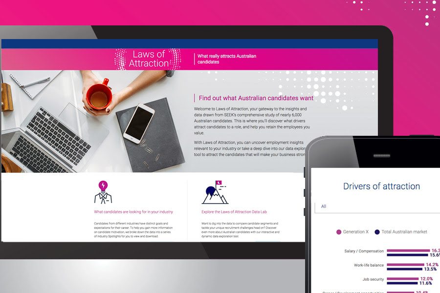
Case Study: Interactive Data Map

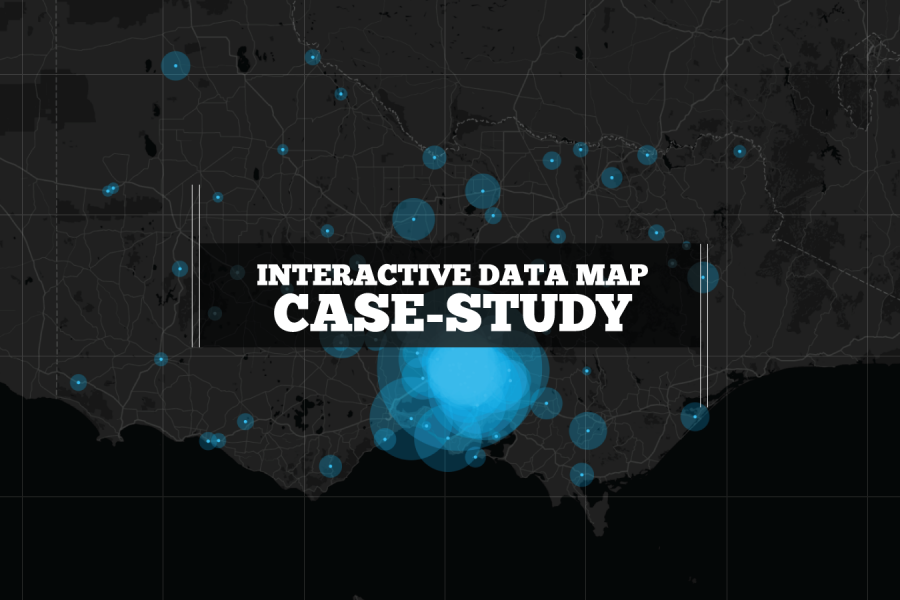
We built this interactive map as a use-case for interactive/explorable maps. It's UI and easy-of-use is a case study of how data visualization can make better sense of geographical data. Certainly better than a table in a spreadsheet!

Share
Great Year In Reviews

What Makes A Great Year in Review? A list of our most favorite digital annual report content elements for 2017 Almost everyone produces a Year-In-Review and most of those still

Share
The Data Visualization Format of the Year (Runner Up): Interactive Maps

The Data Visualization Format of the Year (Runner Up): The Interactive Map With best-practice examples You may have already seen that this year’s best data visualization format winner was declared:

Share
The Data Visualization Format of the Year: Interactive Calculators

The Data Visualization Format of the Year: The Interactive Calculator A Great Example to Show You How It’s Done This year has seen some great data visualizations. From interactive maps,

Share
Case Study: IWDA Annual Report Microsite

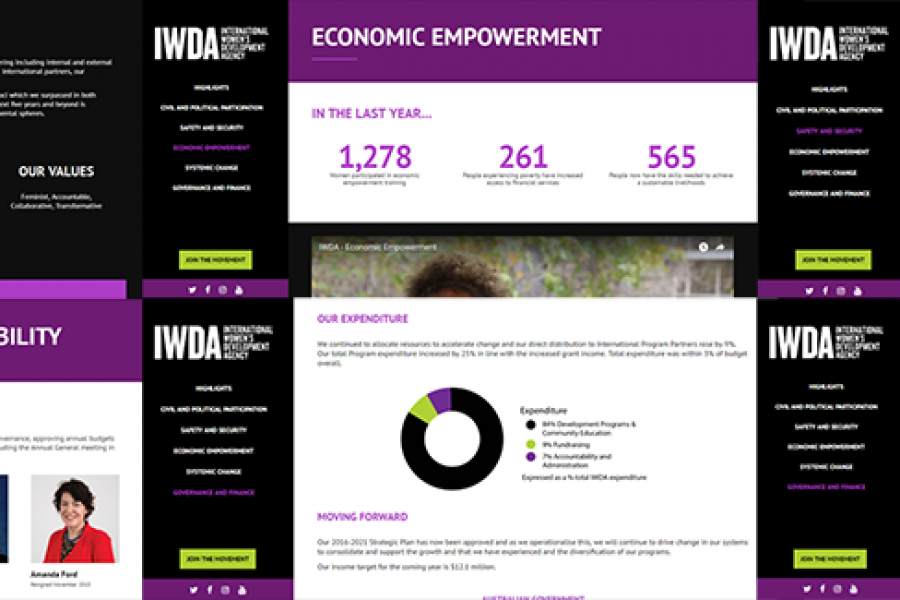
Considering going digital with your annual report? Do it! Here's an example of what interactivity and a non-profit organization's 'year in numbers' looked like after they ditched paper and went digital.

Share
What is a Microsite vs a Website?

What is a microsite & what are they used for? A look at what makes a good microsite, how they differ to a website & some great examples. In previous

Share
Amazing Microsite & Interactive Experience

A Killer Microsite & Interactive Web Design Experience That Will Inspire You! Microsite and interactive data tool that is the future of data design If a good infographic tells a story, then

Share
Case Study: Monash Health Interactive Timeline Tool

Monash Heath wanted a time-based interactive data visualization to show the pathway of a patient’s journey through the healthcare system. We used Adobe Illustrator, Excel, HTML, JavaScript, and CSS to come up with this digital experience.

Share
Digital Annual Report Designs That Don’t Suck

Examples of Digital Annual Reports That Don’t Suck A handful of forward-thinking companies and non-profits have begun to turn the routine production of a digital annual report into an opportunity

Share
Dashboard Examples

2 Examples of Dashboards We Love and Why. To finish up the year, we thought we’d showcase a few dashboards that caught our collective eyes here at Datalabs HQ. There isn’t a

Share