


6 of the Best Marketing Dashboards
… And Why Your Business Needs One!
Tired of tiny details and endless numbers on your marketing strategy report? Tired of constantly opening new tabs on your browser just to get a glimpse of the myriad aspects of marketing trends? Well … you’re not alone and we hear you.
Marketing data tends to be dense, with data spread over several platforms and countless reports, making it arduous to compare and analyze effectively. We can alleviate that load by having all trends and report features in one place. That is, with the use of a single marketing dashboard.
A marketing dashboard is a simple, graphical interface that presents and organizes all components of your marketing strategy in just one page (or microsite). With their aesthetic appearance and interactive nature, marketing dashboards are great communicators and aim to make data presentation easily digestible and highly engaging.
So, we’ve collected some of the best marketing dashboards yet so that (hopefully!) you can be inspired and transform your business.
Tickr
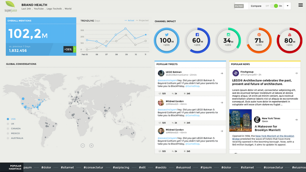 With a beautiful and neat user interface (UI), this marketing dashboard is presented with interactive cartography and structured placement of columns for the latest social media updates. The use of bold primary colors, which are used to refer to the social media marketing data, as well as a clean, tidy layout immediately attracts the audience’s attention and invites them to further engage with the data. The use of vivid color reflects on the modernity and vivacity of the world of social media.
This dashboard incorporates data analysis from the social media web, including features calculating “overall mentions” and “popular tweets”. The cartography is used to communicate the countries in which “global conversations” of trending topics are happening.
Trackado
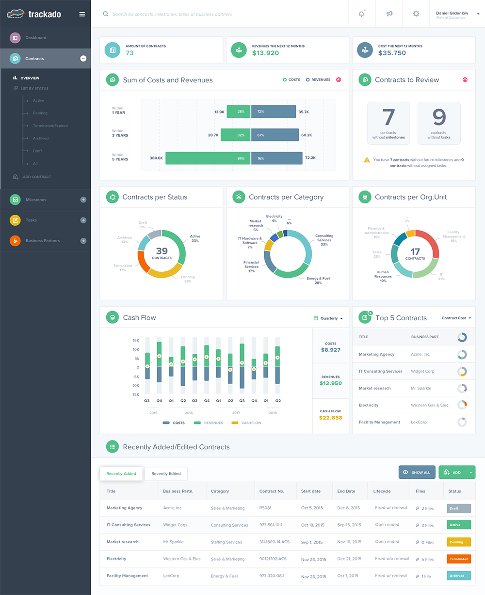 This is an excellent example of a dashboard utilizing a clear contrast between the white background and colorful graphs and charts to create an eye-catching and distinct interface. Each color in their striking palette is used to label a different statistic, making the data easy for the audience to understand. The dashboard’s modular panels enable effective segmentation and breakdowns of the data. This, in conjunction with its clear-cut graphics, invites the audience to observe the dashboard both closely and from a distance.
The dashboard effectively displays the company’s future goals, cash flow, and contracts as well as reflecting the company’s clear organization and leadership.
Responsive Miracle
 This is a great example of how marketing dashboards can take heavy data and turn it into a clean and easily-digestible display.
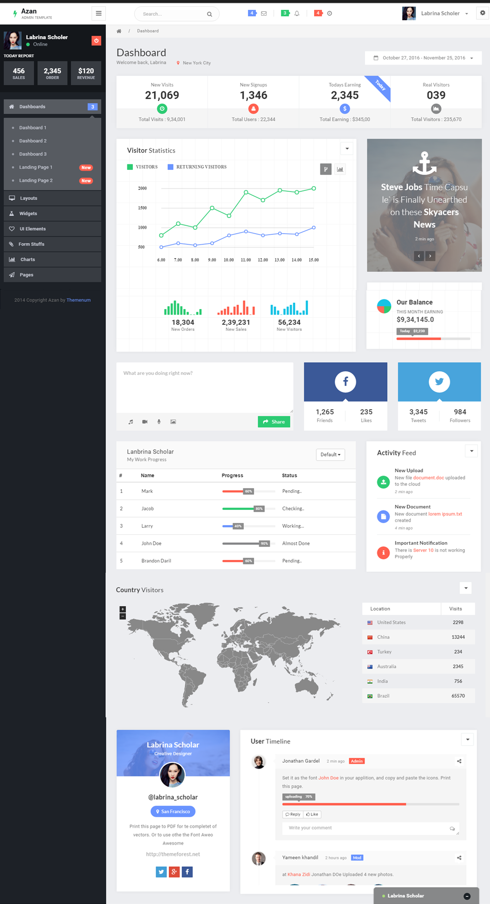
On the information side, this marketing dashboard details the number of visitors hitting a company site. Looking closer, this data is especially significant in terms of marketing analysis as it deals with the “real visitors” that are actually beneficial to the site and picks out the bots that could be skewing your visitor data – a valuable insight. Along with this, the marketer can see how much s/he earns on a daily basis and how this corresponds with the number of new visits and sign-ups. The cartography module also provides insight into the spread of global visitors.
On the design side, this dashboard employs best practices, making sure the key particulars are presented first in a simple display with the supporting data that expands on the ‘whys’ and ‘hows’ appearing after. What’s more, the graphs and cartography displays are interactive, allowing the marketer to drill down on certain fields, zoom in or switch displays if needed. You can even minimize sections of the dashboard. This makes for a highly personalized interface for everyone on the marketing team; they can easily and effectively access the data they need, how they need – and all using just the one dashboard. And as the name suggests, this whole dashboard is responsive – optimized for desktop, tablet, and mobile devices.
Avalon
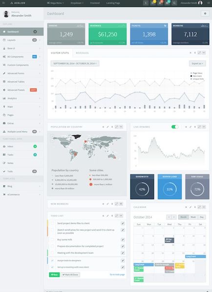 Another responsive design, this dashboard, depicting clear line graph and geographical maps, is simple and beautiful. The use of cold colors on specific statistics can be another option for marketers who aren’t fans of bright colors and proves that even the most boring of corporate style-guides can be used effectively in data visualization (if left in the right hands!).
Color aside, the variety of features included on this dashboard allows for a holistic view of stats combined with a place to take action – a true one shop stop. This is a platform where key insights such as revenue and members, visitor statistics compared with revenue, and much more are shown visually, and right alongside operational widgets such as categorized to-do lists and interactive calendars. If you’re looking for efficiency gains, look no further. This dashboard allows marketers to easily gain and compare data insights, then act.
Joelle Carignan for an iPad App for Marketing Executives
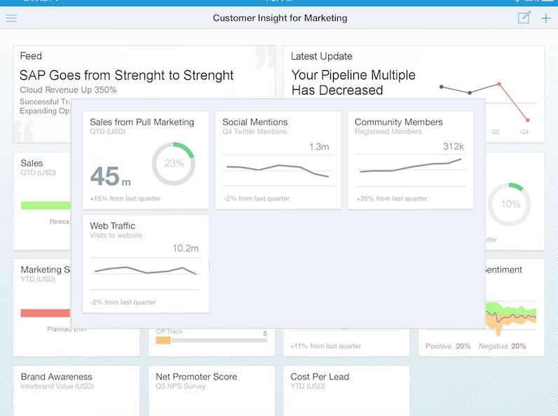 Developed specifically for iPad devices, this marketing dashboard features an abundance of relevant marketing data: Sales Forecast, Marketing Spend, Online Sales, Social Reach, Social Media Sentiment, Net Promoter Score (NPS), Cost per Lead, Campaign Status, and even a module for displaying the latest industry news. Even if an iPad isn’t going to work for your own business, it’s definitely worthwhile checking this dashboard out to use as a guide for the data you may want to include in your own. This dashboard immediately shows marketing insights in context to both the company’s campaigns and competitor press releases. Its clear overview of the company’s key performance indicators relevant to marketing is designed with a simple layout and clear depiction of numerical movement with a variety of data visualizations. These features allow the audience to focus on the necessary informative data without getting bored with simple color-labeled textual data.
Sisense
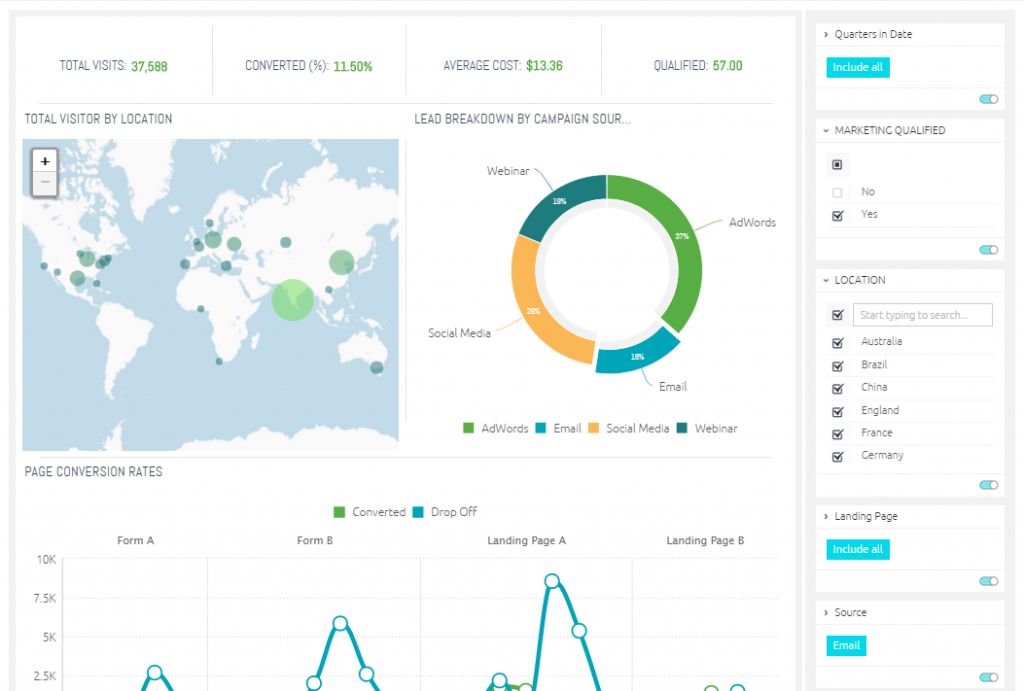 Along with its interactive geographical map, the crisp layout and effective use of labels in this dashboard allows anyone to easily interpret its data. The distinguishable line graphs and pie charts uncover insights into the most recent trends and campaign breakdowns in clear visualizations. Moreover, the colored segments of the pie chart allow for marketers to easily compare findings at a glance. This is a great example of how complicated data can be transformed into easily comprehendible visualization. This is just one example of a Sisense dashboard – there are loads more features available to enable customization for your own business needs.
In summary…
Hopefully, any of these marketing dashboards will compel you to adopt the use of a dashboard for your own marketing practices.
Marketing dashboards make your marketing strategy a lot more efficient. Data visualization is a powerful tool that allows you to gain valuable insight into your data in an engaging and easily comparative format. Most dashboards are customizable to suit your marketing needs which means you can have all the data and corresponding action items relevant to your business in the one central place. Marketing dashboards also allow you to see the bigger picture of your overall marketing strategy. Seeing things from a distance offers a fresh perspective with a greater holistic insight into trends and patterns.
The drive to a successful marketing strategy is not only about seeing what works but is also about recognizing where the trends are and which tactics do not work for your business. And marketing dashboards are a truly convenient solution to achieving this.
And you can kiss Excel goodbye.
Need a dashboard for marketing, business intelligence or something else? Or just need some advice on what dashboard would work best for you?
Get in touch with us directly by emailing hello@datalabsagency.com
or by clicking the Contact Us link in the navigation.
Want to keep researching? Find out about Tableau Dashboards here.