


Six Questions Content Marketers Should Ask of Their Google Analytics Data
Understanding the Value and ROI of Content is Imperative to Modern Marketing Analytics.
Here are some great ways to start asking the right questions of your data…
1 What are the various user behaviours on different content areas of the website?
Using your website’s navigation and site structure as a guide, establish defined content areas (or utilise Google Analytics Content Grouping functionality). Wait a short period of time until enough data has been captured and your marketing team will see unique behaviour that might merit further investigation.
Examples of unique behaviour are a high page-per-session, content areas used frequently (or not at all) by mobiles and tablets, and sections of the site that used heavily by various languages (for example, visitors from China or paths taken by confused users, looking for content.
2 What content is visited by your targeted users?
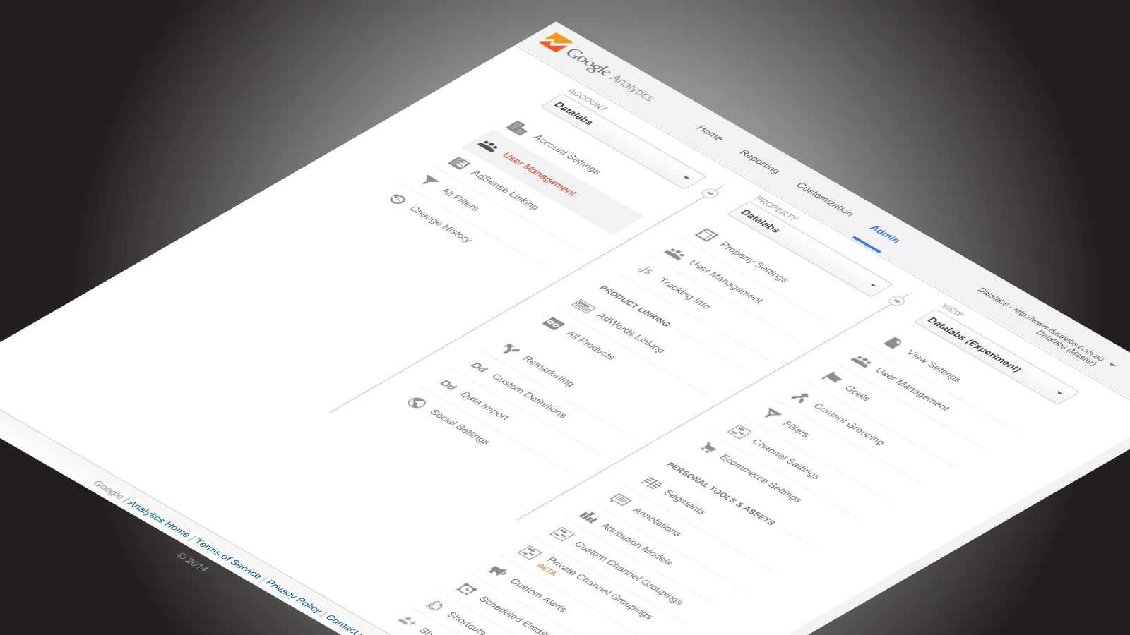
Using the Segments functionality in Google Analytics, we, here at Datalabs, slice through our clients’ data, showcasing the only the behaviours of targeted users. By doing this, we ‘cruelly expose the true traffic volumes and user flows that marketers are interested in growing.
All other segments and traffic become secondary for the time being. Areas that we would want to look at our popular landing pages, successful marketing channels, and pages with high exit rates. These exit pages would then be flagged as needing a technical fix repair, deletion, or a redesign.
Lifting the underperforming pages has a drastically positive impact on our clients’ marketing campaigns.
3 What content has a low visitation/high bounce rate amongst its intended audience?
Within your marketing team, define a threshold for visitation numbers and bounce rates, then build a custom report that visualises and ranks, in order, the top- and bottom performer pages in terms of visitations and bounce rates. Factors that negatively impact visitation could be low SEO metrics, like PageRank and number of backlinks.
Alternatively, user experience design could be at fault, especially in the areas of navigation and location of links to the page. Now determine why those select pages have high bounce rates: Is it because of a slow page load time (bad user experience, slow page load time is also a factor in SEO rankings)?
Is it because of confusing or missing content? Maybe even geographic reasons (content ranks highly for international audiences for general keyword terms but is unable to be actioned by the same audience (e-commerce sites often have this problem).
4 What type of content is most effective with each audience?
Look at your return-on-investment for content creation by tracking content by its type. Examples of content types would be: articles, videos, infographics, PDFs, images, interactive visuals, etc. Certain content types might be attractive and therefore viewed heavily by certain marketing segments.
In addition, certain channels might be the perfect places for certain content types, based on the data.
5 What landing pages are underperforming in relation to SEO opportunities?
An analysis of Google’s search volumes by keyword gives marketers the first data we need; then looking at the traffic levels of your landing pages will give marketers the second dataset of this equation. The Datalabs Agency visualizes the ratio between these two datasets and then analyses which landing pages are performing to expectations and which are under- and over-performing. This then gives us a ranking, which we can use to find the questions of “Why?” Insights that are positive can then be used to rectify those pages that should be delivering better benefits to your marketing efforts.
6 What are users — ones that don’t come through branded keywords — doing on the site?
Users that come to your site having typed in an unbranded keyword could be your next customer. Possibly, they’re searching for information to inform their next choice. The focus of this portion of the organic marketing channel is to make sure that the content they are searching for matches what your organisation is delivering. The key here is to have a strong call to action and the ability to migrate these users to deeper pages or to collect their details. A new focus is to build a remarketing list using the data from this group so that in the future, you can show them relevant messages. The user has left your site and is visiting other sites other. Remarketing allows you to reach them again and give them a reason to return to your website.
And a Here are a Couple of Notable Additions
- Segments – this is a huge part of content and marketing analytics, but start to define some simple segments and cross-reference them by distribution channel. Not the most revolutionary idea but important to know which gender split works through social, paid or organic etc. That would then influence the type of content and how you spread it around which gives you a more target approach.
- Beware bounce rate for blogs – bounce rate measures single session interactions so for a blog or targeted landing page, that might be a lot higher than a others pages like your homepage or service pages. This isn’t inherently a bad thing. A higher bounce rate for a content page means that your reader isn’t moving through your site after engaging with your content but there are methods to change this such as retargeting, email signup etc.
Looking for Help with Your Analytics?
Check out our Visual Analytics Strategies today.