


Interactive Infographic Dashboards:
5 Ways A Great Dashboard Can Optimize Your Business Operations.
Business leaders employ numerous tools to track operational progress and strategically plan future campaigns. It is not an easy task, considering there are almost limitless and complex data that can tell the story of how the data can drive the business.
Enter, the business dashboard, a strategic tool that Stephen Few, in his book Information Dashboard Design defined as:
“…a visual display of the most important information needed to achieve one or more objectives; consolidated and arranged on a single screen so the information can be monitored at a glance…”
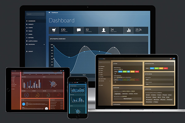
Dashboards are multipurpose and beneficial across all business management groups, from it financial, marketing, HR, IT, content, or sales. They display a concrete, real-time visualization of what to implement for better business decisions and they are vital for leaders and analysts who need to take a look at business objectives and make decisions on that data.
Let’s take a look at some rewards for creating dashboards — rewards that are beyond just a cost-benefit analysis.
#1: Tracking Performance and Insights
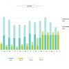
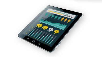
Dashboards are like gauges that give a picture of key performance indicators and metrics that govern a business campaign’s success or failure. Interactive dashboards project the KPI trajectory by crunching raw data from multiple points and metrics related to business success. It will combine reports and provide valuable insights to show campaigns that are not doing well. It lets organizations manage resources better and improve the scalability of operations.
#2: What Spreadsheets Can’t Do, Dashboard Can! 

Spreadsheets have been the go-to strategic analysis tool. They’re valuable but can fail to solve to big data problems and offer no real insights. A dashboard can display relevant data ranging from basic charts and graphs to tables, but the real win is when it can be customized to incorporate multiple data types and visuals. Beyond that dashboards allow business leaders to drill down, explore, and take a deeper look at various facets of their data.
#3: Reduce Ambiguity and Increase Efficiency
Raw data in spreadsheets cannot intuitively help to identify trends or clarify ambiguities. With the help of an interactive dashboard and appropriate metrics, it is possible to visually analyze and facilitate the creation of a clear strategy that leads to action. A Hurwitz research survey in 2005 showed improved operational efficiencies and the conception of greater intellectual capital through the use of business dashboards. The research respondents reported a full return on investment in dashboards in less than a year.
#4: Dashboards & Visualisation Save Time
With increased efficiency, less time is required for parallel tasks that otherwise would have demanded more time. Dashboards not only add aesthetic value but also lead to the automation of tasks. It improves the scalability of the business as it enhances both top and bottom-line growth backed by inter-department co-operation.
 #5: Real-time Optimization
A well designed visual dashboard has the ability to incorporate real-time metrics and provide analysis on-the-go. In turn, this gives a common ground for fine-tuning and alignment of campaigns in real-time. The visual approach makes it easy for the user to engage and employees understand what is expected from them, thus realization of goals and strategy is optimized.
In today’s world, organizations that are leveraging dashboards to the fullest are able to make data exploration a part of everybody’s work. Great dashboards are able to fulfill the niche requirement of business leaders from reporting to deciding the course of the future operations and strategy.
Are you a business leader wanting to make interactive dashboards an essential part of your business approach to data management? Click ‘Contact Us’ in our navigation.