hello@datalabsagency.com
logo
Datalabs Agency
En
  • De
  • Ar
0
logo
  • Data Training
    • Our Six Main Workshops
      • Introduction to Data Visualization: Tools & Techniques Workshop
      • Designing Great Business Dashboards Workshop
      • Infographics & Report Design Workshop
      • Creative Data Presentations with PowerPoint
      • Visual Storytelling for Government Workshop
      • Creative Power BI Dashboard Design
    • Online Courses
      • An Introduction to Data Visualization & Storytelling
      • Designing Great Dashboards
  • Data Design
    • Style Guides
      • Power BI Style Guides
      • Tableau Style Guides
    • Animated Data Videos
    • Maps & Cartography
    • Interactive Infographics
    • Power BI Dashboards Designs
    • Tableau Dashboards Designs
    • Infographic Reports
    • Interactive Data Visualizations
    • Digital Annual Reports & Microsites
  • Case Studies
  • Shop
    • Ecommerce Products
      • Power BI Templates
      • Power BI Theme and Style Guide
      • An Introduction to Data Visualization and Storytelling Course
      • Designing Great Dashboards Course
      • Data Visualization Consultant
  • Login
  • Contact
    • About
      • Otto Ottinger
      • Blog
Digital Annual Report Design - Datalabs 2015 0
Digital Annual Report Designs That Don’t Suck
31 March 2016
Image Page Design 0
Infographic Report Design
11 April 2016
Articles
Excel Data Visualisation Artwork
April 11, 2016 by Datalabs in Articles

Excel Data Visualization Artwork Project.

Creating beautiful, artistic work exclusively in Excel.

We were tasked by a digital agency to create something different for their client, using only the Microsoft product suite (particularly Excel and Powerpoint). The final product needed to be unique, engaging, 3D, and entirely different from what you might expect to create with Microsoft.
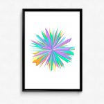
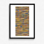
The brief was open to using a data visualization framework, as Excel is a common tool in the field, but needed to break away from the standard of ordinary usage of charts, filters, colours and design, The images are data-driven – they are real Excel charts, but layered and overlaid to them look unlike something produced by Excel.

Excel Data Visualisation 1
Spike Graph Excel
Excel Circle Art

Expanded Pie Chart Excel
Excel Starburst Graph
Data Visualizations Excel

Layered Graph in Excel
Artistic Bubble Charts

How We Made Them

We used only the standard charts available in excel, creating huge data sets that allowed us to be able to change the traditional look and feel of the chart – breaking or deconstructing it. In some of the examples, you can see the elements of a basic Excel chart (pie, line, bar, bubble, etc), but they have been manipulated into beautiful forms. Using excel in this way is exciting, and we are absolutely excited about it!

The final delivery was done in Excel, which could be then exported into Powerpoint.

0 Comments
  • art
  • chart types
  • data visualization
  • Excel
  • Microsoft
  • PowerPoint
0 Like!
Share
Datalabs

Data Visualization Training: Workshops & Courses

Shop Online for Data Visualization

  • Image of a man using our Power BI templates to design a report
    Power BI Templates
    Select options
  • Image of our custom Power BI Theme on a computer
    Power BI Theme and Style Guide
    Select options
  • An Introduction to Data Visualization and Storytelling Course
    An Introduction to Data Visualization and Storytelling Course
    Add to cart
  • Photo of a data visualization consultant advising clients and helping solve design issues.
    Data Visualization Consultant
    Buy product
  • Designing Great Dashboards Course
    Designing Great Dashboards Course
    Add to cart

Style Guides for Data?

A photo of our data viz style guide for Microsoft Power BI

Data Visualization & Storytelling Group Workshops

Contact Us

  • This field is for validation purposes and should be left unchanged.

From Our Blog

  • 8 Incredible Examples of Interactive Data Visualization
  • Data Analytics Conferences 2024 & 2025
  • Data Visualization & Design Conferences 2024 & 2025
  • Case-study: Intranet Dashboard Design for Nestlé
  • Dashboard Tips: 3 Alternatives To Using A Data Table
  • Data Visualization Training
  • Brand Guidelines for Data
  • Online Courses & Products
© 2024 Data Arts Pty Ltd
logo

We noticed you're visiting from Australia. We've updated our prices to Australian dollar for your shopping convenience. Use United States (US) dollar instead. Dismiss