


All industries have a critical need for visual analytics.
The insights that can come immediately from a well-designed business dashboard or data visualization in the finance industry could provide the highest return-on-investment (ROI).
Finance has long been an advocate of business dashboards and data visualization. Companies like Bloomberg and networks like CNBC have incorporated visualizations in their products and broadcasts. In Australia, finance personalities like Alan Kohler are figure heads for data visualization, producing charts and graphs from Australian Bureau of Statistics (ABS) and the Reserve Bank of Australia (RBA) data.
But why do the dashboards and visualizations that the finance industry produce suck?
Is it the software that produces them?
Is it the skill set of the producer?
Is it the lack of creativity in the data visualization process?
Finance, Design, & Data
I think it’s a combination of all three. To find one person who has in-depth finance knowledge, a graphic design background, and the ability to visualize complex business data with an eye for discovery is hard. Often, you’ll find a data analyst with an interest in design. Or a graphic designer who works well with numbers. But the combination of data visualization know-how, technical and artistic skills, and business acumen, is rare.
Looking at what’s visualized today in finance and you can see what I mean. The data is there; the graphics are un-inspiring; the result is a visual cliché that is, more likely than not, filling space and being ignored. Creativity and modern design needs to be injected into these charts and graphs.
How do you do this?
We would say, of course, hire a professional — one with a business and a data visualization background. A person who thinks visually and thinks, from a user’s perspective, in reverse: what would be the one insight that I would like to get from looking at this data? Thinking in reverse, thinking visually, and coming at the data with financial experience is the best course of action to coming up with an insightful, powerfully-useful visualization.
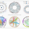
Creative Finance Data Visualization
Take for example, the bread-and-butter of finance data visualization: the timeline. Trends in housing prices, unemployment figures, and stock prices are place in line graphs on a timeline. This is useful information. Needs to be done. But it will unconsciously slip into the category of a visual cliché for most readers on finance journals and websites. The useful information that is inherent in a timeline are the trends, the most recent value (eg. what is the stock price right now), and the causality (ie. what factors are affecting the data that’s being visualized). For that reason, we would suggest that a finance timeline shouldn’t stand alone. Here we’re modern design and creativity come into play. The use of small multiples can tease out the factors that affecting the main timeline (the causality). The break-out the current value (and the date and timestamp) will communicate to the user the current value of a stock. The use of higher-order data visualization assets such as scatterplots or bubble charts might give greater insight as to how this particular stock is trending in relation to its competitors.
The Form of Finance Data
Often data from the finance industry is presented in periodical reports and white papers. The unfortunate form that these reports or papers take are in the form of a PDF. The data is locked away, not interactive, and “un-discoverable”. It’s as though Microsoft Excel and Adobe, the inventor of the Portable Document Format (PDF), have conspired to make sure that you’re average finance consumer will be treated to a substandard design that is flat and not up-to-date.
This is not how finance data or business dashboards need to be.
Business Dashboard and Data Visualization Design
The advances in data visualization technology allows data visualization agencies, such as Datalabs, to present data in an interactive format shown through the browser (or through apps). The result is beautifully-rendered charts, modern in their look-and-feel and creative in their use of discoverability, and even storytelling.
Allowing users to “play” with data sets, enticing them with engaging color palettes and font choices, and communicating to users that your company or government agency cares enough about its financial data to design it in an attractive, insightful manner should be the norm. Unfortunately, it’s not.
If you’d like to ween yourself off boring Excel charts, save time and money in collecting and presenting data, and want to give your audience the best, most engaging experience, contact us. Business intelligence dashboards and data visualizations for finance are our expertise.