


Brand Guidelines for Data: The Data Visualization Format of the Year (First Place)
Formatting All Data Visualization with Best Practice Principles
In 2023, the visual branding of data has only grown in importance. As companies and organizations grow more sophisticated in their utilization of data, their public-facing infographics and dashboards need to be consistent with the look and feel of their marketing and communications.
Since we started ranking data visualization formats, pitting themselves against each other so-to-speak, our first and second-place winners of the data visualization format of the year have largely swapped places: the Interactive Calculator and the Interactive Map. But this year, both those lovely formats have given way to a foundational format. 2023’s data visualization format of the year is the brand guidelines for data!
Why Brand Guidelines for Data?
We’d love to say all data visualization was clear, engaging, and beautiful. The technology and information needed are out there in this day and age. Though we wouldn’t be having this conversation if that was the case. And, unfortunately, even some of the most innovative data visualization concepts let themselves down when it comes to design.
‘But who cares about the design so long as you’re getting the message across?’, you might ask. But that’s just the thing… the design is ultimately how the data is communicated. We’re talking about data visualizations here. Bad data design often results in bad communication.
Before and After Implementing Brand Guidelines for Your Data
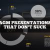
The Corporate brand guidelines rarely cover data visualization formats. An organization’s website and email templates may be really distinguished. Those beautiful brand assets and pixel-perfect design consistency tend to fly out the window when it comes to annual reports, interactive data formats, Annual General Meeting (AGM) presentations, infographics, research papers, and basically any other collateral that data is presented in. And even if you send these works to a designer, they’re probably not a data expert.
Brand guidelines for data can ensure that:
- Design and data come together to create engaging and meaningful communications
- All text is legible and purposeful by outlining font sizes, families, colors, and hierarchy
- White space is used effectively and consistently to reduce unnecessary clutter and make it easier for the reader to identify ‘blocks’ within the visualization
- Optimized layouts are used for the varying arrays of data content
- Color is used logically and consistently – For example, style guides can distinguish when to use categorical palettes (where data has no inherent order but should be differentiated, so contrasting color families could be utilized here) and when to use sequential color mapping (where data should be categorized but the categories relate, so perhaps different hues of the same color family will tell the data story better)
- The most effective chart or graph is used to convey the data set at hand which allows further insight and relationships to be conveyed
- The developer is informed of best practice tips as they go
- Additional graphical elements are utilized in places that can add context to, or simplify, the data
- Text labels are introduced only when necessary, and only where practical (for example, using hover over labels rather than text overlays to reduce clutter in charts)
- Your organization’s brand guidelines and reflected to create instantly consistent and distinguishable data communications
- Your data analysts and researchers (who aren’t designers) can effectively present beautiful, comprehendible data
These factors work together to make for visualizations that are intuitive and can be more quickly and easily digested.
Relationships between data can be readily identified and trends uncovered – without inflicting the frustration of a person who’s been concentrating on one thing for the past three hours to no avail… Basically, the reader is able to spend less time trying to understand what’s going on and more time putting the newfound insights to use.
The Difference a Custom Data Visualization Brand Guideline Can Make
Here’s just one example of how bad design can impact the communication of data…
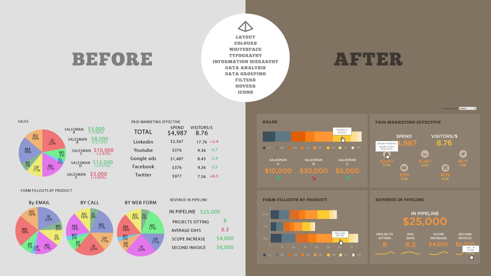
In the ‘Before and After’ image, we see the data – but it is not intuitive to digest. And it’s certainly not pretty, to say the least.
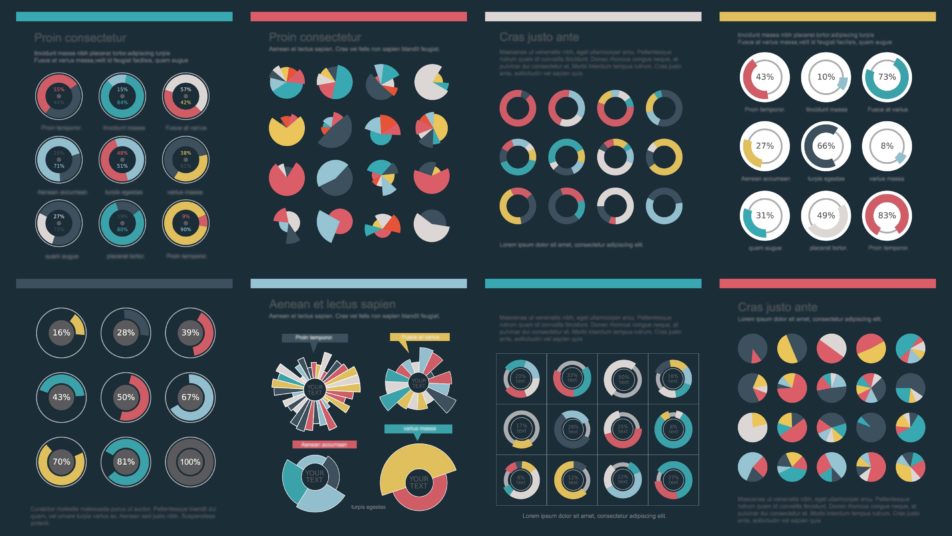
Data Design Consistency Is Key
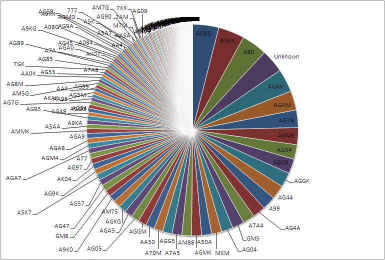
The colors used to differentiate the categories in each pie chart in the ‘Before’ image aren’t consistent throughout the pie charts, even though the categories are the same. In other words, if you looked at one chart and identified the AV category as ‘teal green’ and scanned the other charts for ‘teal green’ to compare, you’d be interpreting the data wrong as the AV category is lime green or orange in other charts. Keeping this the same, especially where different data sets are displayed in the same page or viewing space, is a simple way of reducing the time taken to interpret data. Thus, it’s a simple way of communicating better.
Minimize Clutter To Increase Legibility
There are a number of ways the ‘After’ image reduces clutter and makes for an easier read. These ways can be attributed to the best-practice methods outlined within a data visualization style guide. To name a few:
- Consistent font families and sizes allow the reader to identify and distinguish headings and labels within the graphs.
- Consistent white space separates information blocks so that the reader can skip over blocks that may not as relevant to them and focus on the ones that are without getting lost in the display.
- It also helps to distinguish the relationships between the data sets.
- A hover-over labels function is used to replace the jumbled text seen in the ‘Before’ image. This drastically reduces the clutter and means the reader can still see the label information only if they need to, and without the design being sacrificed.
- Icons have been employed to represent social platforms, which are easily recognizable. This reduces clutter, lifts the design and also allows for a quicker read (did you know visuals are processed 60,000X faster in the brain than text?)
- Instead of using the all too common pie chart for every set of data (which is pretty hard to decipher unless you have a compass handy), the ‘After’ image correctly makes use of a better alternative: grouped stacked bar charts. The grouping of the three data sets also tells the story of their relationship with one another, which is an extra insight the ‘Before’ image doesn’t communicate without further analysis.
Don’t just recreate raw data in pictures – Analyze and make meaningful visualizations
The ‘After’ image also goes above the standard recreation of numeric and text data into a visual. The ‘Revenue in Pipeline’ section in the ‘Before’ image cites some figures… but provides no context to the timeframes to which these figures relate. In the ‘After’ image, all these figures are still there… though with the addition of a line graph depicting the fluctuations over time, along with hover-over labels containing the start and end dates for the data. With the addition of a simple line graph, a lot more insight can be gained, and the data truly tells a story. A good data visualization style guide helps the developer choose the right chart for their data set by questioning the purpose of the data. Had the developer of the ‘Before’ image been asked these questions, perhaps he/she would’ve realized the data is nearly pointless without a timeframe…
Good vs. Bad Visualization
GOOD VISUALIZATION: Here are some best practice examples of data visualization style guides and their features.
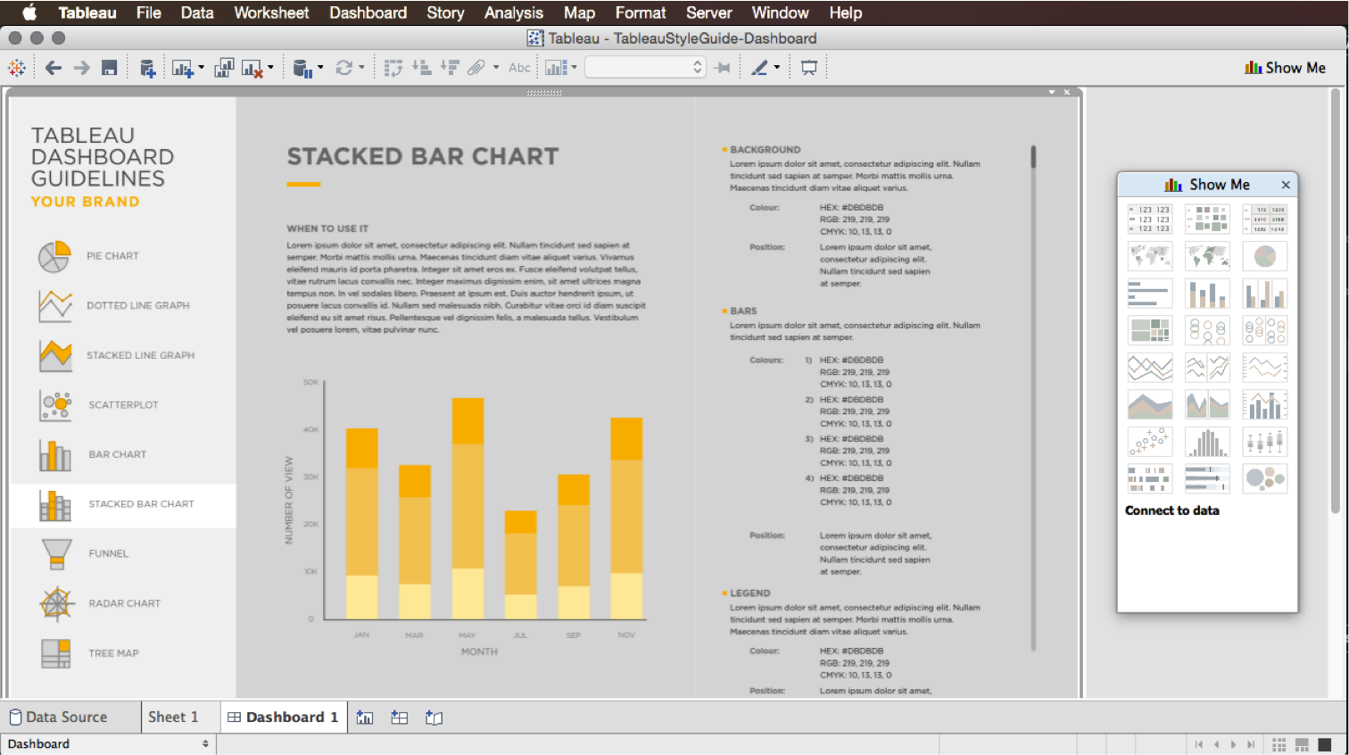
1. This Tableau Style Guide features tabs for each chart and graph, in addition to the general guidelines. On each tab, there is an explanation of the chart and when it’s best used, color information about the categories, background, and text, font style information for consistency and legibility, and a live example to show you how it’s done.
2. Urban Institute’s Data Visualization Brand Guidelines outline the color combinations for both categorical and sequential data sets and for the number of categories used in the visualization. This think tank even designs data guidelines for specific areas like tax policy. Thankfully, the Institute doesn’t take itself too seriously: when it gets to seven categories, the main brand guideline shows this gif and then suggests considering breaking up the data or consolidating some categories:

Now … Have a look at these BAD data visualizations and imagine how they might’ve looked if they’d followed a data visualization style guide.


Data Visualization Style Guides – Our Hero!
These, among many other reasons, are why brand guidelines for data are a true hero to all data viz formats. And also why they get our bronze tick of approval for best data viz formats. From interactive data visualizations to annual reports – data viz style guides ensure the design of your doesn’t sacrifice your data message, and your data message doesn’t sacrifice your design.
Want your own data brand guidelines?
Get in touch with us directly by emailing hello@datalabsagency.com
or by clicking the Contact Us link in the navigation.
Want to keep looking? Find out about Data Visualization Style Guides here.