


Tableau Launches Four New Exciting Features

If you haven’t figured it out, we are OBSESSED with data visualization, dashboarding, and data discovery. One of our favorite BI tools, Tableau, recently launched Tableau 2018.1, and we simply can’t wait to share what new features we are absolutely loving! *cue heart eyes emoji*
Without further ado, let’s begin….
1. Viz in Tooltip Movements
What is it?
At long last! This new amazing feature allows authors to reveal easily customizable visualizations when viewers hover over or select individual marks. Therefore, the data shown is automatically filtered, giving precise views of relevant data to viewers.
Why is it great?
First of all, it’s interactive, which is always a plus point in terms of usability and engagement. It encourages deeper exploration of the data and invites curiosity in a fun way – a recipe for powerful data visualization.
Secondly, whether it’s presented through a mobile device, desktop, or tablet, visualization in tooltips will save designers so much space! This long-awaited feature allows designers to reveal more data without skimping on design. No more cluttering with extra dimensions and measures that may or may not be relevant to the user. Now data designers can keep their designs clean by showcasing only the key metrics on the main display and letting their users explore further when it’s actually of interest.
2. Connect to data on the web
What is it?
Starting data design and pulling data sources can now be done in one browser-based flow. Whether it is an Excel/CSV file, published data from an online source, or data stored in an online cloud space, linking your data to your design just got a whole lot easier!
Why is it great?
In a world that is more online, this feature is a lifesaver for all data-design authors out there. Not only is it efficient, but also super time-saving.
3. Step and Jump Lines
What is it?
Straight-line graphs usually aren’t telling the whole story, since they only portray the constant change between two different points of data. However, numeric data doesn’t always behave continuously, and more often than not contains irregular changes in different points of time. This feature allows authors to emphasize on these sudden changes. Best used when the data is discrete in nature.
Why is it great?
With this new feature, authors now can highlight the magnitude of significant changes between data points and the duration of the change, making a stronger statement through the information presented. Consider the two graphs below (containing the same data).
The typical line graph looks pretty straightforward. Viewers can indeed see the changes between the years. However, when changed to steep lines, the spikes and the points in which it happened becomes clearer to viewers, offering a more efficient way of deciphering and analyzing data. It’s the little features like this that warm our hearts!
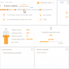
4. Dashboard Starters
What is it?
This shiny new feature allows authors to quickly transfer data from common business applications (e.g. Salesforce and Marketo) and create pre-designed dashboards in a matter of minutes. Instead of starting from scratch, transferring data is as simple as providing Tableau with account access.
Why is it great?
Why is it anything BUT great? This feature is quick, easy to use, and automatic. There are a dozen of Dashboard Starter designs to choose from, and Tableau supports the most common cloud applications: Salesforce, Oracle Eloqua, Marketo, and ServiceNow. Cheers Tableau!
We are really grinning ear to ear here at Datalabs HQ. Data design in Tableau has never been more efficient and exciting thanks to these new amazing features!
Want to make the most of these features in your Tableau dashboard designs?</h2?
Talk data design with the people who know it best. Connect with us on social or click “Contact Us” at the top of this page in the navigation.