

With the dust now beginning to settle, let’s take a different look into the past US Election…
Politics and outcomes aside, American elections bring with them an enormous responsibility to effectively communicate their data to a worldwide audience. And this year’s election definitely brought itself up to the benchmark with some really cool use of data visualization and best practices.
Check out two of the best data visualizations spotted on the web during the 2016 Election and find out why they’re so effective.
Bloomberg’s live 2016 Election Center
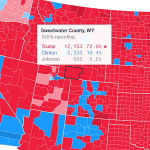
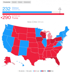 A usual contributor, Bloomberg host a truly robust, live and interactive data viz display. The display includes a traditional bar graph at the top, quickly and easily communicating the most basic and pivotal data: tallied votes and points for each candidate, before providing an illustrative view of the state outcomes with a simple color key. Under this sits a Key Races display that utilizes simple color-coded bar graphs for each State in the Key Races category. Each state (either from the geomap or Key Races displays) can be drilled into, exposing County segmentation. You can even toggle the full map from State view to County view.
So what makes this so great? The audience for Bloomberg’s 2016 Election Center come from all kinds of demographics, with different levels of both comprehension and interest. The choice and ordering of visual displays in this example perfectly addresses this challenge.
High-level data such as the current Presidential vote tally is shown first in a clear bar chart. After that, the more granular data that resulted in the Presidential vote tally is available by scrolling down further and making a simple double-click here or toggle there within the interactive charts.
 Furthermore, you can toggle the whole geomap from displaying Presidential results to Senate, House and Governors results using the tabs just above the display. What’s great about this is that each different tab consistently uses the same layout and graph types, rather than using different displays that the user would have to try to interpret all over again.
Another challenge to face is the 2016 Election data is delivered live, so if your data visualization is just a static graph, you’d have to update it every time the vote count changed to keep your audience engaged. Bloomberg answers this seamlessly by not only having a system in place to output live data, but also by ensuring the framework for all its displays allows for a range of hypothetical results to be visualized in the charts without ‘breaking’ the design. Notice how the initial bar chart has unused space to the right? If Trump scored more than 290 points, the chart would still be able to continue displaying this to scale.
To top it off, this web-based resource is truly responsive and can be viewed and interacted with without issue on desktop, tablet and mobile devices.
FiveThirtyEight’s 2016 Election Forecast
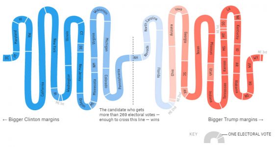
Before we saw any final results, there was an abundance of data that many researchers and analysts were using to predict the election outcome. FiveThirtyEight’s 2016 Election Forecast draws on polls, the economy and historical data to fuel almost a dozen different types of data visualizations surrounding who would be most likely to win the presidency.
In addition to the ever-popular geomap, FiveThirtyEight uses a huge range of data visualization displays to represent their data: Line graphs to express the chance of each candidate winning over time, box plots to show the expected margins of victory based on each State as well as a handful of other creative diagrams that effectively visualize data using a combination of techniques such as heat mapping, sequencing and scaling.
So what makes FiveThirtyEight’s 2016 Election Forecast so great?
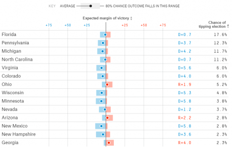
Similar to Bloomberg’s layout, FivethirtyEight ensured that the first visualization was the most basic and encapsulated the overall findings of the data, with more complicated data presented below. This makes for easy and logical digestion of the data. Though what’s truly admirable about FiveThirtyEight’s 2016 Election Forecast is their awesome use of a variety of visualizations to display data. Every time the user scrolls down, a new and exciting display appears before them. This can really engage an audience. Better still, each new visualization included a brief description of what the display was showing so that it could be easily interpreted by your average layman.
And again, the whole page scales and adjusts the interactions to ensure it can be viewed on desktop, tablet and mobile devices.
Overall
The 2016 US Election displayed an array of quality visualizations and layouts. Here are some of the best practices they employed. Use this as a checklist for your next data visualization:
Simple displays of the overall data are shown first, then it’s broken down
Interactions are intuitive – clear labels or hover over effects on areas a user can click make the interactions easy to navigate
Ability to update with live data (or at least at 5 minute intervals – which is still pretty impressive)
Future-proofed designs are used to allow for a clear display of the data, regardless of what that could’ve been
A mix of creative visualizations are used to engage the audience
Brief explanations are provided for the different visualizations and their data to make sure the audience can enjoy the range of displays without sacrificing understanding
Data visualization displays made for the web are responsive, meaning renderings on mobile and tablet devices don’t diminish the design or flow of the page or interactions
Excited by interactive infographics?