See the potential that creative design and storytelling can bring to data. These data visualization case studies span Australia, the United States, Europe, the Middle East, and Asia.
Explore the power & impact of great data visualization & storytelling.
Data Visualization Case Studies

Mercedes-Benz Case Study
The Datalabs Agency took a collaborative approach injecting a lot of the Mercedes-Benz (or Daimler) brand and updating it to fit data visualization best practices. The icons, fonts, and color palette all got extensive and worthwhile attention.
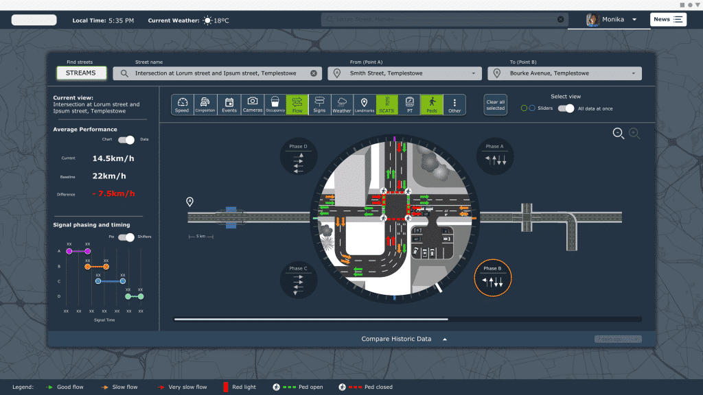
Traffic Management, IoT, and XAI Software Design
The Department of Transportation asked the Datalabs Agency to design a traffic management platform for its data. The result: a suite of interface designs showing the complexity of the road system and a way forward to optimize it at a systems level. See the future of transportation design…

Hydro Tasmania Energy Portal
The Datalabs Agency was commissioned by the energy company, Hydro Tasmania, to prototype an asset and resource management tool, utilizing the best practices in UI and data visualization design

Walton Family Foundation Case Study
The team at Walton Family Foundation reached out to Datalabs seeking assistance with a series of Tableau dashboards, dashboards to present a series of metrics and KPIs on the environmental program for the foundation’s leadership team.

HCF Annual Report Case Study
A health care fund, HCF, asked the Datalabs Agency to design its Year in Review report and animated data videos, a suite of designs that included a video summary of two important reports.

Dell Foundation Case Study
The fine folks at Michael and Susan Dell Foundation reached out to Datalabs with a unique Power BI design and development challenge. That was to re-design the education reporting system and migrate it from custom software to Power BI.

Mercedes-Benz Dashboards
A long-term client of the Datalabs Agency, Mercedes-Benz in Germany and Singapore trusted us to design and develop their Power BI dashboards, style guides, and BI framework.

UPS Online Workshop
UPS asked the Datalabs Agency to train its staff in the fundamentals of data visualization. Our agency facilitated a series of training workshops using their data and design guidelines to lift their thinking and skills to the next level.
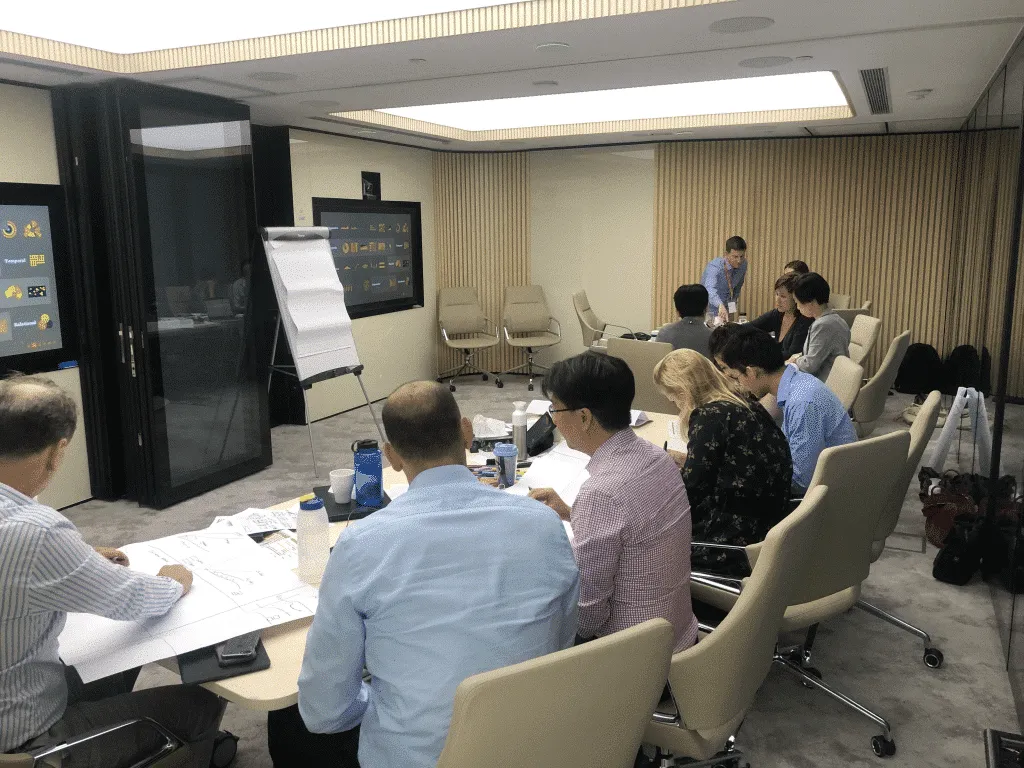
Rabobank Data Visualization Workshop
The Dutch bank, Rabobank, hired us to train its staff in Hong Kong. We tailored our Introduction to Data Visualization & Storytelling Workshop to include agriculture data, Power BI design, and collaborative exercises.

Tabcorp Tableau Style Guide Project
Tabcorp approached Datalabs to see if we could help them define a style for their business intelligence platform, Tableau. Here’s a peek inside…

ADF Infographics & Animations Case Study
A beautiful suite of infographic reports and animated data videos designed with data-driven graphics, icons, and illustration for our client the Australian Drug Foundation.

Al Jazeera Infographics Workshop Case Study
Two days with Al Jazeera journalists, producers & designers in Doha, Qatar talking about infographics, data, and their process in creating data-driven motion designs for their broadcasts.

SEEK Employment Data Microsite Case Study
A case study of SEEK Australia’s Laws of Attraction Interactive Microsite, showcasing employment data from Australia, Hong Kong, Singapore…

Case Study: Rewilding Australia Project Map
With an interactive map now live on their website, Rewilding Australia has increased the amount of interactive media on its site tenfold. Check out the cartographic experience.
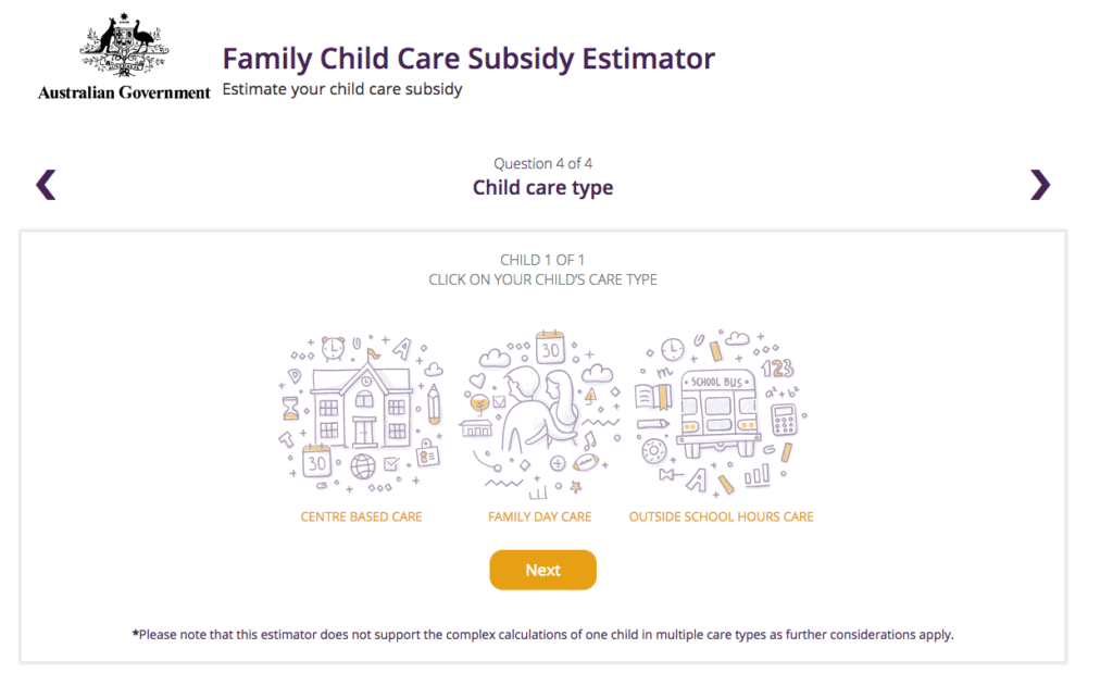
Department of Education and Training Child Care Subsidy Estimator
The Datalabs Agency was engaged to help Australia’s Department of Education provide a clean and simple user interface in which parents and carers of children could estimate the amount of money they may be entitled to receive.

Case-study: Intranet Dashboard Design for Nestlé
Nestlé’s aim was to develop an easy-to-use, visually engaging experience that would help to make Nestlé employees’ jobs easier, and therefore, more enjoyable. The Datalabs Agency designed and developed a fun Intranet portal in response.
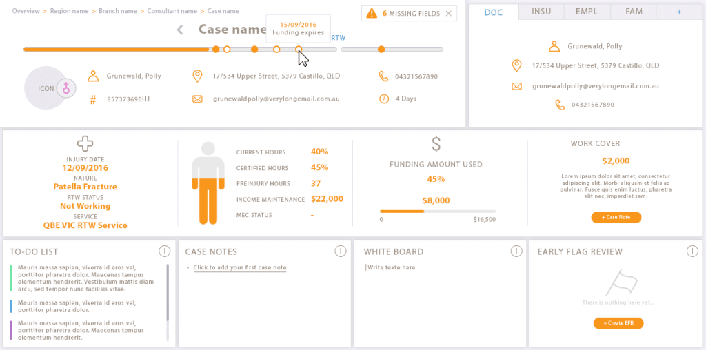
Interface Design Case Study
Our client engaged Datalabs to design a best-in-class dashboard and user interface for their frontline staff’s main workstation. Check out the infographic look in this data visualization case study.

University of Melbourne Map Project – A Case Study
The Datalabs Agency was commissioned to turn the list of the University of Melbourne’s partners and connections around the world into an interactive map that would sit on the home page of their site.

Department of Education & Training Case Study: Interactive Calculator
The Department of Education and Training needed a clean and simple user interface to assist in the communications strategy for the Australian Government’s New Child Care Package. This interactive tool was a hit with parent’s in need of some numbers.

Case-study: Victoria University Dashboards & Infographic Reports
A case study on a Tableau dashboard, infographic and data design project for the marketing team at Victoria University.

Case Study: Interactive Data Map
We built this interactive map as a use-case for interactive/explorable maps. It’s UI and easy-of-use is a case study of how data visualization can make better sense of geographical data. Certainly better than a table in a spreadsheet!
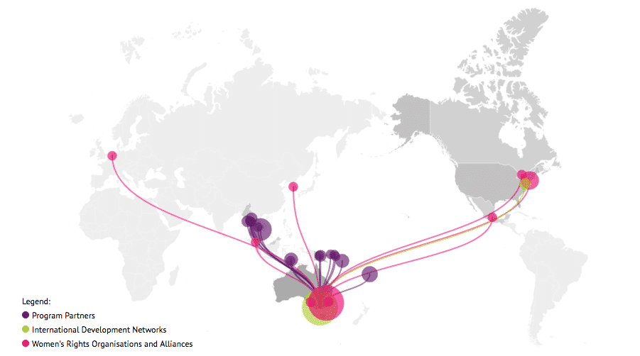
Case study: International Women’s Development Agency Map
Looking for what data visualization can do for your website? Check out this live example of an interactive map developed for International Women’s Development Agency.

Case Study: Monash Health Interactive Timeline Tool
Monash Heath wanted a time-based interactive data visualization to show the pathway of a patient’s journey through the healthcare system. We used Adobe Illustrator, Excel, HTML, JavaScript, and CSS to come up with this digital experience.

Case Study: Medical Research Infographic
Case Study: Medical Research Infographic Who: Association of Australian Medical Research Institutes What: Summary Report Infographic When: August 2016 Why: The team at the Association of Australian Medical Research Institutes

Infographic Case Study
A large Australian and New Zealand food manufacturer engaged Datalabs to visualize a set of survey results undertaken by their human resources department and an external consultancy. The result was this visually engaging infographic.

Case Study: IWDA Annual Report Microsite
Considering going digital with your annual report? Do it! Here’s an example of what interactivity and a non-profit organization’s ‘year in numbers’ looked like after they ditched paper and went digital.

Pillar Superannuation Tableau Dashboard Report
The aim for this project was to create an interactive dashboard, utilizing Tableau, to convey the data that had been collected over the financial year. Check out this financial firm’s reporting suite.