

The fine folks at Michael and Susan Dell Foundation reached out to Datalabs with a unique Power BI design and development challenge. That was to re-design the education reporting system and migrate it from custom software to Power BI. The reporting system was to present and flag KPIs on learner and educator performance across schools in South Africa. The reporting system had many levels and users, visualizing data from a province high level down to individual student profiles. Therefore, the user experience navigating across views required a lot of thinking and design effort. We also took a slightly different design process for this particular project – read about it below.
Michael & Susan Dell Foundation
A Datalabs Agency Power BI Case Study
The Engagement
The Project

The Process
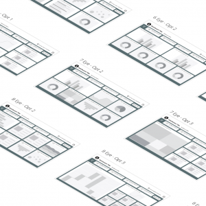
Our process began as usual with a kick-off meeting, (with stakeholders from America, South Africa and Australia). We then began the auditing of the current system, data and requirements/opportunities. Once we were happy with our audit, we presented the team at Dell a series of relational maps to define our system structure and have all parties on the same page. From here, this is where we changed up our process. We chose to design in Power BI! Thus the design and development were coinciding. This of course has the benefit of completing the project faster allowing for more time to add more features and the client being able to interact in the actual environment which is much better for technical and user testing. However, designing in Power BI rather than a design tool does have the risk of taking longer as it requires more time to develop than design. See below to see if this approach paid off.

The Power BI Development Phase
Designing in Power BI had both pros and cons. Let’s start with the cons. In Power BI, the data defines how the charts look. To get a more accurate representation of how the charts will look in the final version, we had to create a lot of very specific dummy data. This took a lot of time. Plus, when there was a change, we had to do it all over again. Another set back was that Power BI was new software for the client, so they didn’t know too much of the software capabilities and limitations. This inevitably meant Datalabs spent a lot of time documenting why decisions were made and why Power BI can’t do certain functions. In retrospect, a lesson on Power BI would be good for clients less familiar at the start of the project. The benefits of designing in Power BI however was that we prototyped, experimented and tested all in the end software. From this we learnt so much and were able elements in that we likely wouldn’t have before, such as the navigation system. Plus, the client got to interact with Power BI from an earlier stage which is fantastic for user feedback.

The Final Outcome
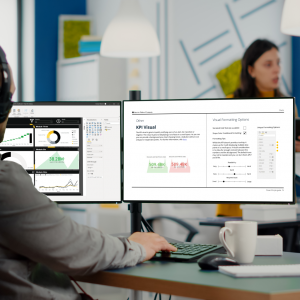
Whilst this project saw a couple major challenges, the team at Datalabs overcame them and successfully produced a series of Power BI dashboards with heavy data sets and a complex user navigation system. The final result was four functional dashboards that acted as templates for a whole lot more. These dashboards are to be used by 10,958 unique users reporting data on 11.6M students across 22,732 schools! Well, the results are in. We recently received word from the team at the Dell Foundation that the dashboards have been a big hit. In particular the Overview page which we got told “has been a significant hit with our DDD users – they LOVE it.” So all in all, a great project that we learnt a lot from.

Check Out Our Dashboard Design Products!

Get the best grids, layouts, navigation, and UI components for your dashboards.
Price range: $1,121.00 through $1,972.00
An all-in-one package containing tools, guidance, and assets to design great dashboards
Price range: $426.00 through $1,064.00