

The team at Walton Family Foundation reached out to Datalabs seeking assistance with a series of Tableau dashboards. The foundation behind the family that started Walmart was looking for sleek new designs for its major launch of new dashboards. The need for these dashboards was to present a series of metrics and KPIs on the environmental program for the foundation leadership team. These metrics were based on water quality, fish health, farming environmental impacts, and many more – all based on protecting the environment in America. The data for these metrics came from many sources. The first challenge was to sift through the data and design visualizations, and the second was to establish a data flow in Tableau to bring it to life. Read about how we did this below.
A Tableau Case Study
Walton Family Foundation
The Project

The Design Phase
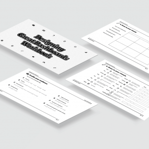
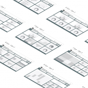
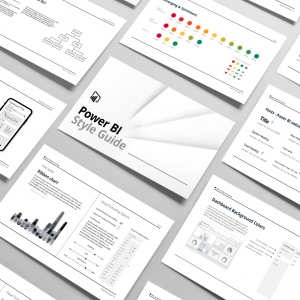
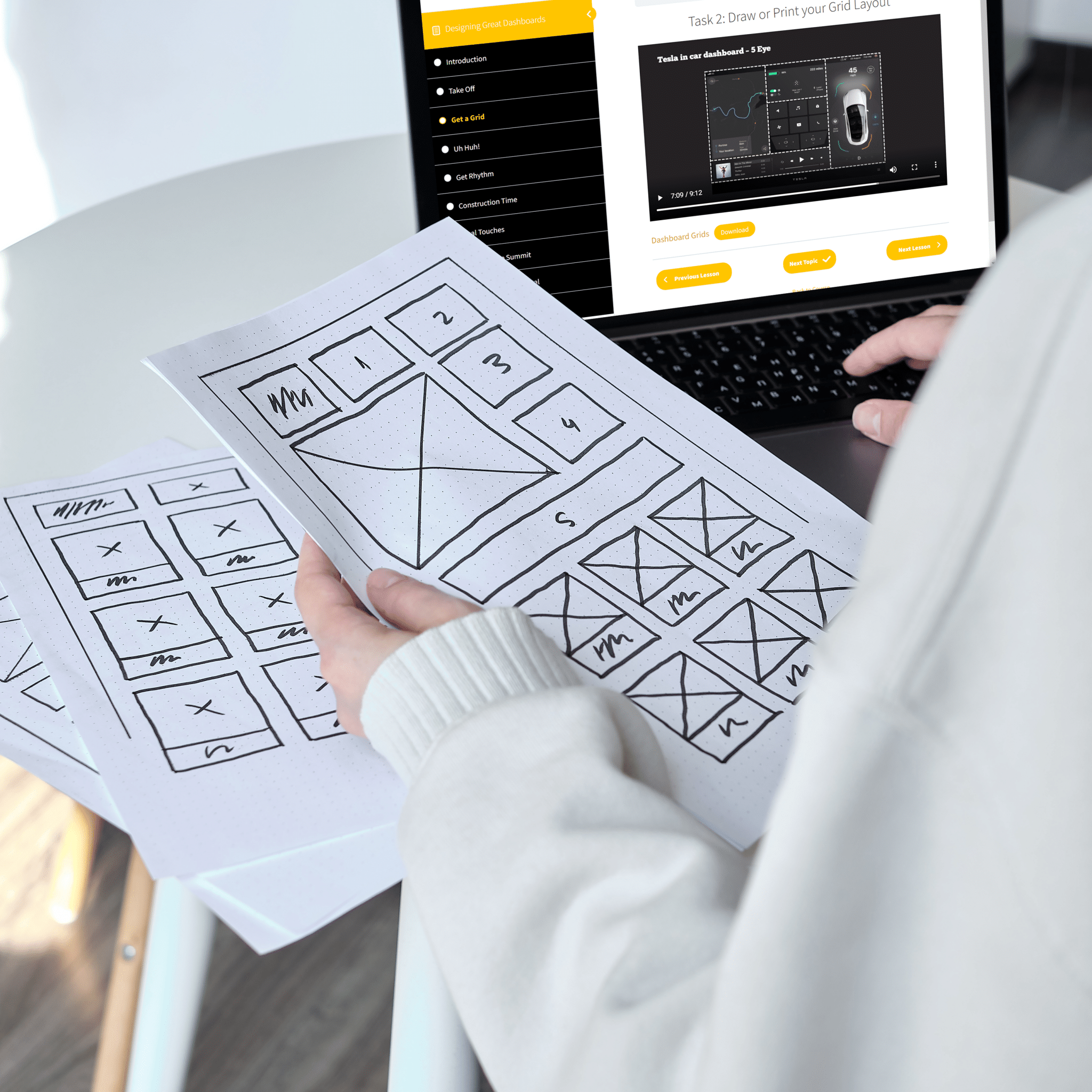
The data visualizer at Datalabs got straight to work with his design tool of choice, Figma. This is a great tool for producing dashboard prototypes and collaborating with others such as developers or the client themselves. Version control was an important factor as with so many metrics comes a lot of comments and a lot of design variations. Figma is a great way to see everything at once with multiple dashboards planted on the same pasteboard. After designing the color pallette, multiple charts, different layouts and even a couple otter icons, we managed to satisfy the team at WFF and move the designs into Tableau. See below.

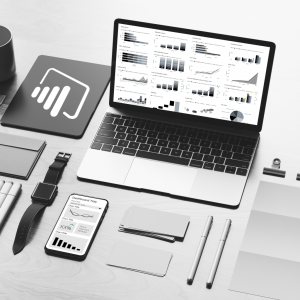
The Tableau Development Phase
The Tableau phase was the longest as it became quite complex. The challenge was to design a simple Excel spreadsheet which allowed multiple users to enter and update data and feed that into Tableau through Tableau flow and prep builder. Our approach was to develop the dashboards and charts with dummy data first. This allowed us to establish a data structure that fed the variety of charts and provide WFF with a template to know the required data structure. Complex, I know. Well, put simply we developed the dashboards according to the designs to the tee and integrated the multiple data sources successfully. Now apart from being visually stunning, (if we do say so ourselves), they are completely interactive with dropdown filters and information tooltips.

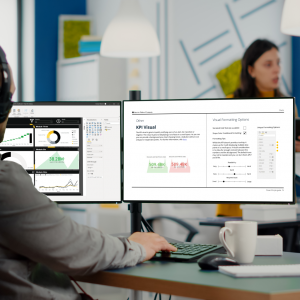
The Final Outcome
This project had its challenges from juggling multiple data sources, multiple design versions, different user needs, etc. Yet, it was a success in the end and most importantly it hopefully assists in making our environment more sustainable and healthy. What made this project successful was clear and constant communication with the client. If challenges arose they were communicated and resolved as a group. At times, this meant the project process had to pivot slightly. Being agile and flexible with such a large and dynamic project is crucial and allowed these dashboards to be seen to the very end. Thanks to the team at Walton Family Foundation.


