


3 Alternatives To Using A Data Table
Stop using tables. Seriously, there are better ways to show data. Here are three:
 When we run our data visualization workshops we run an exercise called ‘Break the Table’. This is my little gift to the reporting/analyst/finance world. It’s a simple exercise that asks the group’s participants to not use a table to display information in your reports, infographics, or dashboards.
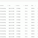
Why is a Table of Data Bad?
….because the table is (much like the pie, bar and line chart) criminally overused and not an engaging way to show data. It’s not a bad way to display data, as such, but it’s bland and gets ignored by all those that don’t already know what’s in there. If you’re looking for a good example of this, check out any company annual report or year in review. They’re in there because they have to be. Nobody reads them that didn’t write them in the first place.
Here are three alternatives to a table for your next report. Feel free to use the table as the source and reference in for these visualizations – but don’t make it the centerpiece and use some good information design to get people to really understand the data, rather than just brush over it.
1. Small Multiples
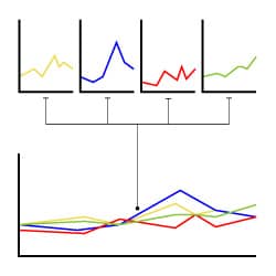 A simple concept that says if you have to show a large set of similar numbers (say, 1-2% increases in yearly profits over 10 years) then use the same visualization repeatedly, showing only that change i.e. A set of 10 line charts that show the 1 change, rather than a line chart with 10 lines on it.
2. An Opinion
Here’s where it gets a little tricky. We always say that good data visualization has an opinion, otherwise, it’s just a data dump. People (users) are looking at information design to simplify information. That means, that if you’re confident in what the data is saying (even if it’s nothing at all) call it out. Let the user know what’s important, what’s not, and if they need to spend time on this or move on to something more relevant.
Often when we talk to data analysts they tell us that it’s not their place to editorialize, but we disagree. That’s what people  want from data visualisation. You can still add the detail to the report (just don’t make it the centerpiece). If the data leads you to a conclusion if you see a trend or opportunity: call it out. Give access to the data to show where it came from, but give your option first.
3. Top 10% & Bottom 10%
This follows on from the last point, in giving your information a focus. The top/bottom option is all about calling out or highlighting that which you need to take action on, either positive or negative. Think in terms of sales teams and ask what the top 10% are doing that the bottom 10% are not (apart from selling, obviously). And then you have an action item.
 Look at the bell curve. The 80% in the normal section is not where you want to focus your attention, it’s understanding why the top is performing well and why the bottom isn’t. It’s action-orientated and practical.
What are the top percentile doing that the bottom isn’t? Answer that question and you’ve got a good little project to move on. Bury that detail in a table and nothing changes.
Knowing that you can’t control everything, take the table away and just point people in the direction of the next most important step they can take.