


Design Thinking Meets Data Science
The term “Big Data” has gained lots of attention in recent years.
Want to know what the sexiest job of the 21st century is? It’s Data Scientist (according to Harvard Business Review) – even though the term has only been around in the last decade. This is serious stuff, guys.
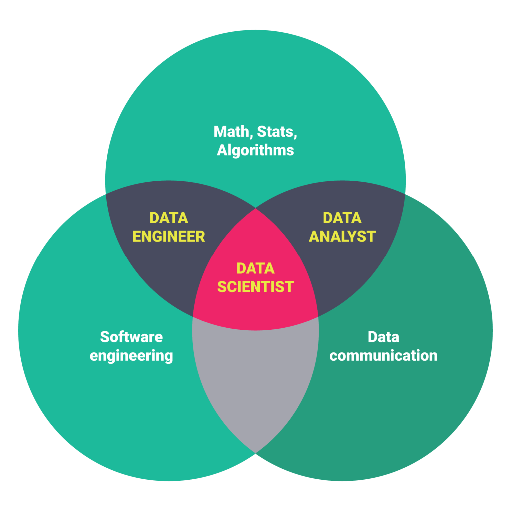
What makes one a “Data Scientist” though? In a broad sense, it could be anyone using data and statistics combined with programming to do something new, something never done before. That sounded way simpler than it actually is.
In reality, since the term is so new, oftentimes there isn’t a solid role/job title. Instead, the skills that make a data scientist great would make an excellent supplemental addition to hireability, applicable at almost every type of industry or job title.
- Industry bodies that have a member base dealing with data (e.g. Chartered Accountants in the Finance industry or ADMA in the Communications industry) → better communication and engagement with clients, especially when it comes to complex topics and data.
- Large corporates → boost internal capability, engage employees, create a business’ data and communication package with a professional and authoritative look/feel.
- Government groups → communicate complex policies and data in a way that the general public — the layman, can understand.
- Research agencies → when your data is your most valuable asset, it is an obligation to showcase it in the best way possible.
- Developers → complement technical knowledge with a data-driven design approach, which will result in a multifaceted skilled developer.

Building Data Scientists’ Capability
Data scientists have the curiosity to make discoveries in the world of big data. The growth in demand for these types of people highlights the fact that organizations today are wrestling with big volumes of data. Due to this, there is a need for people who can dive headfirst and swim in a sea of data, coming out with insights and discoveries.
Behind the scenes, data scientists analyses complex data and come out with conclusions. These conclusions need to be easily digestible by the target audience, which more often than not isn’t fluent in the language of data analytics. To be able to do so requires a skill that is often forgotten – communication and user interface design skills.
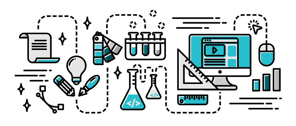
Truth be told, a lot of data scientists and dashboard developers are not designers. However, a degree of design application is needed when presenting data, or else their dashboard design is near wasted, with the expert research and data analysis being let down. So how can we do it? – by using the Design Thinking process when creating a design for data.
1. Get to know your users
Who said dashboards are all about data? What’s most important in a dashboard is arguable whether or not it provides sufficient information for the intended users. Basically, dashboards aren’t meant to be a database or a data bin, but must be cut to cater to different needs.
To be able to create a dashboard that is useful to the intended audience, the objectives must be clear. You must ask what FAQ the intended audience might have. This will give you a basic idea of what data should be included and omitted, and what the dashboard hierarchy should be.
Once done, it’s time for sketching and prototyping. Similar to a product design process, in designing data, prototypes can be made and used in garnering feedback. This could be in the form of sharing simple sketches with key stakeholders to get their input.
2. Start with a basic overview
Think of dashboard design as designing the front page of a newspaper. You know people are going to pick it up, expecting to see an overview of breaking news and quickly scan if there are any headlines of interest. If there are, then that’s when they would crack open the newspaper to read the intended section.
This is how the front page of a dashboard supposed to work – users should be able to see all the important information at first glance and click/turn to the next page to read more on the data that is relevant to them.
The only difference between a newspaper and a dashboard is that the first page of dashboards doesn’t need to contain a lot of text. Copious amounts of text can cloud key information and create disinterest. Always try to be more visual when presenting the data, and be thoughtful in color choices and combinations.
3. Provide easy, intuitive orientation and navigation
Most dashboards are a set of pages rather than a single one. Following up with the basic overview page, interested users who want to explore the data further should be able to navigate the dashboard with ease.
In the case of digital dashboards, this taps into web design, where dashboard designers should work with a familiar pattern that’s already intuitively drilled to those who use the internet on the daily (aka most of the world’s population). This often means – tabs on the top, left-handed menus, drop down choices, etc.). There is room to be creative here. Don’t be rigid with your data presentation.
—
Despite the often technical and skill limitations, good data scientists and designers will keep on building their toolset and skillset, looking novel solutions to the problems they face.
Think of them as a hybrid of data hacker, analyst, communicator, trusted adviser, and UI designer. Those who’ve mastered all this is extremely powerful, rare, and in demand!
Learn the essential design and communication skills of a data scientist today through our expertly-designed workshop! Either online as an instructor-led webinar or in-person for a full day of hands-on learning. And all from the ones who are most passionate about data & design (our humble selves!).
Click here or get in touch with us for more info. We’re a friendly bunch.