hello@datalabsagency.com
logo
Datalabs Agency
En
  • De
  • Ar
0
logo
  • Data Training
    • Our Six Main Workshops
      • Introduction to Data Visualization: Tools & Techniques Workshop
      • Designing Great Business Dashboards Workshop
      • Infographics & Report Design Workshop
      • Creative Data Presentations with PowerPoint
      • Visual Storytelling for Government Workshop
      • Creative Power BI Dashboard Design
    • Online Courses
      • An Introduction to Data Visualization & Storytelling
      • Designing Great Dashboards
  • Data Design
    • Style Guides
      • Power BI Style Guides
      • Tableau Style Guides
    • Animated Data Videos
    • Maps & Cartography
    • Interactive Infographics
    • Power BI Dashboards Designs
    • Tableau Dashboards Designs
    • Infographic Reports
    • Interactive Data Visualizations
    • Digital Annual Reports & Microsites
  • Case Studies
  • Shop
    • Ecommerce Products
      • Power BI Templates
      • Power BI Theme and Style Guide
      • An Introduction to Data Visualization and Storytelling Course
      • Designing Great Dashboards Course
      • Data Visualization Consultant
  • Login
  • Contact
    • About
      • Otto Ottinger
      • Blog
0
Case Study: Rewilding Australia Map
16 July 2018
Dashboard Prototype design 0
Interface Design Case Study
04 December 2018
Articles
University of Melbourne Map Project – A Case Study
July 16, 2018 by Datalabs in Articles

Screen Shot 2018-03-28 at 10.03.13 AM

An Interactive Mapping Project for the University of Melbourne’s Business School

The map shows former students, faculty/alumni, programs, and partnerships that potential students could engage with around the world.

Client: University of Melbourne’s Faculty of Business & Economics
Timeframe: 5 weeks
Technology: Leaflet, MapQuest & Google Maps with a JSON data file and custom filters.


Jump to the interactive map.


Project Background

The Datalabs Agency was commissioned to turn the list of the University of Melbourne’s partners and connections around the world into an interactive map that would sit on the home page of their site. This would allow all the users (mainly potential students) to see that studying with the faculty could lead to global opportunities to travel, partner, study, and work.

Task:

The aim was to have a simple map that took the data source and used the lat/long coordinates of the university’s partners. We needed to be able to filter by the groups that would be using the map (students, parents, employers, alumni) and then create a sorting mechanism, filtered by the interest groups (partnerships, international study opportunities etc.). This combination required a dual filter and was the most complex element of the ‘interactivity’ on the map.

Design:

The design process went from wireframe and style choices straight into development due to the relatively simple nature of the project. The map took about 2 weeks to develop, including the creation of a data set and parser to process the data into lat/long coordinates.

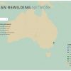
We had to shift some of the pins due to them clustering too heavily around the University of Melbourne’s campus in Parkville as they weren’t able to be seen (and clicked).

Project Outcome:

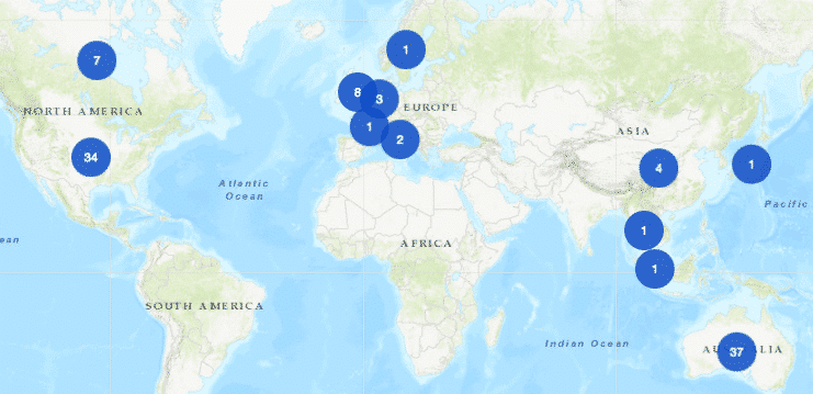
The outcome was a light-weight, simple map that quickly visualizes nearly 400 listings and profiles of partners. It’s a great way to introduce the user to the volume of international activity undertaken by the faculty. It has some neat UX tricks to keep the focus on the area in which the user is interested in and to make sure that in the minimum amount of clicks, they can access something of interest.

Interested in Digital Maps & Cartography for Your Organization?

Have a look at our experience as digital map designers and catographers here.

0 Comments
  • interactive content
  • Interactive Microsite
  • mapping
  • universities
0 Like!
Share
Datalabs

Leave a reply

Click here to cancel reply.

Data Visualization Training: Workshops & Courses

Shop Online for Data Visualization

  • Image of a man using our Power BI templates to design a report
    Power BI Templates
    Select options
  • Image of our custom Power BI Theme on a computer
    Power BI Theme and Style Guide
    Select options
  • An Introduction to Data Visualization and Storytelling Course
    An Introduction to Data Visualization and Storytelling Course
    Add to cart
  • Photo of a data visualization consultant advising clients and helping solve design issues.
    Data Visualization Consultant
    Buy product
  • Designing Great Dashboards Course
    Designing Great Dashboards Course
    Add to cart

Style Guides for Data?

A photo of our data viz style guide for Microsoft Power BI

Data Visualization & Storytelling Group Workshops

Contact Us

  • This field is for validation purposes and should be left unchanged.

From Our Blog

  • 8 Incredible Examples of Interactive Data Visualization
  • Data Analytics Conferences 2024 & 2025
  • Data Visualization & Design Conferences 2024 & 2025
  • Case-study: Intranet Dashboard Design for Nestlé
  • Dashboard Tips: 3 Alternatives To Using A Data Table
  • Data Visualization Training
  • Brand Guidelines for Data
  • Online Courses & Products
© 2024 Data Arts Pty Ltd
logo

We noticed you're visiting from Australia. We've updated our prices to Australian dollar for your shopping convenience. Use United States (US) dollar instead. Dismiss