


6 Examples of NPS Charts: How to Best To Visualize a Net Promoter Score
Love it, hate it (or neither…) – Net Promoter Score (NPS) is a key success measure in countless businesses across the world. It drives strategy, CEO bonuses, training, customer service policy, and permeates through all levels of business.
For those of you asking “What’s a Net Promoter Score?”, NPS is a measurement ranging from -100 to 100 (often measured as a 0 to 10 score) that describes the willingness of customers to promote or recommend the products/services of a company. The higher the score, the more likely the customer would promote. The concept of customer promotion has been around for some time, with great business minds such as Walt Disney articulating its importance well before the term ‘Net Promoter Score’ first appeared in the Harvard Business review in 2003.
Do what you do so well, that people can’t resist telling others about you – Walt Disney
So, how can we take advantage of this key metric by visualizing it effectively in our reports? We know that data visualization can be used to control the way information is viewed, normalize peaks or troughs; and there’s certainly no lack of ways to visualize data.
What’s the best way to use data viz to communicate NPS clearly, accurately, and effectively?
Hint: There’s more than one answer. We’ve made and found some examples of NPS charts and NPS infographics that we think are the best visualize this customer satisfaction metric.
Box Plot
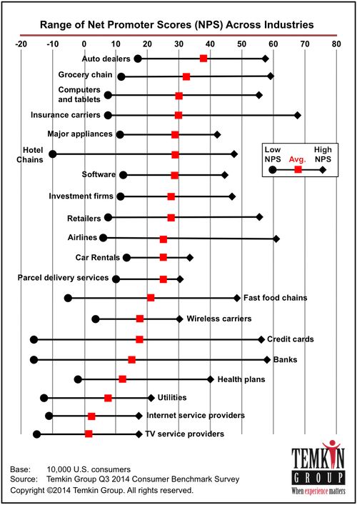
This version of the box plot does a good job of showing and comparing positive and negative trends in a range of industries and makes it easy to see the spread of customers across each. A simple reordering of the individual industries into ‘similar industry categories’ could provide even more insight into customer behavior based on industry type.
Scatter Plot

The scatter plot allows a much more detailed view of sentiment analysis and displays a range of variables that show a lot more than the traditional 0-10 NPS metric. This provides more actionable outcomes but is not as simple as the usual NPS metric.
Pictographs
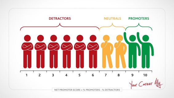
This example shows a simple and effective use of infographic-style icons to explain NPS rather than display the metrics for a particular survey or report. As many reports are charts and metric heavy, it works well to differentiate detractors, neutrals, and promoters and where they fit into the index. While the imagery in pictographs is the main difference setting it apart from other types of data viz, the combination of effective color, labels, and clear scaling can be applied to most other visualizations.
The Gauge
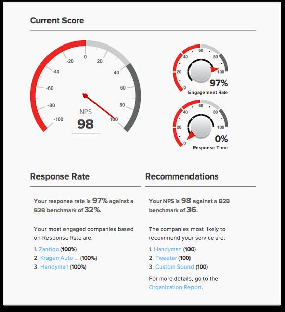
The gauge is a fairly contentious chart type (mainly due to its criminal overuse in its early days of dashboard design) but as you can see here it does a great job of focusing on the main metric then subsequent numbers, followed by some room for explanation. It provides a clear indication of both target and current rates which makes for a quick and efficient insight into how NPS is tracking.
The Infographic
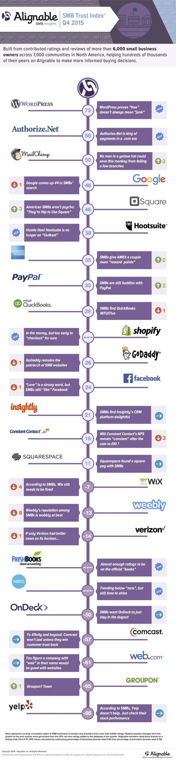
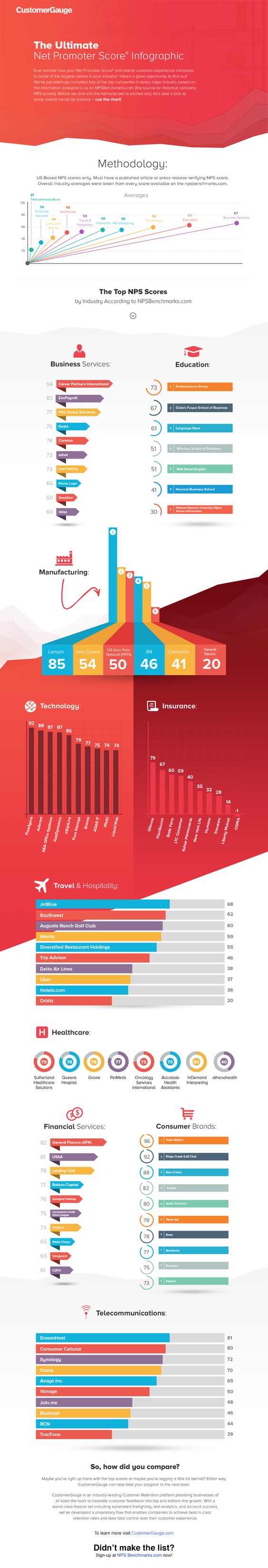
Infographics often use a combination of graphs, icons, color, and bold labels, making them perfect for presentations and shareable collateral that aim to engage the audience. These two are great examples of data-driven infographic reports and use a culmination of different reporting elements that interpret the NPS.
The Alignable infographic utilizes the NPS index as a method for ordering the data in their visualization, making for a logical and linear communication of companies with best to worst NPSs. The addition of a customer quote alongside the numeric score for each company provides real-life insights into how the score translates into customer mentality.
In contrast, the CustomerGauge infographic uses a variety of individual displays to contextualize the data. Starting with broader data sets, the visualizations drill deeper into the data the further down on the display they appear.
Both of these examples use long layout designs to lead the reader down into their visualizations. This is a great method for storytelling in data but isn’t necessarily the only way to display an infographic.
Stacked Bar with Trends
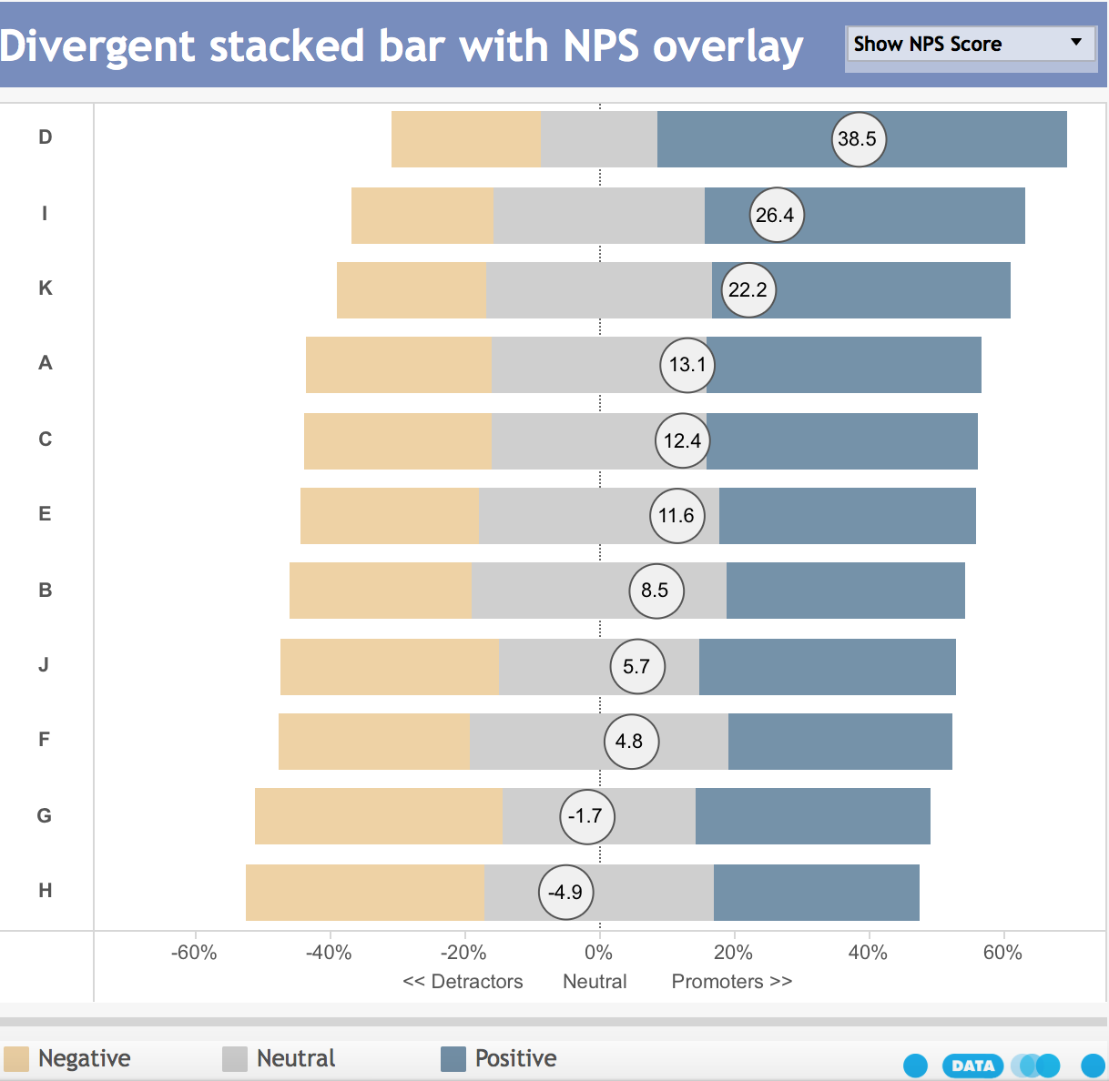
With some of the great attributes that a box plot provides, this stacked bar chart comes complete with the segmented scores, allowing for quick comparison of departments’ overall NPS performance. The color blocks in each bar also give a great visual indication of the customer profiles at first glance making this style of data viz a truly effective means of communicating NPS.