


6 Captivating Information Visualization Examples
Thanks to the ubiquitous infographic, most people are well-acquainted with examples of information visualization. However, infographics aside, we believe the field of information visualization still remains relatively unexplored.
Beyond Infographics, Charts & Graphs
Infographics are just the tip of the iceberg. Leaps and bounds in digital technologies have opened up literally thousands of applications for visualization, from the corporate world to the science, education, and social change sectors.
We’ve curated this list of 6 truly captivating examples of information visualization to help inspire a more imaginative approach to this exciting field.
Information Visualization Example #1
Digital Mapping & Climate Change
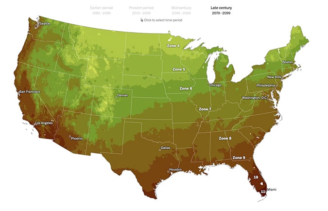
From the Washington Post comes our first example of great information visualizations. This one showcases the use of geolocation data over time, as influenced by climate change. This excellent piece of content shows the eventual migration of tree species. As the climate gets warmer, trees go north. What once was fertile a habitat for one species of tree, becomes uninhabitable. The site features numerous maps — static, animated, and interactive — showing the impact on just one nation. The information is visualized in words, charts, and some of the best cartography I’ve seen this year. Each format chosen by the visual editors at the Post is the right one.
Information Visualization Example #2
Parallax Storytelling & Supply Chains
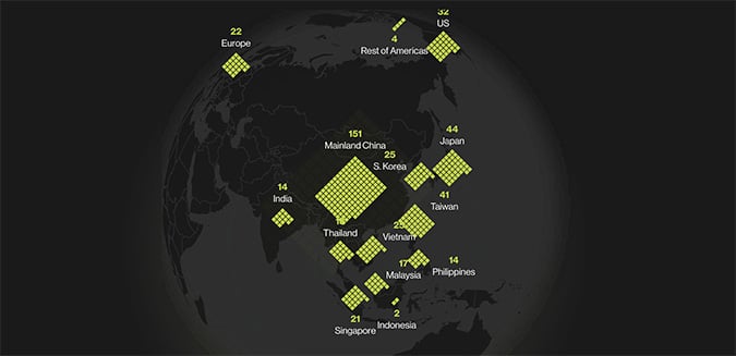
Parallax storytelling with data is here to stay. And there’s a good reason for it — the interactive nature of scrolling and discovering is perfect for some complicated and visual stories. This second information visualization example is a fantastic case in point. The visual journalists and designers at Bloomberg have tackled the changing nature of Apple‘s supply chain arrangement in Asia. In a series of interactive and animated charts, data and varied bits of information are fed to the article’s viewers as they are needed. The story progresses as the dense reporting discusses everything like the politics of silicon chips, the shifting cost profiles of various countries in Southeast Asia, and the impact of globalization on one of the largest companies in the world. It’s fascinating stuff, visualized in a way that makes sense and doesn’t get in the way of the wider story.
Information Visualization Example #3
Storytelling with Isometric Illustration
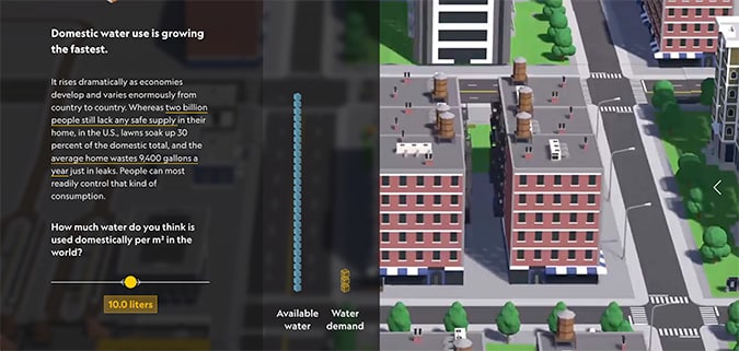
This next example of information visualization is near and dear to my heart. Produced and designed by my past employer, National Geographic, the use of isometric illustration is what I particularly love about “Mind the Water Gap: Mapping the World’s Water Shortages“. The illustrations make the dire message in this article itself a bit more approachable. Of course, with National Geographic, there are great maps. But it’s the use of parallax scrolling over the isometric illustrations that gives the information (data, dates, modeling, etc.) its structure. The use of interactive sliders to control the modeling is another stand-out, too. If you’re looking for modern information design, look no further than what’s here in Mind the Water Gap.
Information Visualization Example #4
Augmented Reality Animation
Hans Rosling’s famous lectures combine public data with a sports commentator’s style to describe our past, present, and future. In this “Joy of Stats” video, he uses augmented reality animation to overlay real-world footage with sophisticated visualizations to help tell the story of the world in 200 countries over 200 years using 120,000 numbers – in just four minutes. This is public education at its best.
Information Visualization Example #5
Creative Campaign

This clever campaign by Australian advertising agency Leo Burnett for the World Wildlife Fund aimed to raise awareness not just of illegal poaching, but of the larger industry supporting the slaughter of endangered animals. With an approach that straddles art, advertising, and data visualization, the Stop One. Stop Them All. campaign vividly illustrates the concept of a supply-chain, without sacrificing emotional impact.
Information Visualization Example #6
Scientific Simulation
This stunning video by NASA visualizes carbon dioxide (which is actually invisible) swirling around in our atmosphere. The simulation took 75 days to create on a supercomputer at NASA’s Goddard Space Flight Center. Its superhigh-resolution mapping is 64 times as great as the average climate model and shows that massive amounts of carbon dioxide are absorbed seasonally by forests and other vegetation. In this case, visualization transforms the movement of carbon from something rather dry into something quite mesmerizing.