 What is the Business Case for Data Visualisation?
Data is ubiquitous these days, but it wasn’t always that way. Data collection used to be limited to hand-written records and/or oral interviews.
When computers were used, they were utilised only in the capacity to analyse data. The process was so expensive, people had to make decisions based on limited information.
Enter the Internet Age. Computer systems were no longer used only to analyse data, but became a major source of data as well. Jump to today’s incredibly advanced online world, and there is so much data available it’s overwhelming.
In fact, according to Harvard Magazine, “the total [data] accumulation of the past two years—a zettabyte—dwarfs the prior record of human civilization.” The amount of data readily available has already far surpassed the limit of individual human understanding.
What Do You Do With All That Data?
The challenge arises once you’ve collected data from a multitude of sources. What exactly do you do with it now? Free online tools like Google Analytics can help you collect and monitor it, but may not do much to help you understand it.
Data can be the equivalent of a foreign language to those who have little to no background in data analysis. Chief Marketing Officers and Marketing Managers need to understand the language of data enough to properly and effectively communicate what course of action their respective companies should take.
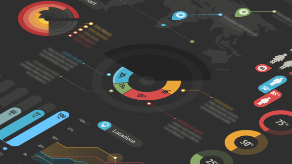
One of the best ways to more easily understand and communicate large amounts of data is to make it visual. Visualised data can come in the form of infographic reports, bubble charts or dendrograms, and can even be used to visualise entire systems.
The Perks of Data Visualisation
Data visualisation can help you turn collected data into categorised and analysed data, and helps foster near-instantaneous understanding. After all, 70% of all sensory receptors are in the eyes, and 50% of the brain is involved in visual processing, making visual information much easier to digest and understand than traditional spreadsheets, for example.
Furthermore, Harvard Magazine notes that humans are far better than computers at seeing patterns, making creative approaches to visualising data integral to the process of creating knowledge.
Not only will visualising data help you understand it, it will help you explain it to executives and higher-ups who have the power to make important decisions based on it. By making big data visually appealing and breaking it down from terabytes to baby bites, it can be more easily presented and allows the data to speak for itself.
Data visualisation can also make your presentations more persuasive. According to a study conducted at the Wharton School of Business, only 50% of an audience was persuaded by a purely verbal presentation, while 67% was persuaded by a verbal presentation accompanied by visuals.
Data Visualisation in Marketing
According to a recent study by The Economist, only one in ten executives do what the data suggests if it contradicts his or her gut feeling. This means that not only does a Chief Marketing Officer have to collect and analyse data, s/he also has to present it in a way that makes the recommended course of action desirable and ultimately 100% persuasive. This seemingly daunting task is made much more manageable with the aid of data visualisation.
While marketing used to be viewed as an industry solely dependent on creativity and consumer insight, it has increasingly become a metric and strategy-centric one. This shift in the marketing sphere means marketers in today’s world need to up their data geek game, constantly staying in tune with what the metrics are saying. While more marketers begin to make this transition, data visualisation can help bridge the gap and prove to be a very effective tool.


