


Our Opinion On Pie Charts
…or the Case For and Against the Pie Chart.
If there’s a list of controversial charts types in this world, then assume the pie chart makes the top of that list on a very regular basis.
So, what’s wrong with the pie chart? Surely there are other charts that do more damage in the world of data and design?
I’ll start by saying that we lean toward the ‘pie chart apologist school’. We don’t make any claims that it’s the best – but they’re not the worst out there either. It’s not in our opinion a ‘bad chart’ (see dual-axis line/bar chart, tables, waterfall chart) … they just have a few issues is all.
Why Do We Like Them?
Simply because the circle is a pleasing symmetrical shape. It gives variation to the angled corners that most of the chart types we use in dashboards and reporting possess.
Why Don’t We Like Them?
Overuse. Too many variables. Often hard to interpret and compare. 3D.
About Organizations Who Ban the Pie…
When we do data viz workshops, we usually get a universal groan across the audience when we get to the chart section and hit the pie chart slide.
It ranges from annoyance all the way through to violent rage after which we get run out of town by a pitchfork-wielding mob.
We take a more gentle approach. Don’t ban the pie. Understand the pie. Know the pie.
I’d imagine that’s probably how Bruce Lee would talk about it. Likely, before a lightning punch to its throat.
Well, no one at Datalabs has ever won a fight against a chart or person so our advice is don’t overuse it and definitely don’t do it in 3D. We also suggest not doing any chart in 3D. Ever.
That’s it. Like all good data viz and design, moderation is key.
What are the Alternatives to the Pie Chart?
One of the starter exercises in the workshop we run is to take a piechart with its values adding up to 100 percent and revisualize it. The simple trick here is to see the pie as simply an enclosed shape that had been divided into sections. If we see it as just a shape, then changing it to a rectangle (stacked bar) or square (treemap) or any other shape variation (triangle – pyramid, trapezoid – or other possible chart junk) and dividing that shape into sections is simple.
Or for variation sake, try a doughnut chart (try not to explode it…). We use these because you get some room to put a like extra context in the middle. For example, an icon so we can remove a heading or label or maybe an arrow indicating a positive or negative trend.
To Compare or Not to Compare the Pie Chart
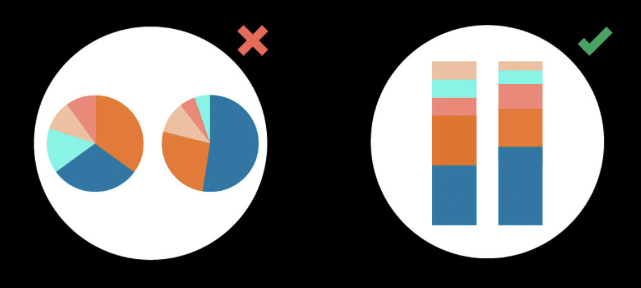 As a general rule, we say to use two stacked bars rather than two pie charts to compare discreet numbers. It’s just ten times* quicker and easier to compare the categories (*likely not mathematically correct). A major problem people have with pie charts is that the representative part is the outer edge. The actual inner wedge of the pie chart, as it attenuates towards the center, isn’t the part that ‘contains’ data. It’s pure visual embellishment. The outside of the circle is the only part that contains data, essentially making the wedges superfluous and its curved, data-carrying outer line harder to compare to another.
Possible exceptions to this no-comparison rule are when a pie chart only contains two values; say, for gender splits across countries. It would be okay to have multiple pie charts to show and compare the split here as it’s still easy enough to interpret the ratio at glance.
The Verdict?
There are pros and cons to any chart type, including the humble, though controversial, pie. When it comes to when not to use a pie chart, there are too many scenarios to list! But when it comes to when to make use of a pie chart, we can happily say you’ll get the most out of pie charts when showing a smaller amount of variables that collectively add to 100 percent. But you also may fall victim to that pitchfork-wielding mob that we’re incontrovertibly certain is still after us…
Well, folks, that’s our hat cast into the pie chart ring. Bring it on Twitter.
All opinions expressed here are of a personal nature and do not necessarily represent those of Datalabs, it’s parent companies or subsidiaries.
Okay, guess we’re not quite ready for that then…Probably for the best really.
Can’t get away from pie charts? Want to learn more about data visualization?
Then convince your organization to book one of our workshops…