


Animation & Motion Graphics are Great for Conveying Insights & Complex Ideas
How can such complex, abstract, and intangible information be conveyed in an easy-to-understand and interesting manner? The answer: animation!
Just like in creative writing, where literary devices are used to convey a story, visual metaphors in the form of animations can be used to explain complex concepts. In true data viz form, it is simply the act of bringing data to life.
Big Data can be complicated, lengthy, and mind-bogglingly full of numbers. Like trying to explain a foggy picture, descriptive words can only do so much to relay what’s on paper. In the financial sector, for instance, crunching numbers and equations into stats and charts are the norm – but could get pretty boring fast for the reader.
Animation enables data designers to simulate changes over time, the transitions between places and time – ultimately unfolding a narrative. It gives Big Data the human element. We can tell stories, evoke emotions, and show processes where it was difficult or impossible with static graphics and text alone.
Animations for the Web
To show data in a tantalizing way through animations, there are a couple of ways to do it. Today’s advanced programming language such as Javascript and CSS animations allow for modern web browsers to showcase your data through beautiful animations. For data designers, there are a couple of ways to maximize this potential for your projects.
1. Animation as Encoding
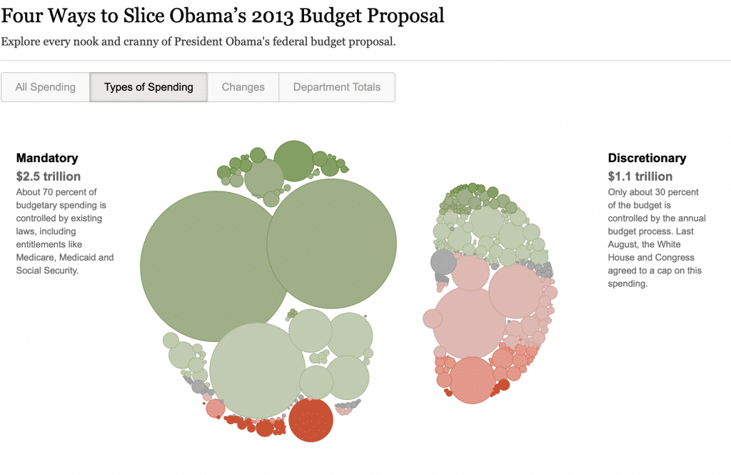
Encoding is all about rearranging and re-organizing your data in a form that makes it easier to comprehend. Think about it like Marie Kondo-ing your house. A little housekeeping goes a long way. One of our favorites is Four Ways to Slice Obama’s 2013 Budget Proposal by the New York Times. When working with a lot of numbers, especially in regards to budgets and finance, it can get overwhelming easily. What we like about this piece is how it groups objects together, drawing attention to different parts at different sections, giving it an element of constancy.
2. Animation as Narration
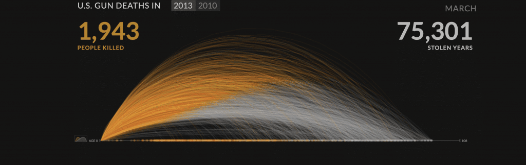
Injecting a narrative structure of exposition – rising action – climax – resolution is the key to keeping your viewers’ interest. Through tension and storytelling, readers are kept engaged, just like this project by Periscopic, highlighting the U.S. Gun Deaths phenomenon.
3. Animation in Transition
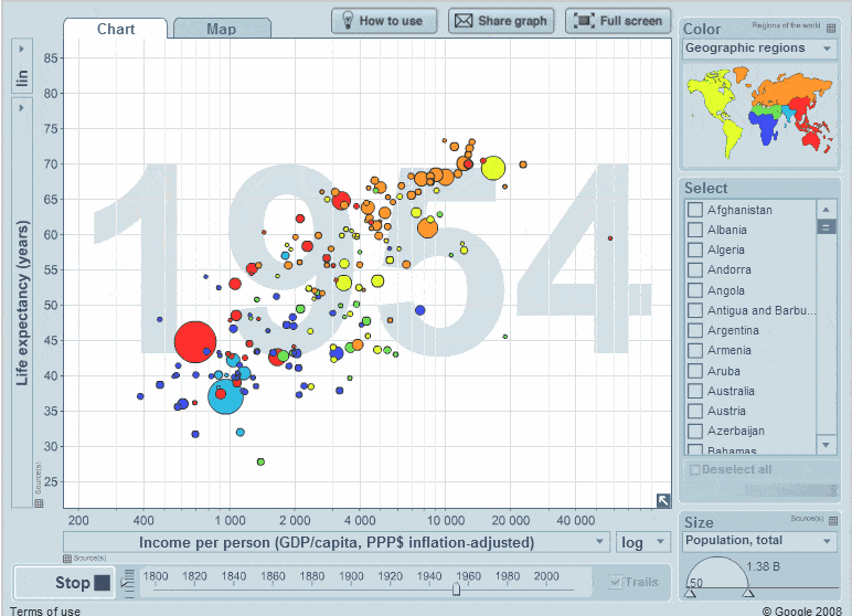
Showing how the data transcends through time. An example of this would be Hans Rosling’s Wealth and Health of Nations, which is arguably the pioneering data visualization animation project.
Visualizing Data with Motion Graphics
Today’s advanced software platform such as Adobe After Effects makes creating motion graphics easy, especially for data visualization. Adding graphics, animation, audio, voiceover, sound effects and onscreen copy makes for a powerful combination to tell your story through data.
Below is one pulled from our own Datalabs Agency archives – a video showcasing the 2015 Australian Federal Treasury Budget. One of our favorites, we dare say!
Note how all the different elements come together, and how important figures are highlighted through design principles of typography, color, and hierarchy.
Get Your Data into an Animated Form
There you have it, folks! Good data visualization work should be easy to comprehend. Here at Datalabs, we are obsessed with animations and we love creating them! No data is too complex.
To explore our past work, visit our Animated Data Videos page or view our Youtube channel. Any questions, don’t hesitate to contact us at hello@datalabsagency.com