

2017 Summed Up in 10 Revealing Data Viz and Infographics
A list of some of our favorite visualizations that explain the year that was 2017.
2017 was an interesting year, wasn’t it? Politically to culturally, it seemed like every day there was something incredible or strange, or incredibly strange, making the headlines.
Making sense of the news and the world around us can be hard, but the great thing about data viz is that it makes it just that little bit easier.
When done well, data viz simplifies and explains the world around us by showing and telling at the same time. Great data viz clarifies information and condenses it, showing us what’s important clearly and effectively. And, of course, beautifully.
It’s not an easy feat, but it is something that helps everyone understand the world around us. We had a lot to get our heads around in 2017 – so we thought we’d share 9 examples of data viz that sum up some of the biggest issues of the year – and make good use of visualization to do it.
Enjoy…
1. Word Frequency and Grade Level of Donald Trump’s Speeches
No matter where you are in the world, Donald Trump was the talk of the town in 2017 on, well, more than one occasion, wasn’t he? It’s no surprise President Trump likes the sound of his own voice, but what might surprise you, even more, are exactly what words he uses, and how often he uses them.
Why we love it: While simple, this data viz gets straight to the point, revealing data in a clean, streamlined way. There’s no point to getting fancy with data interpretation if you don’t need to, is there? Simple as it is, it manages to make visual sense of data that is predominantly verbal – giving viewers a new perspective.
2. Sexual Harassment
Last year, more than any other year before it, stories emerged of sexual harassment from many who, before, may have not felt comfortable to do so. Conversations are now being had, and it’s a huge step forward in bringing awareness, education, and justice to many men and women around the world. However, as this infographic so poignantly shows, we’re really only scratching the service, with many stories remaining untold.
Why we love it: This infographic is more about the viz than it is about the data. Sure, there’s only one piece of data presented, but it’s how this statistic is visualized that makes this data viz so powerful. The creative theme of ‘iceberg’, given the topic of the data viz, is incredibly poignant too.
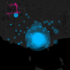
3. #MeToo
The #MeToo movement brought more attention to the cause of sexual harassment and assault than anything else. This hashtag brought together people from all over the world. Click the heading to explore this detailed article dotted with data viz to learn more about the movement, and exactly how big it is.
Why we love it: This article is incredibly powerful, and the data viz is not only there to back up its claims, but it’s also presented in an incredibly beautiful way. We love the galaxy theme; it’s a perfect metaphor for the subject matter and is a brilliant way to present the interconnecting nodes of data that tell the story.
4. Making It Big
Well, we’ve all dreamt about it, haven’t we? Being a huge rockstar. No? Just me? Well, regardless, the odds aren’t exactly in our favor. Or anyone’s favor. Well, we knew that, but now, thanks to this data viz, we know exactly how much. Which is… great. I think…
Why we love it: The node diagram continues – though this time, it includes a great scroll experience that triggers animations and other visual events as the user scrolls through the content. We’re loving this scroll-to-reveal UX style UX lately. And ‘Making It Big’ does a great job of slowly breaking down the outer layers of aggregate data, and drilling into the more granular, all while guiding the user through with awesome supporting visuals. More interactive data viz features throughout the experience, so be sure to check it out if you need some inspiration for web interactions.
5. Travel Visa Inequality
If you’ve ever thought that where someone is from dictates how they’re treated when they go overseas, you’re probably right. It’s a sad reality in our world – and even though we can’t see borders, borders are exactly what determines whether a person with Visa A is treated fairer, or worse, than a person with Visa B. Learn more by clicking the link.
Why we love it: This is another great example of another no-fuss presentation of data – getting straight to the point without sacrificing beautiful, streamlined data. In addition, the data is well-placed in the article, making for an easy read. Again, users can scroll to unveil a new focus in the data set as supporting text guides them through the experience. You can also hover over any country to get more stats and their overall ranking.
6. Transgender Day of Remembrance 2017
We’ll firstly add a bit of a content warning for those who may be upset by the information in this viz (assault, death, violence). TDoR is a moving and solemn reminder of the ways in which many trans* people have suffered at the hands of others. This interactive data viz honors and mourns the lives of the individual trans* we lost in 2017.
Why we love it: Created using the well-loved d3.js library, this interactive chart uses a pictograph visualization to represent every life lost with a symbolic flickering candle. The no-fuss style of this data viz (both in terms of data display, and its colors) is a necessary portrayal of the stats given its subject matter. Anything more would be far too ‘showy’. With simple regional filter buttons on top, it’s a great example of how less can be more – especially when it comes to more serious topics.
7. What She’s Worth – The Slow Road to Equal Pay
Well, if you paid attention to the media of late, you’ll know it’s no secret women don’t earn the same as men in most countries around the world. This infographic not only details this pay gap but variables that affect a female’s ‘worth’ in employment.
Why we love it: We love the funky style of drawings in this data viz – paired with easy-to-read data, this one is a perfect example of how great data and even better data viz will bring an article to life and make it highly sharable. Each segment in the infographic goes through a decade of data, starting in the 70’s. While there are perhaps a couple of notes they could take on clarifying a chart here and there, the linear layout is a great way to tell a story, building up to the present time.
8. Mass Shootings in America
It’s not an easy topic to talk about, so we’re going to leave it at this: this lengthy, incredibly informative article from The Washington Post uses great data viz to highlight many facts and figures surrounding mass shootings in the U.S over a 50-year time period. Data includes information on victims, sites, killers, and weapons used – so please be aware that this content may upset viewers. A haunting but timely piece for 2017 given the U.S.’s largest-ever mass shooting occurred last year.
Why we love it: The clean lines and style of design/infographics in this data viz-centric article truly adds a new depth of information to this piece that it couldn’t do without. Using interactive pictographs to capture the volumes of victims, weapons and attackers allow for a visually holistic perspective of the issue. Other interactions include a geographic map and several charts detailing more granular information the further you scroll. A great example of how data viz, when done well, not only perfectly compliments journalism, but brings it into a whole new sphere of informative content.
9. The Wall
Well, it’s now 2018, and it hasn’t happened yet, but the wall (you know the one) isn’t an impossibility yet. There is a lot of controversy surrounding the structure – as this infographic creator argues the wall is, quite simply, ‘a waste of money and a bad idea because the assumptions behind the project are not true’. And then, there’s the environmental impact. Explored in this data viz, is exactly that.
Why we love it: The slick and modern palette of this data viz is what struck us initially. Plus the grey tones used in the background perfectly compliment the subject matter, while also allowing the figures and stats to ‘pop’. With good use of white space and layout that incorporates geographic location in question, we think it makes for an extremely easy to read and interesting data viz.
Well, 2017 was certainly an interesting year. We hope you enjoyed these great examples of data viz and that they helped you understand some of the issues that we faced last year and continue to face today.