hello@datalabsagency.com
logo
Datalabs Agency
0
logo
  • Data Viz Design
    • Power BI Dashboards Designs
    • Tableau Dashboards Designs
    • Infographic Reports
    • Animated Data Videos
    • Interactive Data Visualizations
    • Maps & Cartography
    • Digital Annual Reports & Microsites
    • Case Studies
  • Training Workshops
    • Our Five Main Workshops
      • Introduction to Data Visualization: Tools & Techniques Workshop
      • Designing Great Business Dashboards Workshop
      • Infographic & Report Design Workshop
      • Creative Data Presentations with PowerPoint
      • Creative Power BI Dashboard Design
    • Online Courses
      • An Introduction to Data Visualization & Storytelling
      • Designing Great Dashboards
  • Style Guides for Data
    • Power BI Style Guides
    • Tableau Style Guides
  • Shop
    • Power BI Templates
    • Power BI Theme and Style Guide
    • An Introduction to Data Visualization and Storytelling Course
    • Designing Great Dashboards Course
    • Data Visualization Consultant
  • Blog
  • Contact Us
    • About Our Data Visualization Agency
  • My account
Prev
Dashboard Laptop 0
Great Dashboard Tips
21 July 2016
Next
User-Journey-Data-Visualisation 0
Case Study: Monash Health Interactive Timeline Tool
18 August 2016
Articles
Financial Operations Dashboard
July 27, 2016 by Datalabs in Articles

Finance Dashboard Design

Financial Operations & Reporting BI Dashboards

A Business Dashboard for Reviewing Financial Risk

Our client offers vehicle fleet leasing and management, Australia-wide, and internationally. Their solutions are time-saving and cost-effective, as well as providing the added comfort of taking away the hassle of large scale vehicle management.

Why Dashboards?

The client contacted Datalabs with a need to review changes in a potential loss of revenue, based on the results of the last 5 financial years. This allowed them to prove decreases in revenue loss, via trends and comparative filters. It was to be shared internally, to provide analysis and insight on previous years, and so that future revenue could benefit.

How We Designed Their Dashboard

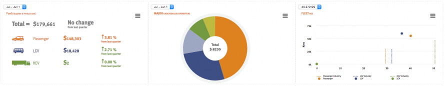
The loss of revenue data required detailed visualization work. It existed in data-heavy reports, that lacked a visual style and focus on user experience. Often they were multiple reports, that required extensive breaking down to get to the core of the data. The data needed to be reflected in a format that that could provide a fast comparison in potential areas of risk. A 9-eye dashboard was decided to be the best format.

A whiteboard session was conducted, which allowed Datalabs to dissect the necessary insights ,and visualise in beautiful interactive charts. Our design focused on our methodology of simplification, amazing visuals and excellent user experience, that allows clear actions to be taken as a results of the information in the dashboards. The design process occurred in Adobe Illustrator, and the data development in HTML, JS and a CSS file, to be hosted on the client’s intranet.

Chart Design Focus

Areas of focus for the chart:

  • Infringements Accumulated
  • Toll Costs
  • Driver Age
  • Vehicle Damages and Maintenance

Being able to provide fast insight to benchmark data can be invaluable to your future business practices.


Go To The Dashboard


If you would like to develop a similar project, or perhaps can see elsewhere how your business could benefit from data visualization – give the Datalabs Agency a call today!

0 Comments
  • automotive
  • chart types
  • data dashboards
  • financial reporting
  • interactive content
  • logistics
  • transportation
0 Like!
Share
Datalabs

Style Guides for Data?

A photo of our data viz style guide for Microsoft Power BI

See Our Data Visualization Workshops

Learn Online: An Intro to Data Viz & Storytelling Course

Shop Online for Data Visualization

  • Image of a man using our Power BI templates to design a report
    Power BI Templates
    Select options
  • Image of our custom Power BI Theme on a computer
    Power BI Theme and Style Guide
    Select options
  • An Introduction to Data Visualization and Storytelling Course
    An Introduction to Data Visualization and Storytelling Course
    Add to cart
  • Photo of a data visualization consultant advising clients and helping solve design issues.
    Data Visualization Consultant
    Read more
  • Designing Great Dashboards Course
    Designing Great Dashboards Course
    Add to cart

From Our Blog

  • Dashboard Users and Audiences: A Designing Great Dashboards Guide
  • Data Analytics Conferences 2022
  • Data Visualization Conferences 2022
  • New Online Course for Designing Great Dashboards
  • New Workspaces for Rent at Jack’s Magazine

What We're Known For

  • Data Visualization Training
  • Brand Guidelines for Data
  • Online Courses & Products

Stay Informed about Data Visualization

Stay in Our Social Circles

© 2022 Data Arts Pty Ltd
logo