


5 Tips For Designing a Great Dashboard
Not all dashboards are created equal – here’s how to get it right from the designers at the Datalabs Agency.
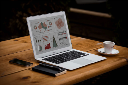
Infographic dashboards are massively useful tools for visualising and reporting the effectiveness of any data set. If designed well, they can scale the productivity of your team and support valuable decision-making quickly and effectively. Like anything worth doing, designing a useful and functional visual dashboard can be a tricky task.
This is a guide for designing effective dashboards for both internal (i.e. for marketers) and external (senior management or end-user) purposes.
Know Your Audience
When designing a dashboard, you must take into account the audience and the setting in which the dashboard will be viewed, we tend to use marketing-style user personas as the basis for how we design dashboards.
Depending on the audience preference the dashboards can be designed for consumption on different platforms and devices by different personas with unique needs. We usually advise with starting at the top-level snapshot (C-suite, Department Heads, Ministers), then working down to the strategic, operational or reporting level.
With any good design, understanding the use needs and problems allows you to target the dashboard to solve their problems and the user will love your for it.
Choosing The Right Metrics
A good dashboard avoids clutter.
It is about catering a digital experience to multiple needs and usually a broad base of users. Of the identified audience, it is necessary to select visuals that are meaningful to them, while considering that there will be multiple personas views the dashboard, with different needs. These visuals rely on choosing the right metrics to build a systematic means of measuring performance.
Our advice on this problem is to embrace natural constraints. Keep your dashboard to one screen then limit your modules within it to 9 or 12. This will allow you to focus on the main metrics that you wish to track with the dashboard and give a hierarchy to the data. Identify the metrics at the outset and create an order that prioritises them via importance and usefulness, then use it as the roadmap to building a truly communicative and insightful dashboard.
Features, Widgets and Filters
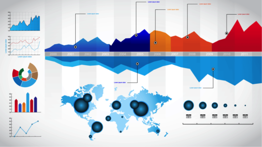
The dashboard needs to give a picture of the progress and the right widgets will help the user refine the focus and user experience. Using appropriate features such as charts or geo-maps allow to spot trends and make decisions quickly is important but adding the ability to go further, even down to the source or spreadsheet allow those that want it to be able.
Filters allow a more refined look at the specifics of the data and to allow a user to focus on their need. Remember that not everyone is a data nerd or has the time to drill down to the source for more information and insight. With appropriate widgets and filters, the user is empowered to drill down and look for trends at a granular level and allow sifting through masses of data with a few clicks or focus their view on their particular niche. A good dashboard accommodates both these users.
Choose An Appropriate Colour Palette
Attractive dashboards should use appropriate colour palettes which contrasts and highlights. We always tell clients that the best dashboards have opinions and actions, and proper use of colours aids both of those in showing highs, lows, opportunities and concerns. Avoid using too many colours, incorrect or mismatching contrasts and as it can be misleading and annoying (in a visual sense). The colours add emphasis and highlights, invoking a prompt response from the audience, so try not to deviate much from the design convention and if you have a style guide then always use that. Alerts and prompts need to be easily identifiable so be mindful of the colour theory (Conventionally, red means danger, green means good etc.) so be aware of that if you’re company colours scheme is red, for example:
Here are a couple of resources we use for colour palettes:
&
Always have scope for rework
Once all elements of the dashboard are in place, the work does not end there. Never forget maintenance and iteration to keep learning and improving your dashboards. A dashboard is a dynamic tool for performance measurement and therefore strive to incorporate feedback from the users to fine-tune the dashboard over time.
Hope this guide to design dashing dashboards helps!