

Examples of Digital Annual Reports That Don’t Suck
A handful of forward-thinking companies and non-profits have begun to turn the routine production of a digital annual report into an opportunity to engage, inform and even excite their audiences.
We’ve collated some of our favourite digital annual report designs, hoping they’ll inspire more organisations to adopt a fresh approach to their own annual report.
Caterpillar
2015 Year In Review
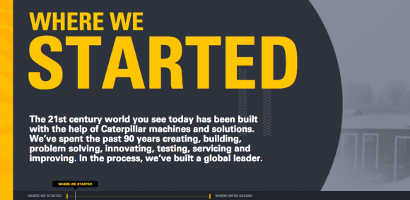
This year in review from heavy machinery stalwart, Caterpillar is probably the best use of the interactive timeline we’ve seen in an annual report. We love the timelines because they are story lead, double as navigation, allow the use of the side scroll (we’re fans…) and they use the ‘time’ element well, which in a year-in-review is particularly effective.
Also, use of colours for the win – from the brand yellow as the primary and overly, through to the increasing colour over the years.
ThankYou (Formerly ThankYou Water)
‘The Last Year Was…’ Annual Report
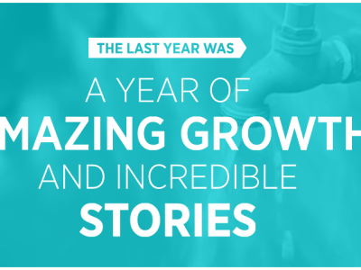
ThankYou’s digital annual report is a fantastic example of a narrative-based design to tell their year’s story. The use of video, graphs, and charts; big, bold colors and images that compel a reader/viewer to delve into the story.
It’s got a fun, informative aesthetic that gives a glimpse into the organization & culture beyond simply reporting events, facts, and figures.
They use simple, clean graphics and animation to convey key statistics and numbers without overwhelming the audience They still manage to keep it fun and light-hearted and there are case studies that show their values and programs outside their core business. Plus, it’s a pretty good cause…
ThankYou’s previous annual report is pretty good too...
AkzoNobel
Interactive Data and Digital Annual Report Design
AkzoNobel’s 2014 digital annual report challenges the conventional wisdom that annual reports can either look good or or contain lots of data. This digital report does both, by linking an image-rich one-page overview to an interactive data tool.
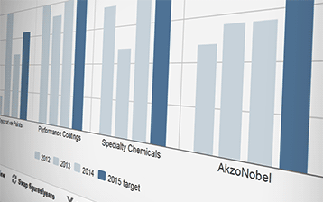 AkzoNobel’s Key Data Comparison tool allows shareholders, investors and analysts a fast and accurate way of examining the numbers, to better understand the growth of the company. Combined with the strong visuals elsewhere in the report, its a great use of interactive digital design bringing data to life.
Vodaphone
User Experience and Digital Annual Report Design
img class=”alignnone wp-image-3404″ src=”https://www.datalabsagency.com/wp-content/uploads/2015/06/vodaphone-digital-annual-report-design-890×540.png” alt=”Vodaphone’s beautifully deisgned digital annual report 2014″ width=”1052″ height=”638″ />
Great user experience shines throughout Vodaphone’s 2014 digital annual report. Every page is bold, yet easy to understand. Best of all, the menu doesn’t ever disappear from view, making it easy to navigate between sections.
That same user experience extends to the so-called boring stuff, like financial statements. While they aren’t part of the digital design (they’re available as downloadable pdfs) they still benefit from the same design treatment, making the overall experience consistently great.
Lemonade International
Non Profits and Digital Annual Report Design
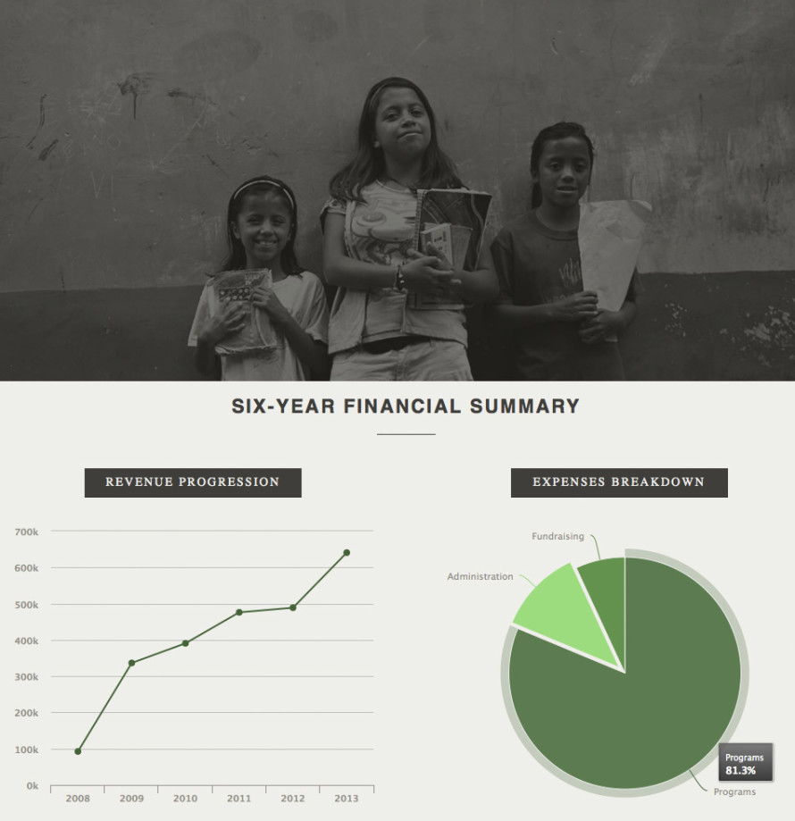
Lemonade International is a small charity that punches above its weight, and that’s all the more obvious for this beautifully executed annual report. A one-page website, it blends powerful photographic portraits from their front-line work, with data visualizations and plenty of negative space. The result is a report that communicates key information to donors with both passion and professionalism.
Goldman Sachs
Thought Leadership and Digital Annual Report Design
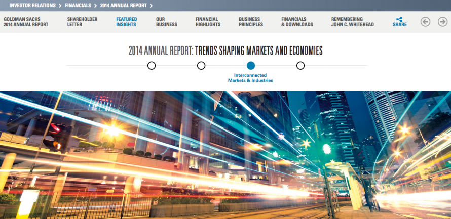
Global finance giant Goldman Sachs has a guaranteed audience for its annual report. And with their 2014 digital annual report, they’ve seized the opportunity to showcase their thought leadership to this audience. The report includes “Featured Insights” on major trends and video interviews with key executives. It’s a great example of how an annual report can work overtime – not simply fulfilling reporting requirements but building relationships with shareholders and investors.
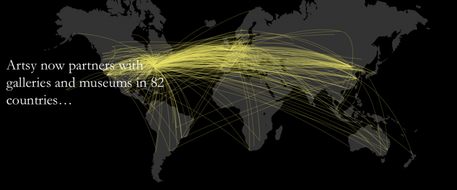
Artsy
Storytelling and Digital Annual Report Design
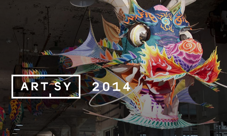
While not a full-blown annual report, Artsy’s 2014 digital year in review makes this list because of its ability to tell a powerful story. With stunning images, well-chosen snatches of text, and a couple of great quality data visualizations, this digital report tells a tale of innovation and growth that most investors dream of.
With so many inspiring examples of compelling digital annual reports, let’s hope 2015’s crop will well and truly outshine the staid pdfs of years past.
If you’re interested in our own digital annual reports & microsites, you can check them out here: Digital Annual Report Design.