hello@datalabsagency.com
logo
Datalabs Agency
0
logo
  • Data Viz Design
    • Power BI Dashboards Designs
    • Tableau Dashboards Designs
    • Infographic Reports
    • Animated Data Videos
    • Interactive Data Visualizations
    • Maps & Cartography
    • Digital Annual Reports & Microsites
    • Case Studies
  • Training Workshops
    • Our Five Main Workshops
      • Introduction to Data Visualization: Tools & Techniques Workshop
      • Designing Great Business Dashboards Workshop
      • Infographic & Report Design Workshop
      • Creative Data Presentations with PowerPoint
      • Creative Power BI Dashboard Design
    • Online Courses
      • An Introduction to Data Visualization & Storytelling
      • Designing Great Dashboards
  • Style Guides for Data
    • Power BI Style Guides
    • Tableau Style Guides
  • Shop
    • Power BI Templates
    • Power BI Theme and Style Guide
    • An Introduction to Data Visualization and Storytelling Course
    • Designing Great Dashboards Course
    • Data Visualization Consultant
  • Blog
  • Contact Us
    • About Our Data Visualization Agency
  • My account
Prev
Pulitzer's timeless advice for great content: "Put it before them briefly so they will read it, clearly so they will appreciate it, picturesquely so they will remember it and, above all, accurately so they will be guided by its light.” 0
Timeless Advice for Great Content Marketing
06 March 2015
Next
What metadata will be collected about me? 0
Metadata & What Australia’s Data Retention Law Means For You
18 March 2015
Inspiration
What is Good Data Visualisation?
March 17, 2015 by Datalabs in Inspiration

What is Good Data Visualisation?

An Infographic

Nathan Yau describes good data visualisation as "a representation of data that helps you see what you otherwise would have been blind to...".

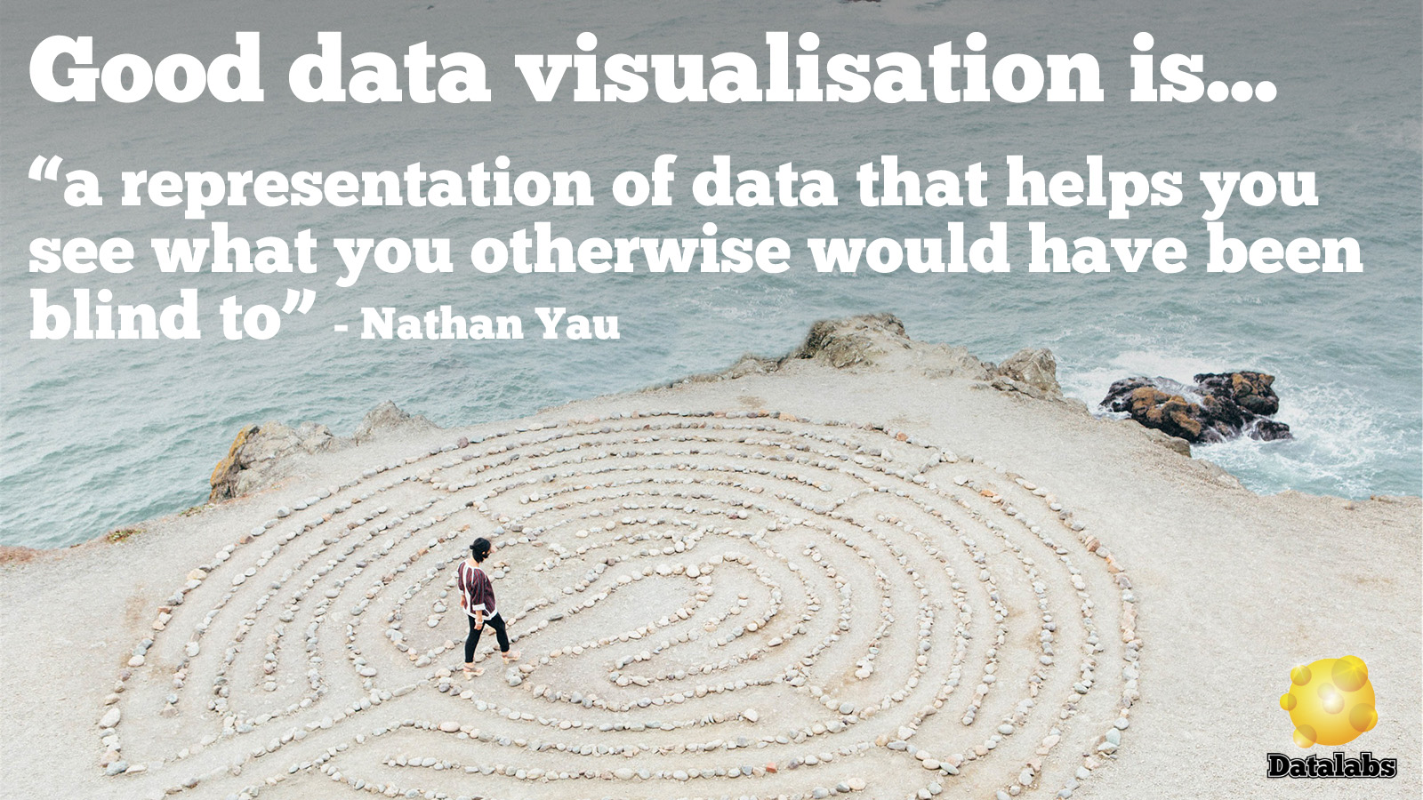
We think Nathan Yau of flowingdata.com gets to the heart of why we visualize data – data visualization helps us make and share complex discoveries.

0 Comments
  • bad data visualization
  • data visualization
0 Like!
Share
Datalabs

Style Guides for Data?

A photo of our data viz style guide for Microsoft Power BI

See Our Data Visualization Workshops

Learn Online: An Intro to Data Viz & Storytelling Course

Shop Online for Data Visualization

  • Image of a man using our Power BI templates to design a report
    Power BI Templates
    Select options
  • Image of our custom Power BI Theme on a computer
    Power BI Theme and Style Guide
    Select options
  • An Introduction to Data Visualization and Storytelling Course
    An Introduction to Data Visualization and Storytelling Course
    Add to cart
  • Photo of a data visualization consultant advising clients and helping solve design issues.
    Data Visualization Consultant
    Read more
  • Designing Great Dashboards Course
    Designing Great Dashboards Course
    Add to cart

From Our Blog

  • Dashboard Users and Audiences: A Designing Great Dashboards Guide
  • Data Analytics Conferences 2022
  • Data Visualization Conferences 2022
  • New Online Course for Designing Great Dashboards
  • New Workspaces for Rent at Jack’s Magazine

What We're Known For

  • Data Visualization Training
  • Brand Guidelines for Data
  • Online Courses & Products

Stay Informed about Data Visualization

Stay in Our Social Circles

© 2022 Data Arts Pty Ltd
logo