


A Finance Data Problem.
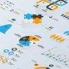
Visual Financial Modelling & Systems Visualisations
Digitized cash is invisible. It’s physical existence and its flow through your company’s coffers are referenced only by numbers on a spreadsheet. Revenue and expenses are too important to be so obscured by the officers in charge of accounting for them. Financial systems are best understood by looking at the data, the visual data.
That way problems could be quickly analyzed and addressed — unprofitable business units, profit margins under threat from competition, or the loss of productivity in a geographical territory; and new opportunities could be pursued: Industry and sector growth, business units that contributing creating greater value for shareholders, or the net benefits of M&A activity.
Data Visualisation Idea
Use interactive data visualizations and dashboards to allow Chief Financial Officers (CFOs), finance directors, and financial analysts to see the systems in which they work. Let them re-model the data in their vision, sculpting financial models that show the flow of money, the creation and destruction of value, and the predictions of the future financial landscape for your company.
The Datalabs Agency develops and designs interactive financial visualizations, capturing the physical nature of a company’s financial system. With the ease-of-use of a well-designed app and the beauty of a work of art, finance has never looked.
Implementation
Working with financial data has its advantages over areas in business, its structures are well-defined. But that shouldn’t mean that financial data visualization shouldn’t be creative. The Datalabs Agency has designed interactive visualization and dashboards for the big banks here in Australia. Working with C-Suite executives and their staffs, Datalabs’ team can gather financial, technical, and business requirements for your visual financial model or financial systems visualization. All data is secure and kept confidential. Connect with us to see the possibilities of these next-generation data tools.
Products and Services Used in this Data Visualisation Idea
Data Analysis, Interactive Visualisations, Business Intelligence Dashboards