


Case Study: Department of Education and Training
Interactive Child Care Subsidy Estimator
When: June-August – Initial 2-week development-to-delivery phase, then updates and revisions.
What: Interactive web interface used to calculate the Federal Government’s Child Care Rebate.
Who: UI Designer, Javascript Developers, Data Developer, and Project Manager
Challenge
The Datalabs Agency was engaged to help the Department of Education and Training provide a clean and simple user interface in which parents and carers of children could estimate the amount of money they may be entitled to receive as part of the Australian Government’s New Child Care Package.
The Department wanted a quick, accurate tool that could give families an idea of what their new subsidy might be under the New Child Care Package that starts 2 July 2018, and compare this to their estimated entitlements under the current Child Care fee assistance.
The detail of this policy was provided to us in a spreadsheet and we needed to be able to convert that information into a light-weight web app that maintained the accuracy and detail of the policy but also allowed users to quickly and easily find the type of care relevant to their child, and the type of Government assistance they may be entitled to.
The complexity of this case study was trifold.
Firstly, we had a lot of new information to wrap our heads around. In order to build this interactive web interface, we had to understand the different types of care, mixed care amongst siblings, how various types of cover tapered on or off when circumstances differed, and, how entitlement levels were based on the hours in before and aftercare as well as the number of hours the parents worked.
Secondly, our biggest challenge was ensuring the product (the estimator) allowed Australians from all walks of life to use the product to find out what the new entitlement policies meant for them and their family. This was no easy task, as you can imagine how different all of our lives are! As a result, the many equations our team wrote were extensive.
And thirdly, as often feels like the case but most definitely was this time around, we had time on our back. In a matter of days, we had to gather feedback from a number of stakeholders, which was something we always needed to consider and make sure we stayed on top of.
Solution
The first part of the work, before the design began, was to understand the various outcomes of the policy – and there were many potential outcomes that needed to be accounted for. We then had to accurately calculate them.
To do this, we needed to recreate the maths of the policy and outcomes from an Excel sheet into a set of formulae that could be used as code rather than Excel cell references.
As you can imagine, this led to some fairly frantic maths revision for our production team who finally understood why their parents were right when they told them to continue taking maths in university (thanks, Mum!)
For our second challenge – the fact that all Australians needed to be able to use the estimator accurately – we had to calculate and gather a lot of variables, which our developers then had the really fun job of implementing into code before rigorously testing it. And testing it again. And again. And again…
For our third big challenge – time – we had to not only work quickly but precisely, too. We also had to allow ourselves extra room to be agile in our methodology. And because we were, we were able to complete the project in a two-week time frame. Our developers are amazing! You’re amazing, guys! Amazing!
Approach
For this project, our approach had to be fast but effective.
As the initial phase of this project was done in an extremely short time frame (just two weeks) to coincide with a media announcement, our interaction developer built the framework, charts, sliders, and interactions while our logic and equations were built by our data developer.
After taking requirements and a phone briefing with the client, we spent the first day deconstructing the data and equations from the spreadsheet and recreating them in the development environment.
We then moved straight into a live prototype to make sure the maths and the information architecture was accurate and functional. It was a fast approach, but one that was necessary, with all of our regular quality and accuracy assurances in place.
Design
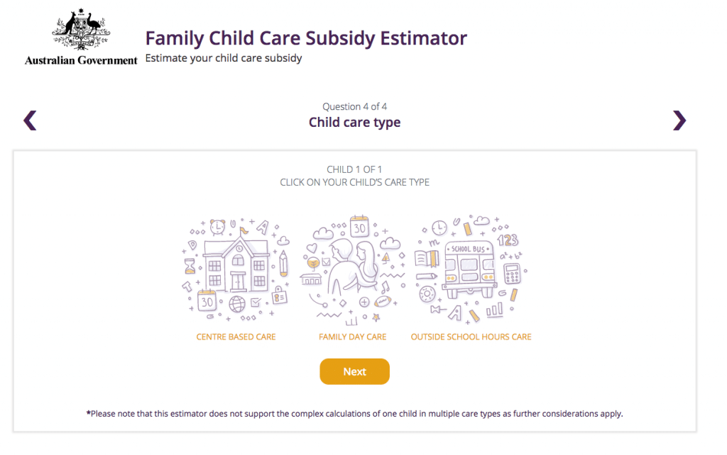
For this project, considering it was to be accessed by a wide variety of Australians, the main requirement of the tool’s design was that it was to be simple and usable. The purpose was that a user could, within a few interactions, input enough details to get an estimation of the child care assistance that was appropriate to them.
Keeping that in mind, we chose to develop each page as a separate window rather than a single scrolling view; the idea was to clearly differentiate the steps in the selection of options, and we felt this was simple, more readable, and provided a sense of satisfaction to the user interacting with the estimator.
As a whole, the design was kept simple and clean to make sure that the journey through the tool was clear and functional. The design’s function was to facilitate the user being able to input their data from simple information (for example, a single child in one form of daycare) through to the more complex (say, several children in different types of care) while still having an estimator that was able to use whatever data it was given to create an estimate of the assistance based on this data input.
We felt that this design, with the above structure, was the best way to progress the user through the input fields quickly and efficiently. Hooray!
A final but important aspect of the design of this project was that, because so many different Australians from different demographics would be using this tool, it was essential to making the interface and the overall UX as intuitive and seamless as possible. Now, that’s no easy task, but we believe we achieved that through our design. Lastly, because this tool was for a government website and needed to align with their already-developed best practices, the site (tool) needed to meet WCAG 2.0 web accessibility standards.
Final thoughts
While this project was a bit of a test for our hard-working developers, it also proved to be a great example of what we can achieve.
The tool gave us a great understanding of how to interact with complex government policy and allowed us to figure out how to simplify complex policy for the purpose of simple and efficient user interactions.
Since its launch, we’re proud to say the estimator has had nearly 800,000 page views. We’re pleased to say it has even received some great positive press. We’re very proud to have delivered this project in only two weeks – but mostly we’re just proud that we were able to make a great data tool that can now help parents and carers all over the country.