

Nestlé Chooses Datalabs & Illustration-based Dashboard Designs
 Who:
Who:
Nestlé
What:
Intranet dashboard landing page design
When:
May 2016
Why:
When you are constantly focused on the needs of your customers and consumers, often internal software and items get designed purely for functionality, rather than a good user experience. It’s usually not until multiple user complaints, that you start to see the cracks. And no one wants disenfranchised employees!
Nestlé’s intranet dashboard for their product data had a basic design, but the format was not very engaging and didn’t offer a very user-friendly experience. Nestlé heard the complaints from their team and realized they needed to re-visualize their intranet dashboard landing page. Their aim was to develop an easy-to-use, visually engaging experience that would help to make Nestlé employees’ jobs easier, and therefore, more enjoyable.
How:
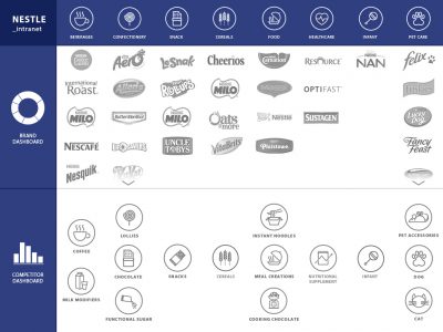
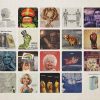
The design went through a couple of different variations. Originally, the design was logo-based, utilizing the wide variety of well-known Nestlé product imagery to represent the dashboards that related to those products.
The logos would be categorized, and the categories would be scrollable where needed. This would allow the user to easily click on the dashboard they were interested in, based on the item logo. It also allowed the design to use a similar layout to
the existing intranet landing page and, therefore, deliver an easier transition of user expectations.
After internal discussion, a new approach was chosen which allowed the functionality to showcase the wide range of Nestlé products but gave way to a more engaging design. Using a character/cartoon style, Datalabs developed a single image of a kitchen scene that would be broken into 24 clickable sections. Each section of the graphic would feature easily identifiable imagery of a product category.
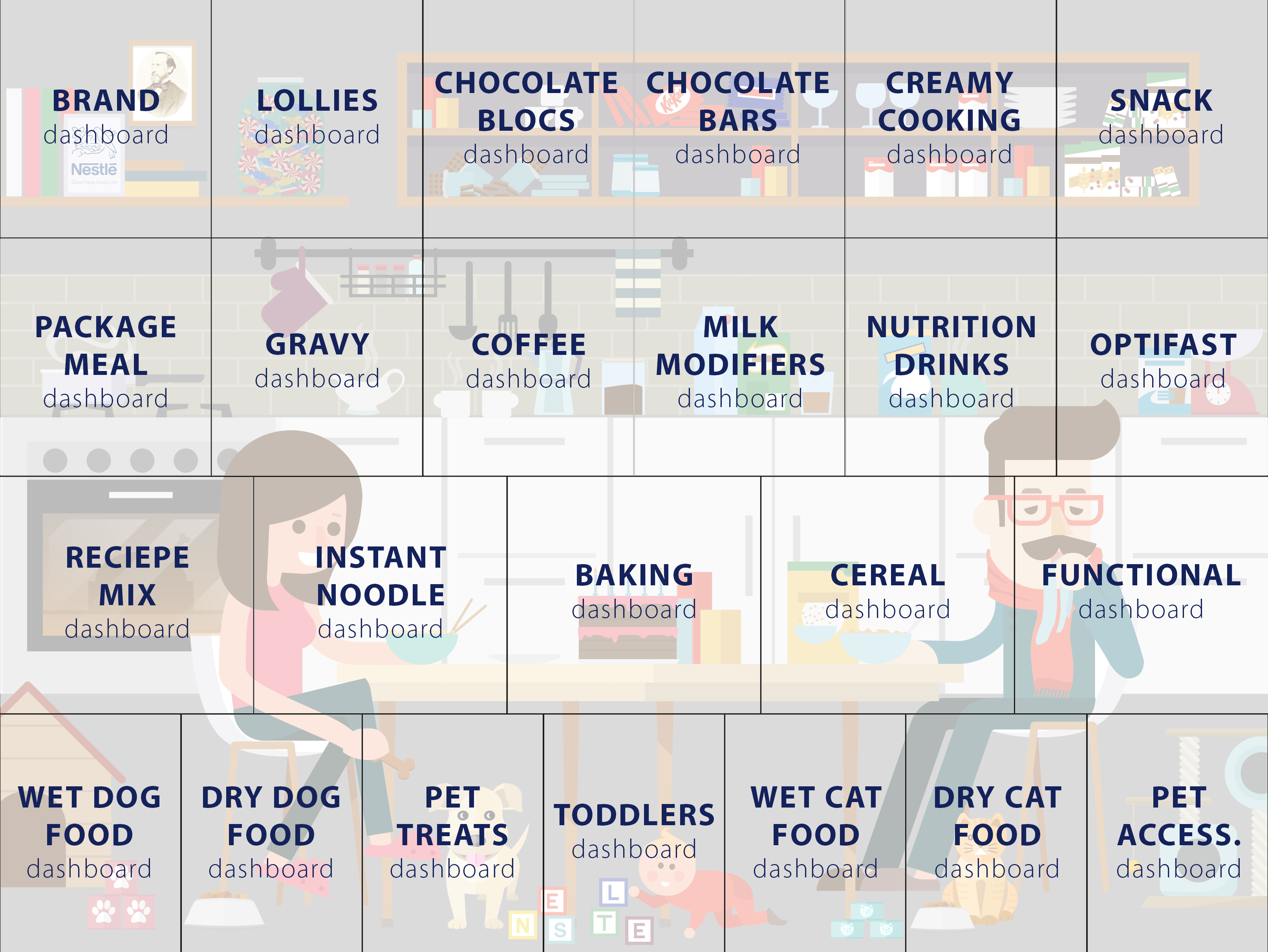 At first, the image wouldn’t necessarily appear as a dashboard. But once your mouse hovered over a section of the image, the associated text label for that dashboard would be revealed in a rectangular grid format. Once clicked, the user would be taken straight to the relevant dashboard.
The Result:
Your intranet doesn’t need to be boring! Be kind to your staff, and design to make their job easier and more user-friendly. Don’t feel that simple functionality means a simple design. Take advantage of that simplicity and make something engaging (and downright adorable); like this!
If you care at all about your employees, you won’t make them use ugly visualizations. Give your employees the best. Give them a call and hire Datalabs’ interactive data visualization services!
Business dashboards could be the answer to all your big, messy data problems!
Interested in what we do?
Get in touch with us directly by emailing hello@datalabsagency.com
or by clicking the Contact Us link in the navigation.