hello@datalabsagency.com
logo
Datalabs Agency
En
  • De
  • Ar
0
logo
  • Data Training
    • Our Six Main Workshops
      • Introduction to Data Visualization: Tools & Techniques Workshop
      • Designing Great Business Dashboards Workshop
      • Infographics & Report Design Workshop
      • Creative Data Presentations with PowerPoint
      • Visual Storytelling for Government Workshop
      • Creative Power BI Dashboard Design
    • Online Courses
      • An Introduction to Data Visualization & Storytelling
      • Designing Great Dashboards
  • Data Design
    • Style Guides
      • Power BI Style Guides
      • Tableau Style Guides
    • Animated Data Videos
    • Maps & Cartography
    • Interactive Infographics
    • Power BI Dashboards Designs
    • Tableau Dashboards Designs
    • Infographic Reports
    • Interactive Data Visualizations
    • Digital Annual Reports & Microsites
  • Case Studies
  • Shop
    • Ecommerce Products
      • Power BI Templates
      • Power BI Theme and Style Guide
      • An Introduction to Data Visualization and Storytelling Course
      • Designing Great Dashboards Course
      • Data Visualization Consultant
  • Login
  • Contact
    • About
      • Otto Ottinger
      • Blog
0
Online Data Visualization and Storytelling Course: Now Live!
11 February 2020
0
Your Guide to Data Visualization Conferences in 2021
26 November 2020
Articles
Covid-19 Data Design and Dashboards
July 13, 2020 by Otto Ottinger in Articles

What do you think about the current methods of Covid-19 contact tracing?

Covid19 Data Designers Network Graph Image
Designing the next generation of software, especially in the Coronavirus pandemic, is going to take new thinking, new interfaces. This image imagines four insight areas (white stars) in a network graph. Our explainable artificial intelligence (XAI) methodology meets big data visualization.

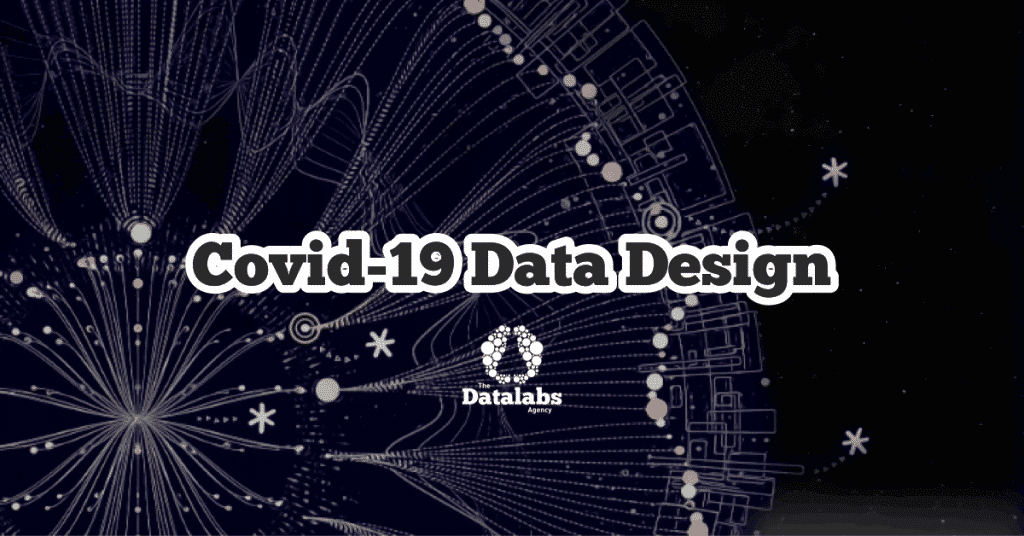
Where I live, it seems to be paper-based, paired with a non-functioning mobile app that gives me a false sense of confidence. This image, a beautiful modified network graph is how The Datalabs Agency sees contact tracing.

Covid-19 Data Visualization Designers

If you work in a government organization that deals with contact tracing or know of someone who does, get in touch, forward this on, or contact us here.

0 Comments
  • automation
  • big data
  • business intelligence
  • chart types
  • data dashboards
  • data scientists
  • data visualization
  • Federal Government
0 Like!
Share
Otto Ottinger

Leave a reply

Click here to cancel reply.

Data Visualization Training: Workshops & Courses

Shop Online for Data Visualization

  • Image of a man using our Power BI templates to design a report
    Power BI Templates
    Select options
  • Image of our custom Power BI Theme on a computer
    Power BI Theme and Style Guide
    Select options
  • An Introduction to Data Visualization and Storytelling Course
    An Introduction to Data Visualization and Storytelling Course
    Add to cart
  • Photo of a data visualization consultant advising clients and helping solve design issues.
    Data Visualization Consultant
    Buy product
  • Designing Great Dashboards Course
    Designing Great Dashboards Course
    Add to cart

Style Guides for Data?

A photo of our data viz style guide for Microsoft Power BI

Data Visualization & Storytelling Group Workshops

Contact Us

  • This field is for validation purposes and should be left unchanged.

From Our Blog

  • 8 Incredible Examples of Interactive Data Visualization
  • Data Analytics Conferences 2024 & 2025
  • Data Visualization & Design Conferences 2024 & 2025
  • Case-study: Intranet Dashboard Design for Nestlé
  • Dashboard Tips: 3 Alternatives To Using A Data Table
  • Data Visualization Training
  • Brand Guidelines for Data
  • Online Courses & Products
© 2024 Data Arts Pty Ltd
logo

We noticed you're visiting from Australia. We've updated our prices to Australian dollar for your shopping convenience. Use United States (US) dollar instead. Dismiss