hello@datalabsagency.com
logo
Datalabs Agency
0
logo
  • Data Viz Design
    • Power BI Dashboards Designs
    • Tableau Dashboards Designs
    • Infographic Reports
    • Animated Data Videos
    • Interactive Data Visualizations
    • Maps & Cartography
    • Digital Annual Reports & Microsites
    • Case Studies
  • Training Workshops
    • Our Five Main Workshops
      • Introduction to Data Visualization: Tools & Techniques Workshop
      • Designing Great Business Dashboards Workshop
      • Infographic & Report Design Workshop
      • Creative Data Presentations with PowerPoint
      • Creative Power BI Dashboard Design
    • Online Courses
      • An Introduction to Data Visualization & Storytelling
      • Designing Great Dashboards
  • Style Guides for Data
    • Power BI Style Guides
    • Tableau Style Guides
  • Shop
    • Power BI Templates
    • Power BI Theme and Style Guide
    • An Introduction to Data Visualization and Storytelling Course
    • Designing Great Dashboards Course
    • Data Visualization Consultant
  • Blog
  • Contact Us
    • About Our Data Visualization Agency
  • My account
Prev
PIe 0
Should You Use A Pie Chart?
16 April 2018
Next
0
Department of Education and Training Child Care Subsidy Estimator
16 July 2018
Articles
Case Study: Rewilding Australia Map
July 16, 2018 by Datalabs in Articles

Mapping Intelligence: Helping Wildlife in Australia

rewilding-1.jpg

About the Rewilding Mapping Project

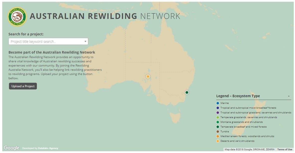
  • The interactive map is designed with d3 and Google Maps
  • Showcases the current projects the organization is working on
  • Allows the public to visualize, and interact with, their projects
  • Pulls data from Google API and a custom backend that allows the user to populate a ‘project’ that will appear on the map
  • Interactive map combined with data visualization
  • Now a centerpiece of their website

Who:

Rewilding

What:

Interactive Map

When:

September 2017

Why:

If you’ve got a project that works with locations or maps, geo-mapping, and geospatial data visualizations are the way to go. These may sound like fancy terms, but in essence what it really means is interactive maps work.

Why? Because clients and their customers alike enjoy maps, and they like them even more if they can play around with them. This in turn means engagement with your brand or business. With a project like Rewilding Australia’s, showing data with a map just made sense. Making it interactive made it fun, and together, it means increasing interaction with your website and the information you want to share with your audience.

How:

The map is interactive and the user can explore the region by the different projects (animal releases) by location. They can see the same data breakdown across the chosen region. The map uses customer PHP to integrate with Google Maps API. The admin can then verify the project, check the details, and approve the entry onto the map. We built this without a CMS due to time and budget constraints, instead opting for a web form that captured the data in a lightweight database could then populate the map. 

The Result:

With an interactive map now live on their website, Rewilding Australia has increased the amount of interactive media on their site tenfold, thus bringing their website into a whole new realm of web-interactivity. As well as being visually appealing, the project map also invites and encourages more engagement with visitors to the site, which in turn, means more page views, and hopefully, more help for the rewilding of native Australian animals across the country!


Maps help solve big, messy data problems! Check out our Maps & Cartography page for more info.

If your business or brand could use an interactive map,

head straight to our inbox at hello@datalabsagency.com

or simply click Contact Us in our website navigation to access our online form.


0 Comments
  • environment
  • interactive content
  • Interactive Microsite
  • mapping
  • science
0 Like!
Share
Datalabs

Leave a reply

Click here to cancel reply.

Style Guides for Data?

A photo of our data viz style guide for Microsoft Power BI

See Our Data Visualization Workshops

Learn Online: An Intro to Data Viz & Storytelling Course

Shop Online for Data Visualization

  • Image of a man using our Power BI templates to design a report
    Power BI Templates
    Select options
  • Image of our custom Power BI Theme on a computer
    Power BI Theme and Style Guide
    Select options
  • An Introduction to Data Visualization and Storytelling Course
    An Introduction to Data Visualization and Storytelling Course
    Add to cart
  • Photo of a data visualization consultant advising clients and helping solve design issues.
    Data Visualization Consultant
    Read more
  • Designing Great Dashboards Course
    Designing Great Dashboards Course
    Add to cart

From Our Blog

  • Dashboard Users and Audiences: A Designing Great Dashboards Guide
  • Data Analytics Conferences 2022
  • Data Visualization Conferences 2022
  • New Online Course for Designing Great Dashboards
  • New Workspaces for Rent at Jack’s Magazine

What We're Known For

  • Data Visualization Training
  • Brand Guidelines for Data
  • Online Courses & Products

Stay Informed about Data Visualization

Stay in Our Social Circles

© 2022 Data Arts Pty Ltd
logo