


Case Study: Medical Research Infographic
Who:
What:
When:
Why:
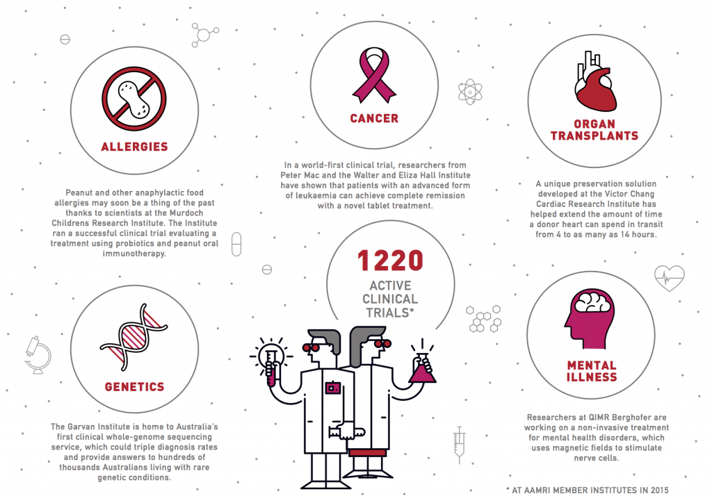
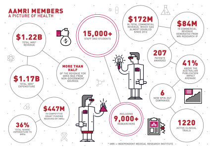
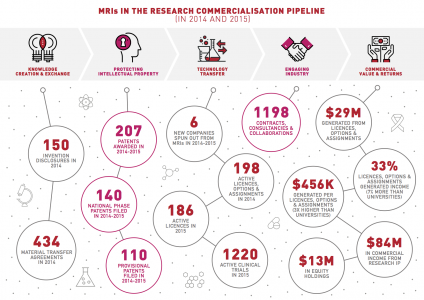
The team at the Association of Australian Medical Research Institutes (AAMRI) is the peak body representing medical research institutes (MRIs) across Australia. AAMRI works to improve the policy landscape for medical research in Australia and promote the important role medical research plays in the health and wealth of all Australians. AMRI’s members research in almost all areas of human health. The team at AAMRI was developing a 2016 AAMRI member report, to highlight the success of their members, and outline the “DNA” of their member workforce.
To demonstrate the return on investment in health and medical research, AAMRI wanted to showcase the progress their members have made. The consolidation of medical research achievements would help legitimize and personalize their tangible aims and objectives but they also needed to keep their audience engaged. And so it was that AAMRI approached us to weave in some creative design, and personification to their infographic report.
How:
The majority of the 2016 report was designed by a different design company. It was very data-driven and was led by AAMRI’s pre-existing style and brand guidelines.
The Datalabs Agency’s mission was to design three separate infographics that would be three key highlights of the year’s work. These would be spread out across the 22-page report and, essentially, act as chapter summaries that would provide context to the expanded data throughout the report.
As the rest of the report was quite data-heavy, the infographics needed to provide some contrast. To achieve this, the design contained simple character illustrations and icons. The copy was reduced substantially to give the reader reason to drive further into the report. As the main report was still in design, our team used the style and brand guidelines of AAMRI to keep the design style aligned.
The final product was developed out of three design drafts, the third being the magical final number. Each design went through three drafts, and the process took around two weeks in total.
The Result:
Research data can be quite full-on, visually. Simple illustrations break up content, giving the audience space to appreciate the narrative of the data and stay engaged.
The report showcased the amazing work the researchers did by members of the Association of Australian Medical Research Institutes. Millions of humans across Australia and the globe have a lot to thank organizations like these, and they might not even know it yet!
Get recognized for your work! You deserve the recognition of your success. So give your success the memorable, beautiful, and engaging design it deserves!
Interested in what we do?
Get in touch with us directly by emailing hello@datalabsagency.com
or by clicking the Contact Us link in the navigation.