hello@datalabsagency.com
logo
Datalabs Agency
En
  • De
  • Ar
0
logo
  • Data Training
    • Our Six Main Workshops
      • Introduction to Data Visualization: Tools & Techniques Workshop
      • Designing Great Business Dashboards Workshop
      • Infographics & Report Design Workshop
      • Creative Data Presentations with PowerPoint
      • Visual Storytelling for Government Workshop
      • Creative Power BI Dashboard Design
    • Online Courses
      • An Introduction to Data Visualization & Storytelling
      • Designing Great Dashboards
  • Data Design
    • Style Guides
      • Power BI Style Guides
      • Tableau Style Guides
    • Animated Data Videos
    • Maps & Cartography
    • Interactive Infographics
    • Power BI Dashboards Designs
    • Tableau Dashboards Designs
    • Infographic Reports
    • Interactive Data Visualizations
    • Digital Annual Reports & Microsites
  • Case Studies
  • Shop
    • Ecommerce Products
      • Power BI Templates
      • Power BI Theme and Style Guide
      • An Introduction to Data Visualization and Storytelling Course
      • Designing Great Dashboards Course
      • Data Visualization Consultant
  • Login
  • Contact
    • About
      • Otto Ottinger
      • Blog
0
6 Awesome Marketing Dashboards
25 November 2016
FiveThirtyEight’s 2016 Election Forecast 0
The 2016 US Election: Beautifully Clear Data Visualization
02 December 2016
Communications
Case Study: IWDA Annual Report Microsite
November 30, 2016 by Datalabs in Communications

IWDA Annual Report Microsite Case Study

See an example of Datalabs’ digital annual report designs.

Who:

International Women’s Development Agency (IWDA)

What:

Digital Annual Report

How Long:

Six weeks (including map)

IDWA Interactive Annual Report Microsite

Why:

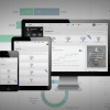
International Women’s Development Agency (IWDA) was looking to make the transition to the digital realm for the 2016 IWDA Annual Report. In previous years, they had distributed their yearly report in a print and PDF format. Datalabs definitely still believes in the need for written publication (even in the ever-increasing digital age), but what better way to bring your data to life than by adding some interactivity? Therefore, this year IWDA decided they wanted to expand their online reach and develop a microsite in tandem with the printed 2016 Annual Report.

How:

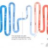
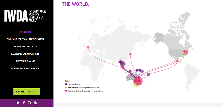
The agency briefed us on a simple vertical scrolling microsite. Overall, it required minimal interactivity, and navigation across 6 pages. Except for a map, which required a zooming functionality, and an animation that demonstrated the IWDA spread across the world.
interactive accordion on microsite

We designed and built the site on WordPress, allowing us to implement design, content, and functionality feedback simultaneously.

As the microsite would live as an add-on to the existing IWDA website, we matched the design style to the current site, so they would be cohesive in design.

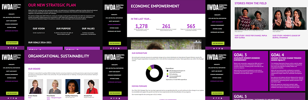
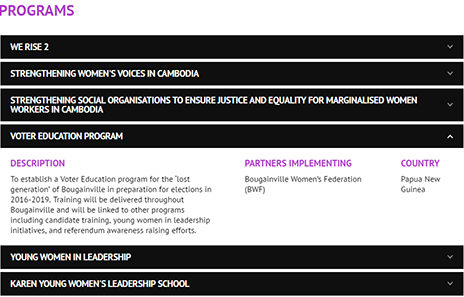
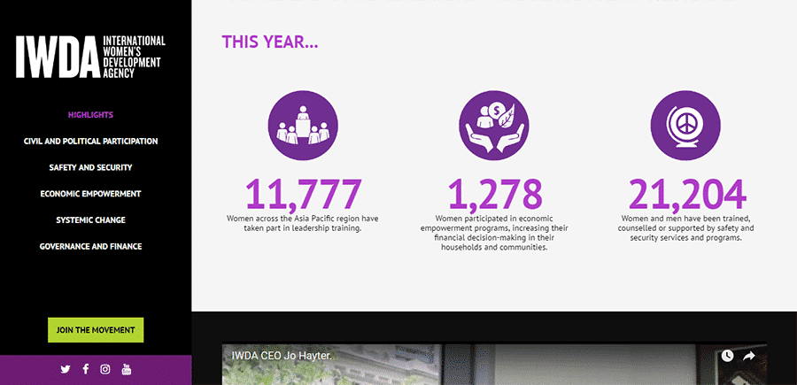
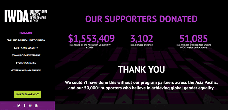
Simple animations and transitions were employed to give UX to the content. Accordion elements allowed the ability to condense areas of larger content, while icons and photos gave the written content breathing space and context.

The result:

IWDA Microsite
IWDA Microsite
IWDA Microsite
IWDA Microsite
IWDA Microsite
IWDA Microsite

IWDA Microsite
IWDA Microsite

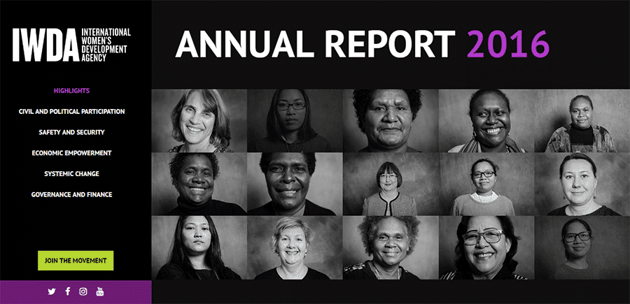
IWDA’s Digital Annual Report

Overall, the microsite design reflects not only the important values and work of the IWDA; it represents who they are. When it comes to presenting the work of organizations such as the International Women’s Development Agency, it is integral that you retain the humanity of the data.

At the Datalabs Agency, we strongly believe in equality for all genders, lifestyles, cultures, religions, and ethnicity. We are all here on this little blue planet; is it really so crazy to think that we all deserve the right to equal happiness? We don’t think so, and we will do what we can when we can to spread those good values!


Considering going digital with your annual report? Do it! Come with us on a magical journey to the digital realm! It’s lovely this time of year!

Get in touch with us directly by emailing hello@datalabsagency.com
or by clicking the Contact Us link in the navigation.


0 Comments
  • animation
  • annual reports
  • Interactive Microsite
  • mapping
  • nonprofits
  • year in review
0 Like!
Share
Datalabs

Data Visualization Training: Workshops & Courses

Shop Online for Data Visualization

  • Image of a man using our Power BI templates to design a report
    Power BI Templates
    Select options
  • Image of our custom Power BI Theme on a computer
    Power BI Theme and Style Guide
    Select options
  • An Introduction to Data Visualization and Storytelling Course
    An Introduction to Data Visualization and Storytelling Course
    Add to cart
  • Photo of a data visualization consultant advising clients and helping solve design issues.
    Data Visualization Consultant
    Buy product
  • Designing Great Dashboards Course
    Designing Great Dashboards Course
    Add to cart

Style Guides for Data?

A photo of our data viz style guide for Microsoft Power BI

Data Visualization & Storytelling Group Workshops

Contact Us

  • This field is for validation purposes and should be left unchanged.

From Our Blog

  • 8 Incredible Examples of Interactive Data Visualization
  • Data Analytics Conferences 2024 & 2025
  • Data Visualization & Design Conferences 2024 & 2025
  • Case-study: Intranet Dashboard Design for Nestlé
  • Dashboard Tips: 3 Alternatives To Using A Data Table
  • Data Visualization Training
  • Brand Guidelines for Data
  • Online Courses & Products
© 2024 Data Arts Pty Ltd
logo

We noticed you're visiting from Australia. We've updated our prices to Australian dollar for your shopping convenience. Use United States (US) dollar instead. Dismiss