AU: +61 (03) 9191 3383 US: +1 (650) 646-3793hello@datalabsagency.com
logo
Datalabs Agency
0
logo
  • Data Viz Design
    • Power BI Dashboards Designs
    • Tableau Dashboards Designs
    • Infographic Reports
    • Animated Data Videos
    • Interactive Data Visualizations
    • Maps & Cartography
    • Digital Annual Reports & Microsites
    • Case Studies
  • Training Workshops
    • Our Five Main Workshops
      • Introduction to Data Visualization: Tools & Techniques Workshop
      • Designing Great Business Dashboards Workshop
      • Infographic & Report Design Workshop
      • Creative Data Presentations with PowerPoint
      • Creative Power BI Dashboard Design
    • Online Courses
      • An Introduction to Data Visualization & Storytelling
      • Designing Great Dashboards
  • Style Guides for Data
    • Power BI Style Guides
    • Tableau Style Guides
  • Shop
    • Power BI Templates
    • Power BI Theme and Style Guide
    • An Introduction to Data Visualization and Storytelling Course
    • Designing Great Dashboards Course
    • Data Visualization Consultant
  • Blog
  • Contact Us
    • About Our Data Visualization Agency
  • My account
Prev
User-Journey-Data-Visualisation 0
Case Study: Monash Health Interactive Timeline Tool
18 August 2016
Next
Strategy Consultancy Data Visualization Boston Image 0
Data Visualization Strategy
28 September 2016
Articles
Amazing Microsite & Interactive Experience
August 19, 2016 by Datalabs in Articles

A Killer Microsite & Interactive Web Design Experience That Will Inspire You!

Microsite and interactive data tool that is the future of data design

If a good infographic tells a story, then an equally great interactive data visualization is an experience that allows the user to dive into the data to create their own experience, by getting to ‘play’ with the data, or going on a guided interactive journey.

For those that are curious, a microsite is a smaller or auxiliary website, often contained within another site, that exists for a single or targeted purpose. For example, sustainable annual reports (like the ones we make here) or to house a report like (this one we made for Finisia).

Data Visualisation Tool
Is It Better to Rent or Buy?

In no particular order, here are our favourite interactive microsites at the moment.

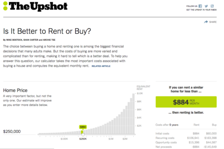
Rent or Buy? – New York Times

It’s a simple data tool designed to allow the user to plug in relevant data about their circumstances, and calculate if it’s better to rent or buy property according to their current and projected state. This one might not be the most visually impressive one on the list, it does take a lot of data and convey it very, very clearly within a simple and highly usable interface.


Looking for a microsite of your very own? Click here for our digital annual reports page

0 Comments
  • data visualization
  • interactive content
  • Interactive Microsite
  • New York Times
  • tools
0 Like!
Share
Datalabs

Style Guides for Data?

A photo of our data viz style guide for Microsoft Power BI

See Our Data Visualization Workshops

Learn Online: An Intro to Data Viz & Storytelling Course

Shop Online for Data Visualization

  • Image of a man using our Power BI templates to design a report
    Power BI Templates
    Select options
  • Image of our custom Power BI Theme on a computer
    Power BI Theme and Style Guide
    Select options
  • An Introduction to Data Visualization and Storytelling Course
    An Introduction to Data Visualization and Storytelling Course
    Add to cart
  • Photo of a data visualization consultant advising clients and helping solve design issues.
    Data Visualization Consultant
    Read more
  • Designing Great Dashboards Course
    Designing Great Dashboards Course
    Add to cart

From Our Blog

  • Data Analytics Conferences 2022
  • Data Visualization Conferences 2022
  • New Online Course for Designing Great Dashboards
  • New Workspaces for Rent at Jack’s Magazine
  • Your Guide to Data Visualization Conferences in 2021

What We're Known For

  • Data Visualization Training
  • Brand Guidelines for Data
  • Online Courses & Products

Stay Informed about Data Visualization

Stay in Our Social Circles

© 2021 Data Arts Pty Ltd
logo