hello@datalabsagency.com
logo
Datalabs Agency
0
logo
  • Data Viz Design
    • Power BI Dashboards Designs
    • Tableau Dashboards Designs
    • Infographic Reports
    • Animated Data Videos
    • Interactive Data Visualizations
    • Maps & Cartography
    • Digital Annual Reports & Microsites
    • Case Studies
  • Training Workshops
    • Our Five Main Workshops
      • Introduction to Data Visualization: Tools & Techniques Workshop
      • Designing Great Business Dashboards Workshop
      • Infographic & Report Design Workshop
      • Creative Data Presentations with PowerPoint
      • Creative Power BI Dashboard Design
    • Online Courses
      • An Introduction to Data Visualization & Storytelling
      • Designing Great Dashboards
  • Style Guides for Data
    • Power BI Style Guides
    • Tableau Style Guides
  • Shop
    • Power BI Templates
    • Power BI Theme and Style Guide
    • An Introduction to Data Visualization and Storytelling Course
    • Designing Great Dashboards Course
    • Data Visualization Consultant
  • Blog
  • Contact Us
    • About Our Data Visualization Agency
  • My account
Prev
Essential expertise for a data visualisation agency 0
Better Decisions Through Visual Analytics.
21 March 2016
Next
Digital Annual Report Design - Datalabs 2015 0
Digital Annual Report Designs That Don’t Suck
31 March 2016
Articles
Infographic Case Study
March 30, 2016 by Datalabs in Articles

Datalabs were hired to create an infographic to visualise data from a client’s HR survey.

This is a quick run down of how we went about designing and developing the infographic

Who

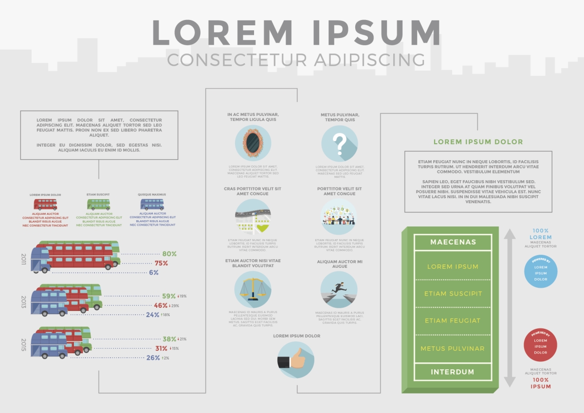
A large Australian and New Zealand food manufacturer engaged Datalabs to visualize a set of survey results undertaken by their human resources department and an external consultancy. The needed a visually engaging infographic with text explaining their progress and statistics with a visually engaging and easily understood format. The survey results were positive but they were not engaging and were unlikely to be read by the staff who’d undertaken the survey.

What

We were tasked with creating an infographic with similar images to those used in the original survey collateral to make sure they were recognizable from the original material. We were given a mock-up in a Word document with stock photo’s that our designer reinterpreted and created icons & graphics. We chose to present the information in two ways both horizontally and vertically (traditional infographic or web-based format) so they could be printed on A3 & send via email & social media.

Why

We visualized the current state, how things had improved, and how they were tracking to keep that improvement going throughout the business. This took on a flow chart view as the data had a narrative that changed over time and that had a natural timeline style. Additionally, we needed to convey data & survey results which meant having a big opening statement that conveyed the data changes with interesting visuals.[/one_third_last]

Wide Print Infographic

Short Infographic Design

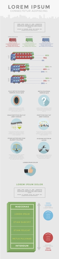
Long Version Infographic

We love designing infographics – story based or data driven. If you’re thinking about one, get in touch and we’ll talk you through our process.

0 Comments
  • Australia
  • food supplies
  • human resources
  • infographics
0 Like!
Share
Datalabs

Style Guides for Data?

A photo of our data viz style guide for Microsoft Power BI

See Our Data Visualization Workshops

Learn Online: An Intro to Data Viz & Storytelling Course

Shop Online for Data Visualization

  • Image of a man using our Power BI templates to design a report
    Power BI Templates
    Select options
  • Image of our custom Power BI Theme on a computer
    Power BI Theme and Style Guide
    Select options
  • An Introduction to Data Visualization and Storytelling Course
    An Introduction to Data Visualization and Storytelling Course
    Add to cart
  • Photo of a data visualization consultant advising clients and helping solve design issues.
    Data Visualization Consultant
    Read more
  • Designing Great Dashboards Course
    Designing Great Dashboards Course
    Add to cart

From Our Blog

  • Dashboard Users and Audiences: A Designing Great Dashboards Guide
  • Data Analytics Conferences 2022
  • Data Visualization Conferences 2022
  • New Online Course for Designing Great Dashboards
  • New Workspaces for Rent at Jack’s Magazine

What We're Known For

  • Data Visualization Training
  • Brand Guidelines for Data
  • Online Courses & Products

Stay Informed about Data Visualization

Stay in Our Social Circles

© 2022 Data Arts Pty Ltd
logo