hello@datalabsagency.com
logo
Datalabs Agency
En
  • De
  • Ar
0
logo
  • Data Training
    • Our Six Main Workshops
      • Introduction to Data Visualization: Tools & Techniques Workshop
      • Designing Great Business Dashboards Workshop
      • Infographics & Report Design Workshop
      • Creative Data Presentations with PowerPoint
      • Visual Storytelling for Government Workshop
      • Creative Power BI Dashboard Design
    • Online Courses
      • An Introduction to Data Visualization & Storytelling
      • Designing Great Dashboards
  • Data Design
    • Style Guides
      • Power BI Style Guides
      • Tableau Style Guides
    • Animated Data Videos
    • Maps & Cartography
    • Interactive Infographics
    • Power BI Dashboards Designs
    • Tableau Dashboards Designs
    • Infographic Reports
    • Interactive Data Visualizations
    • Digital Annual Reports & Microsites
  • Case Studies
  • Shop
    • Ecommerce Products
      • Power BI Templates
      • Power BI Theme and Style Guide
      • An Introduction to Data Visualization and Storytelling Course
      • Designing Great Dashboards Course
      • Data Visualization Consultant
  • Login
  • Contact
    • About
      • Otto Ottinger
      • Blog
Website Designer 0
Annual General Meetings & Annual Reports
02 August 2014
Xero Infographic Report Thumb 0
Xero Infographic Report Designed by Datalabs
26 August 2014
Reporting
Sales Reports & Dashboards
August 2, 2014 by Datalabs in Reporting

Infographic Sales Reports and Business Dashboards Image

Salespeople and their managers are extremely time-poor and extremely focused on their job: selling.

They don’t have a lot of time to read through endless sales reports or to click through tab-after-tab of Excel spreadsheets. They need to see their sales totals, their effectiveness at closing deals, and their performance to target. Even more importantly from their managers’ perspectives is how they can improve, what methods are effective, and what does the future bring.

Data Visualisation Idea

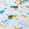
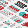
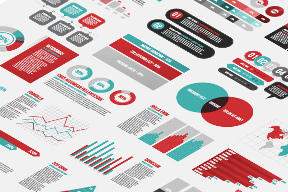
Why not send out a personalised infographic sales report, tailored individually to each sales person? One beautiful sheet of visualised data, detailing all the key performance indicators (KPIs), targets, volumes, opportunities for future sales, and team performance metrics. Design it simply, beautifully — give them a visual that values their intelligence and their ability to make tactical adjustments of their sales methods, on the types of leads they pursue, and of the product mix which they sell. Do this and you’re sure to lift moral, and most importantly your sales effectiveness. Sales numbers are good; visualised sale insights are better.

Implementation

Datalabs is skilled in the psychology and interpretation of data. Salespeople are looking to incentivised, looking to get better, looking for the ‘inside track’ to understanding where their next lead might come from. The answer is in your data. But your current reports are hiding those answers. Datalabs has worked with numerous sales teams and sales organisations. We can help unlock the insights that are in your Customer Relationship Management (CRM) database. We can analyse the qualified leads from your marketing automation software or your digital marketing data. And when we do we can design your sales force the best, most insightful interface, a business intelligence dashboard that communicates quickly the need-to-know-now data and also allows for users to model sales scenarios, like increasing margins, the impact of discounting, or possibly the expansion into new markets or products.

Products and Services Used in this Data Visualisation Idea

Data Analysis, Infographic Reports, Business Intelligence Dashboards

0 Comments
  • analytics
  • data visualization
  • sales effectiveness
  • sales reporting
  • visual reports
0 Like!
Share
Datalabs

Data Visualization Training: Workshops & Courses

Shop Online for Data Visualization

  • Image of a man using our Power BI templates to design a report
    Power BI Templates
    Select options
  • Image of our custom Power BI Theme on a computer
    Power BI Theme and Style Guide
    Select options
  • An Introduction to Data Visualization and Storytelling Course
    An Introduction to Data Visualization and Storytelling Course
    Add to cart
  • Photo of a data visualization consultant advising clients and helping solve design issues.
    Data Visualization Consultant
    Buy product
  • Designing Great Dashboards Course
    Designing Great Dashboards Course
    Add to cart

Style Guides for Data?

A photo of our data viz style guide for Microsoft Power BI

Data Visualization & Storytelling Group Workshops

Contact Us

  • This field is for validation purposes and should be left unchanged.

From Our Blog

  • 8 Incredible Examples of Interactive Data Visualization
  • Data Analytics Conferences 2024 & 2025
  • Data Visualization & Design Conferences 2024 & 2025
  • Case-study: Intranet Dashboard Design for Nestlé
  • Dashboard Tips: 3 Alternatives To Using A Data Table
  • Data Visualization Training
  • Brand Guidelines for Data
  • Online Courses & Products
© 2024 Data Arts Pty Ltd
logo