Data Visualization Consultant

Get expert advice on data visualization from our agency's Managing Director.

Do you need a part-time data visualization consultant? Or one-time advice from an experienced data visualizer?


Some data design projects need an outside resource to fill in where there are gaps in knowledge or experience. We offer our most experienced data visualization consultants to clients around the world. Whether it’s a Power BI dashboard design that just doesn’t look right or a need to think “outside of the box” for a big report, having a consultant on tap to answer questions, suggest alternatives, or solve design issues can be handy.


Book a data visualization consultant and get the opinion of a professional data visualizer on what to change, what to throw out, and what to keep in your data design. Our consultants can review your work, provide feedback on user experience issues, and generally lift up the quality of your work.


So before launching a new dashboard, submitting a business case, or retrofitting an old infographic report, book time with our data visualization consultants and work out the problems and the solutions collaboratively.


Sessions are bookable in one-hour blocks, four hours maximum.

Share

Description

Founder & Managing Director of the Datalabs Agency

Otto Ottinger

John “Otto” Ottinger is a data visualizer, specializing in the visual design of complex data systems. The founder and Managing Director of the Datalabs Agency, a data visualization & consultancy firm, Otto works at the intersection of user experience (UX) design, visual analytics, and storytelling. He started his career as an editor and interactive designer at National Geographic, in Washington, DC.

There he learned the same information design and storytelling techniques that he teaches in his workshops. Now in his role at Datalabs, Otto has gone on to design software, dashboards, infographics, and data tools for clients like Nestlé, Mercedes-Benz, Bupa, BlackRock, Adidas, eBay, Marriott, CommBank, and HCF, among others.

Some of the notable brands Otto has worked with...

Otto Ottinger’s Clients of Note

Icon for the Generative AI Design Workshop

The Right Insights?

Get our honest advice about what insights are useful to your dashboard’s audience.
Icon for data visualization course showing a diagram onlinen

The Best Design?

We’ll suggest the best layout, different charts, & changes to your dashboard’s user experience.
User interaction icon

The Correct Interactions?

Are you using the correct dropdowns, filters, & UI components in your dashboard?

Australia, Europe, & the U.S.A.

KEYNOTES & SPEECHES

Examples of Past...

KEYNOTE SPEECHES

Visualising Economic Data
Reserve Bank of Australia
Cover image of Otto Ottinger's speech at the Reserve Bank of Australia
Sydney, Australia
Data Viz & Storytelling
Rabobank
Slide presentation for Otto Ottinger's Data Visualization & Storytelling speech in Hong Kong
Hong Kong, SAR
Power Of Infographic Design
Australian Academy of Science
Guest Speaker Otto Ottinger's cover slide for a speech about infographics
Canberra, Australia
Visualising Big Data
Big Data & Analytics Summit
Opening slide of Otto Ottinger's Big Data speech in Sydney, Australia
Sydney, Australia

Examples of Past...

Workshops at Company Retreats

Data Journalism
Al Jazeera
Data journalism class teaching infographic design for media professionals
Doha, Qatar
Data Viz & Storytelling
Toyota Australia
Keynote speaker Otto Ottinger's opening slide for a Toyota after sales presentation in Australia
Melbourne, Australia
Data Visualization in Finance
Macquarie Bank
Finance guest speaker Otto Ottinger's speech on banking data
Hong Kong, SAR
Data Viz & Storytelling
Lockheed Martin
Training workshop with the defence industry, opening slide in a presentation by Datalabs
Washington, DC
Training & Workshops

Infographics & Report Design

Team Workshop

Image
Learn the methods to designing professional infographics.

Intro to Data Viz & Storytelling

Team Workshop

Image
Learn the fundamentals and advance to the next level.

The Design of Visual Analytics & Complex Systems

DATA VISUALIZER

Establishing a Data Design Philosophy with the Datalabs Agency

Australian/American Data Visualizer

The best part about running a data agency is the breadth of clients and industry challenges to work with. By “breadth of clients” I mean it runs the gamut of Fortune 500, NASDAQ, and ASX 200 (Australia’s equivalent). Plus, this agency takes me to the Middle East, Africa, and Europe. This leads me to my second favorite part: “Industry challenges.” These same companies — no matter if they work in banking, energy, manufacturing, or education — have similar problems.

The data couldn’t be more different. However, what gets put to me is always a similar challenge.

This one challenge I classify and place into three “buckets”: lack of simplicity, lack of creativity, or inability to communicate visually.

So over my 16+ years as a data visualizer, I’ve developed what could be called a data design philosophy and methodology to tackle these three challenges. To me, data visualization paired with visual communication is a human-to-human art form. Along with my data visualization style, this is what gives a Datalabs Agency piece of work a distinct look and feel.

This same philosophy is also why clients around the globe come to me.

Examples of Past...

DATA VISUALIZATION DESIGN

Global Sales Analytics
Mercedes-Benz
Image of a car, symbol of the sales dashboards the data visualizer Otto Ottinger designed
Stuttgart, Germany
Revenue Dashboards, APAC
Mariott Hotels
Image of luxury hotel landscape design
Hong Kong, SAR
Silicon Chip Manufacturing
Intel
Visualization of a silicon chip design from San Francisco, California
San Francisco, California
Visualizing Procurement Data
Adidas
Photograph of women's athletic shoes from Adidas
Herzogenrauch, Germany

What Do You Want From a Data Visualization Consultant?

Icon for the Generative AI Design Workshop

Time With a Data Visualization Expert

Book an hour or secure a half day. Soon your session with us with get at the core of your dashboard’s problems.
Icon for Data Visualization Workshop: Infographic and Report Design

A Visual Critique

You’ll receive our recommendations on a visually-annotated PDF — everything from chart changes to icon ideas to layout and grid tweaks.

Our data visualization consultants have seen a lot of bad dashboards, reports, and infographics. We know how to solve common design problems and quickly arrive at better choices in charts, insights, layouts, data strategies — you name it. Most importantly, if you seek our advice, we can get your project moving again in the right direction.

What is a Data Visualization Consultant?

A data visualization consultant is a professional data visualizer, hired give advice or a second opinion on the user experience (UX) and the user interface (UI) of a business intelligence dashboard, infographic report, or interactive application.

The Datalabs Agency brings over twelve years of analytics and data visualization design experience. We’ll bring relevant advice, workarounds, and solutions from our portfolio of past client projects. We can suggest options and solve big problems in the usability, structure, and visualizations found in your existing project. We can also discuss the challenges found in your teams’ workflow and abilities when comes to visualizing data. And finally, we have a vast knowledge of the tools and the software that you may be using, be it Power BI, PowerPoint, or Tableau.

Dashboard design sketch in black and white
Final dashboard design from our critique and review process
Map designer's marker
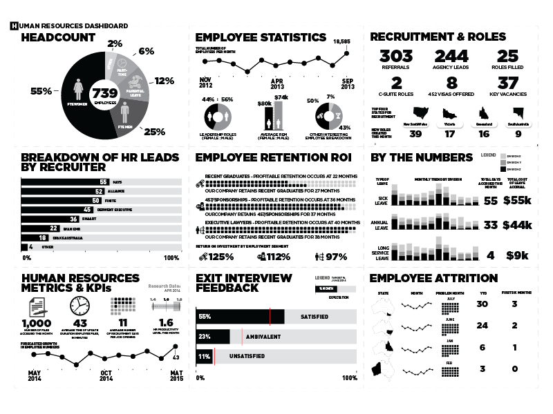
ABOVE: Drag the yellow icon found at the center of the image. This is a before-and-after example of a dashboard design one of our data visualization consultants helped with.

Visualize a Great Hire

Looking for a data visualization consultant?

"*" indicates required fields

Name*
This field is for validation purposes and should be left unchanged.

View The Datalabs Agency’s digital product and services terms and conditions and the Data Arts privacy policy.

Additional information

Facilitator

Otto Ottinger, Managing Director

Services

Dashboard design audit, user interface review, critique of dashboard's interactions, recommendations for charts & graphs, redesign suggestions

Video Conferencing Software

Zoom, Microsoft Teams

You may also like…

An all-in-one package containing tools, guidance, and assets to design great dashboards
$519.00$1,196.00
Get the best grids, layouts, navigation, and UI components for your dashboards.
$1,260.00$2,216.00