


Top 5 Data Visualization Trends
If you’re wondering what we can expect in data viz this year, you’re in the right place.
When it comes to data visualization, your audience (colleague, customer, client, reader – whoever!) is key. And in the current year and beyond, it’s what the viewer wants that will shape data viz trends. That is, while we might have all the data, the way we need to present that data to satisfy consumer demands is constantly changing.
So, what’s going to change? And is your business or brand ready for these expectations? Find out – here are our top 5 picks for trends that will change data visualization in 2018…
1. Interactive Maps as Standard
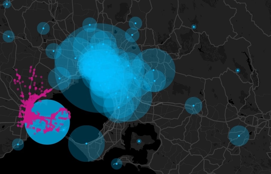
If your brand or business is already using interactive maps to share your data, then great. If not, you’re behind the trend. Interactive maps aren’t the next big thing – they’re already industry standard. They’re expected. People love maps, and people love interacting with them. This, of course, isn’t old news for interactive map developers like us, but the popularity of these maps is! For everyone else, embrace the game-like fun of interactive cartography. Most of all, expect to see more interactive maps than ever before! Because this trend, for a lot of people, is just catching up to itself.
2. It’s All About Stories
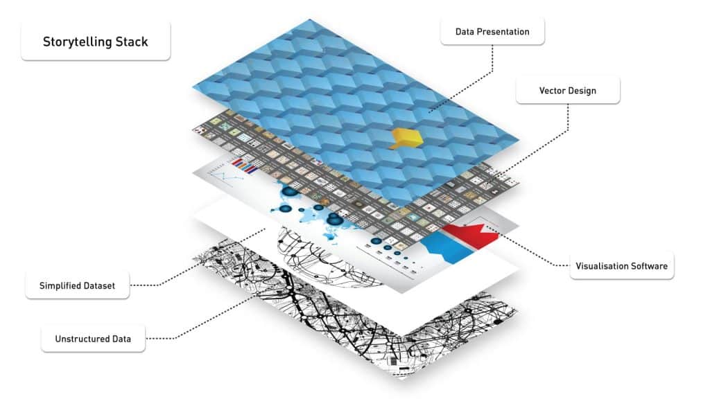
It’s no surprise us humans love stories. And while we can’t be sure of our AI readers’ interests just yet (who knows?), it’s this incorporation of stories into data viz that audiences are loving. We know as data viz creators that a data viz without context is essentially an image with a number on it or a well-formatted table at best. But context helps shape the data we’re sharing and provides even more insight to allows us to tell the story we need to tell. This isn’t a new concept, and in fact, it’s now an expectation. Audiences are now expecting more complex data viz stories (read: more complex data) being synthesized and presented in a way that they understand and in a way that uncovers the insights ‘chapter’ by ‘chapter’. Think more than one data viz type, a whole presentation, custom experiences, storytelling with data. Simple stories from complex data may be no easy task, but if you can get it right, you’ll be leaps and bounds ahead of your competition.
3. Data Viz in Journalism
Well, the newspaper hasn’t died just yet, but there’s no doubt that journalism continues to evolve and change. And one change you can bet on is seeing more data viz in your paper. Why? Well, think about it. News journalism articles are getting shorter and shorter – we’re busier than ever before and have attention spans equivalent to a gold fish’s – yet, the same amount of information still needs to be presented in an article somehow. And, as us data viz folk know, data visualization is a great way of doing this. Not only does data viz take up less screen space, it also synthesizes and condenses information in a way that gives us, the reader, more time. Essentially, it’s learning more in less time – it’s intuitive. Editors love it, and so do readers, so editors love it even more. So, there you go. You’ll be seeing more data viz than ever before while you’re sipping your cup of morning coffee. Who doesn’t like data viz in the morning?
4. Mobile-Friendly Data Viz
Well, it’s news to nobody that we spend a lot of time on our phones. More than ever before, we’re reading the news and accessing web content on our phones, so, of course, the data we’re looking at should be compatible with how we’re viewing it. A big part of this, given its movement into journalism (see above), is data viz. People are well and truly expecting to view great data viz on their phones, even if their screens are a lot smaller than a computer’s. The reality is, without embracing the mobile audience, you’re leaving a lot of your potential audience behind. So what’s the solution? Well, many vendors are now working on adapting their entire desktop experiences to comfortably fit the tiny world of smartphones. And just last year, Apple acquired Mapsense, a mobile data viz startup for US$30 million. So, yeah, we’re betting that making data viz ‘work’ on smartphones will become a basic requirement in 2018.
5. Virtual and Mixed Reality
Okay, so, picture this. Data viz. But in 3D. That’s it! That’s the future! We’ve already heard so much about how virtual and mixed reality is going to change our lives in the next however-many years, right? Well, there are a lot of people out there – we included – who are thinking this obsession with the third dimension will translate to data viz. That is, imagine how interactive, how engaging, how fun data viz could be if you could experience it? Imagine being in a virtual room and picking up and choosing the subjects and the related data sets you want to explore. We’re excited about this technology ourselves, even if it won’t be this year. But one thing’s for sure – we don’t think Annual Report Data Viz Virtual Reality Rooms (ARDVVR) are too far off into the future. Patent-pending on that name, by the way.
—