hello@datalabsagency.com
logo
Datalabs Agency
En
  • De
  • Ar
0
logo
  • Data Training
    • Our Six Main Workshops
      • Introduction to Data Visualization: Tools & Techniques Workshop
      • Designing Great Business Dashboards Workshop
      • Infographics & Report Design Workshop
      • Creative Data Presentations with PowerPoint
      • Visual Storytelling for Government Workshop
      • Creative Power BI Dashboard Design
    • Online Courses
      • An Introduction to Data Visualization & Storytelling
      • Designing Great Dashboards
  • Data Design
    • Style Guides
      • Power BI Style Guides
      • Tableau Style Guides
    • Animated Data Videos
    • Maps & Cartography
    • Interactive Infographics
    • Power BI Dashboards Designs
    • Tableau Dashboards Designs
    • Infographic Reports
    • Interactive Data Visualizations
    • Digital Annual Reports & Microsites
  • Case Studies
  • Shop
    • Ecommerce Products
      • Power BI Templates
      • Power BI Theme and Style Guide
      • An Introduction to Data Visualization and Storytelling Course
      • Designing Great Dashboards Course
      • Data Visualization Consultant
  • Login
  • Contact
    • About
      • Otto Ottinger
      • Blog
Laws of Attraction 0
SEEK Laws of Attraction
14 September 2017
Year in Data Visualization Wrap-up Image 0
A Year in Data Viz
04 December 2017
Articles
Three Interactive Maps
October 26, 2017 by Datalabs in Articles

Three Interactive Data Maps

Data-driven, Interactive & Animated

If you’ve ever spoken to onto the DL team about a project there’s a fair chance we’ve tried to get a map into it somewhere. We like maps. We like the way they can provide scale, context, and navigation in one view. Those are hard things to design for interactive interfaces.

Below are three maps that we’ve built over the past year. They’re very different in design and application.

Simple Animated Map

Animated Map

View live demo >

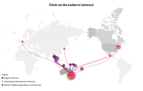
This map was developed as part of the International Women’s Development Agency’s 2016 digital annual report. It was designed to show the reach of programs undertaken by the IWDA, how they link to one another, and also give a little bit of detail on each, with a link out to the various program websites.

It uses d3.js to animate the map and was fully customised in-house. As we knew that the map would be featured within a microsite rather than as a standalone piece, the interactions were created as a rolling animation to seamlessly lift and integrate with the overall annual report site design.

Interactive Data Map

Data Map Victoria
View live demo >

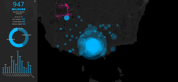
This was an internal sample project that used Victorian road traffic accident data from the Australian Bureau of Statistics. It uses the Google Maps API with a d3.js overlay for the charts and data visualization.

The contrast here is between simple charts detailing demographics on the left and the complex spread of data points and nodes on the map. The map gets less cluttered as you zoom and drill down to locations with the capability to expose individual accidents at that level.

3D Global Trade Routes Map

Interactive 3d Map
View live demo >

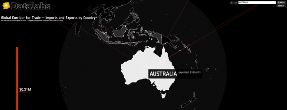
This was made with a Web GI interface and connects to a dataset to show the flow of international supply chain across a 3D globe. The purpose of this was mainly to showcase the capacity of this particular interface, show the flow between trade locations around the world and use the map itself as the navigation for a more explorative user experience.

It illustrates a complex concept of global trade routes simply and elegantly and managed to have a really cool interactive element in controlling the 3D globe.

We have a couple more mapping projects coming up and we look forward to sharing them with you.

0 Comments
  • Australia
  • interactive content
  • Interactive Microsite
  • macroeconomics
  • mapping
  • state of victoria
0 Like!
Share
Datalabs

Data Visualization Training: Workshops & Courses

Shop Online for Data Visualization

  • Image of a man using our Power BI templates to design a report
    Power BI Templates
    Select options
  • Image of our custom Power BI Theme on a computer
    Power BI Theme and Style Guide
    Select options
  • An Introduction to Data Visualization and Storytelling Course
    An Introduction to Data Visualization and Storytelling Course
    Add to cart
  • Photo of a data visualization consultant advising clients and helping solve design issues.
    Data Visualization Consultant
    Buy product
  • Designing Great Dashboards Course
    Designing Great Dashboards Course
    Add to cart

Style Guides for Data?

A photo of our data viz style guide for Microsoft Power BI

Data Visualization & Storytelling Group Workshops

Contact Us

  • This field is for validation purposes and should be left unchanged.

From Our Blog

  • 8 Incredible Examples of Interactive Data Visualization
  • Data Analytics Conferences 2024 & 2025
  • Data Visualization & Design Conferences 2024 & 2025
  • Case-study: Intranet Dashboard Design for Nestlé
  • Dashboard Tips: 3 Alternatives To Using A Data Table
  • Data Visualization Training
  • Brand Guidelines for Data
  • Online Courses & Products
© 2024 Data Arts Pty Ltd
logo

We noticed you're visiting from Australia. We've updated our prices to Australian dollar for your shopping convenience. Use United States (US) dollar instead. Dismiss