


Your field guide to…
DATA VISUALIZATION TYPES
Charts, Formats & Tools
Updated August 2026
So many charts, so little time…
WHICH TYPE OF DATA VISUALIZATION
DOES YOUR STORY ACTUALLY NEED?
Every dataset walks in with a question, and every chart type answers a different one. Comparing categories, tracking change, mapping geography, tracing flows; pick the right visualization type and the audience does almost no work at all.
Pick the wrong one and even good analysis reads like static.
This guide covers the 15 most common types of data visualization we use in client work, grouped into five chart families, then rounds out the picture with the five delivery formats and five tools that dominate the field.
Each entry says what the type is best at and where it falls over.
We built this list from a decade of workshops and studio projects. Skim the family bands, steal the “best for” lines for your next planning meeting, and if events are more your thing, our data visualization conferences guide pairs nicely with it.
Here are the types worth knowing, family by family »
Our workhorses
Which four earn their keep most often?
THE WORKHORSE

Trend, season, shock
THE MAP STAPLE
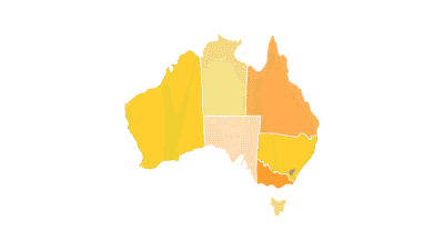
Rates across regions
ALWAYS RUNNING

Live business monitoring
OUR SIGNATURE
Narrative data design
MULTIDIMENSIONAL CHARTS
Pie or Donut Chart
Best for: one whole, few parts
family: charts & graphs

A pie chart splits a single whole into shares your audience can read in two seconds.
Slice count is the whole game. Keep it to five segments or fewer, lead with the biggest share, and the chart does its job before anyone reads a label. The donut variant frees the centre for a headline number, which is why it survives every design fashion cycle.
Once shares get close in size, human eyes stop judging angles well; a humble bar chart beats it there every time.
Histogram
Best for: the shape of one variable
family: charts & graphs
A histogram shows how one measure is distributed, from the runt of the litter to the outliers.
Salary bands, delivery times, response scores; whenever the question is “what is typical and what is extreme?”, this is the chart. Bars touch because the data is continuous, and the bin width you choose quietly decides the story.
Too few bins hides the pattern, too many turns it to noise, so we test several widths before settling.

Scatter Plot
Best for: two measures, hunting a relationship
family: charts & graphs
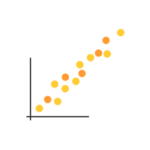
A scatter plot throws every record onto two axes and lets the pattern speak.
Marketing spend against revenue, training hours against error rates; the cloud of dots reveals correlation, clusters and outliers in one view. Colour or size can smuggle in a third variable when the story needs it.
Executives sometimes find raw scatters busy, so we often annotate the two or three dots that carry the argument and let the rest fade to context.
TEMPORAL VISUALIZATIONS
Connected Scatter Plot
Best for: two measures moving through time
family: temporal
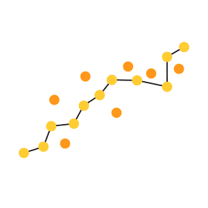
A connected scatter plot traces how two variables travel together, year by year.
Join the dots of a scatter in date order and the chart becomes a path through time: petrol price against consumption, wages against productivity. Loops and reversals appear that neither line chart could show alone.
It rewards an audience willing to slow down, so we save it for reports and long-form pieces, and give it a guided annotation trail.
Polar Area Diagram
Best for: cyclical data with drama
family: temporal

The polar area diagram, Florence Nightingale’s rose, wraps time around a circle.
Each wedge is a period, and its area carries the value, which suits data with a built-in cycle: seasonal sales, monthly admissions, wind by compass point. Done well it is one of the most beautiful chart forms in the canon.
Areas are harder to compare than lengths, so we reserve it for stories where mood matters as much as precision.
Time Series
Best for: anything measured over time
family: temporal
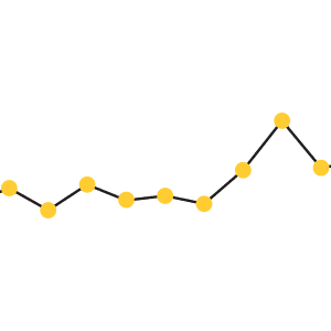
The time series line chart is the workhorse of business reporting everywhere.
Revenue by month, users by week, temperature by decade; a line against a dated axis is the fastest route from spreadsheet to insight, and every stakeholder already knows how to read one. Trend, seasonality and shock all show at a glance.
Our rule: label the lines directly and retire the legend, because eyes should never commute between the two.
MAPS & 2D AREA
Cartogram
Best for: geography reweighted by data
family: maps

A cartogram redraws the map so each region’s size reflects its value, geography be damned.
Population, votes, emissions; when land area misleads, the cartogram inflates and shrinks regions until the data sets the proportions. Election coverage leans on it because empty land does not vote.
The distortion is the message, and it startles audiences in a useful way, though it needs a familiar base map to stay readable.
Choropleth
Best for: rates and ratios across regions
family: maps
A choropleth shades each region by its value, from pale to saturated.
It is the map everyone has seen: unemployment by state, sales by territory, rainfall by council area. The craft hides in the colour scale and in normalising the data, because raw totals just re-draw population.
Show rates per capita and the map starts saying something true.

Dot Distribution Map
Best for: density and spread of events
family: maps
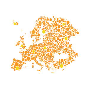
A dot distribution map places one dot per event and lets density do the talking.
Customer locations, incident reports, species sightings; thousands of small dots build a texture of concentration no summary statistic can match. John Snow mapped cholera this way in 1854 and the form has not aged.
Its weakness is overplotting in dense centres, which clustering or transparency usually solves.
HIERARCHICAL CHARTS
Dendrogram
Best for: showing how things cluster
family: hierarchical
A dendrogram is a branching tree that records how items group together, step by step.
Customer segments, survey respondents, gene families; the branch heights show how similar the members of each cluster really are, which makes it the defensible way to present a segmentation.
We bring it out when a client asks “why these segments and why five?”, because the answer is drawn right into the branches.

Ring or Sunburst Chart
Best for: part-to-whole with layers
family: hierarchical

A sunburst chart nests ring inside ring, one level of the hierarchy per band.
Budget to portfolio to project, category to sub-category to SKU; each ring drills a level deeper while the angles keep every slice in proportion to the whole. It rewards interactive drill-down especially well.
Past three rings the labels crowd, so we prune the hierarchy before we draw it.
Tree Diagram
Best for: structures and decisions
family: hierarchical
A tree diagram lays out parent-to-child structure in clean descending levels.
Org charts, decision trees, site maps, taxonomies; whenever one thing contains or leads to others, the tree is the least ambiguous picture available. Readers navigate it without instruction.
Wide flat hierarchies fight the page edge, and a horizontal layout usually settles the argument.

NETWORK VISUALIZATIONS
Alluvial Diagram
Best for: flows between stages
family: network

An alluvial diagram pours quantities from stage to stage in braided streams.
Marketing channel to lead to sale, energy source to use, voter movement between elections; the stream widths carry the volumes and the crossings show the churn. It is the chart we get asked about most after a presentation.
Keep the stages to three or four and the categories under a dozen, and it stays legible.
Node-Link Diagram
Best for: who connects to whom
family: network
A node-link diagram draws entities as dots and relationships as the lines between them.
Stakeholder maps, social graphs, system dependencies; the hubs and bridges jump out the moment the layout settles. Force-directed algorithms do the arranging, and a good one makes structure look inevitable.
Beyond a few hundred nodes it becomes the infamous hairball, and filtering becomes the real design work.

Matrix Chart
Best for: dense networks, no spaghetti
family: network
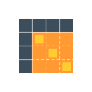
A matrix chart tames a network into a grid, one cell per possible connection.
Where the node-link view melts into spaghetti, the matrix stays calm: rows and columns list the entities and each filled cell marks a link. Sorting the rows well is what reveals the blocks and cliques.
It reads less intuitively at first glance, and it repays the ten seconds of orientation it asks for.
FORMATS
Infographic Report
Best for: narrative data storytelling
format · flat
An infographic report walks a reader through an argument, chart by designed chart.
This is the format the Datalabs Agency is best known for: annual reports, impact summaries and research findings rebuilt as designed narratives where typography, illustration and charts share one grid. A report that people actually read changes what the data achieves.
Think of it as long-form journalism for your numbers.
Dashboard
Best for: live operational monitoring
format · interactive

A dashboard keeps the numbers that run a business on one living screen.
Built in Power BI or Tableau, refreshed on schedule, filtered by whoever is looking; the dashboard answers “how are we tracking right now?” without a meeting. The design discipline is ruthless triage, because a dashboard that shows everything monitors nothing.
Our dashboard design work usually starts by deleting half the tiles a team asked for.
Data Presentation
Best for: the boardroom moment
format · flat
A data presentation puts one chart per slide in service of a spoken argument.
The numbers may live in a dashboard, and the decision still happens in a room. Presentation charts need bigger type, fewer series and a headline that states the takeaway, because the audience reads while listening.
We teach this rebuild in our training workshops; it is the fastest visualization skill upgrade most teams can make.

Interactive Data Visualization
Best for: letting readers explore
format · interactive

An interactive visualization hands the reader the controls: filter, hover, drill.
Public data tools, scrolling explainers and explorable models earn attention that static images cannot, because the reader’s own question drives the view. The craft is guiding exploration so every path lands somewhere meaningful.
We keep a gallery of favourites in our interactive data visualization examples if you want the inspiration tour.
Animated Data Video
Best for: broadcast and social reach
format · motion
An animated data video choreographs charts to a script, a voiceover and a clock.
Motion adds the one thing static charts lack: controlled sequence. A bar race, a growing line or a morphing map delivers the story beat by beat, which is why the format dominates social feeds and conference openers.
Every second is designed, so scripts come first and the charts are storyboarded like film.

TOOLS & SOFTWARE
Tableau
Best for: visual analysis at depth
tool · bi platform

Tableau remains the analyst’s favourite canvas for exploring data visually.
Drag, drop and the chart redraws; that immediacy makes Tableau superb for exploratory analysis and for dashboards with polish. Its calculated fields and level-of-detail expressions go deep once the basics are fluent.
We run Tableau training for teams that own licences and want the skills to match.
Power BI
Best for: the Microsoft-stack organisation
tool · bi platform
Power BI turns the Microsoft ecosystem into a reporting platform.
Tight Excel, Teams and Azure integration makes it the default choice for most corporates, and DAX gives it real analytical muscle. Licensing is the pragmatic reason it wins; the visuals reward a designer’s hand to rise above the defaults.
Much of our workshop teaching happens inside Power BI for exactly that reason.

Adobe Illustrator
Best for: publication-grade polish
tool · design

Illustrator is where charts go to become graphics worth publishing.
BI tools chart data; Illustrator crafts the final artwork: custom annotations, bespoke typography, illustrated context, print-ready output. Most of the infographic work we ship passes through it on the way out the door.
The workflow is chart-from-data first, then refine the vectors, never redraw numbers by eye.
Excel & PowerPoint
Best for: ubiquity and speed
tool · office
Excel and PowerPoint are still where most business charts are born and shown.
Dismissed by purists and installed on every machine on earth; used with intent, the pair produces clean, credible charts in minutes. Defaults are the enemy: gridlines, borders and 3D effects all come off before a chart leaves our studio.
Knowing ten Excel chart moves well beats knowing a hundred badly.

Adobe After Effects
Best for: animated data storytelling
tool · motion

After Effects is the engine behind almost every animated data video you have admired.
Keyframes, expressions and plugins move charts with broadcast-quality smoothness, far past what any BI tool can animate. The learning curve is real and so is the payoff on screens that need to impress.
Data drives the animation through templates and expressions, keeping the numbers accurate under all that motion.
Which type should your team actually use?
Start from the question, never the chart. Comparing categories points to bars; change over time wants a line; geography earns a map; flows deserve an alluvial. The Datalabs Agency is a Melbourne-based data visualization consultancy founded in 2012 that delivers corporate training workshops (Power BI, Tableau, data storytelling), dashboard design, and BI style guides for clients including Mercedes-Benz, Adidas, and UPS.
When your team wants to make these choices confidently, our data visualization training workshops teach exactly this decision craft, with workshop pricing published openly.
Questions & Answers
TYPES OF DATA VISUALIZATION
The Data Design Firm for AI & Visualization
The Datalabs Agency
Templates, guides, grids, icons...
Creative Design Assets »
Learn visualization and storytelling skills...
« Beautiful Courses in Data Design
Some of the notable brands Otto has worked with...
Otto Ottinger’s Clients of Note








Professional & Thought-provoking
Looking for a speaker for your event?
"*" indicates required fields