

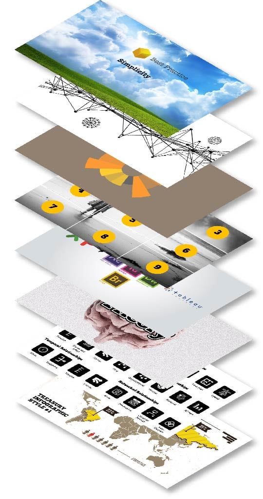
Introduction to Data Visualization: Tools & Techniques Workshop
Skill up your organization’s abilities in data visualization.
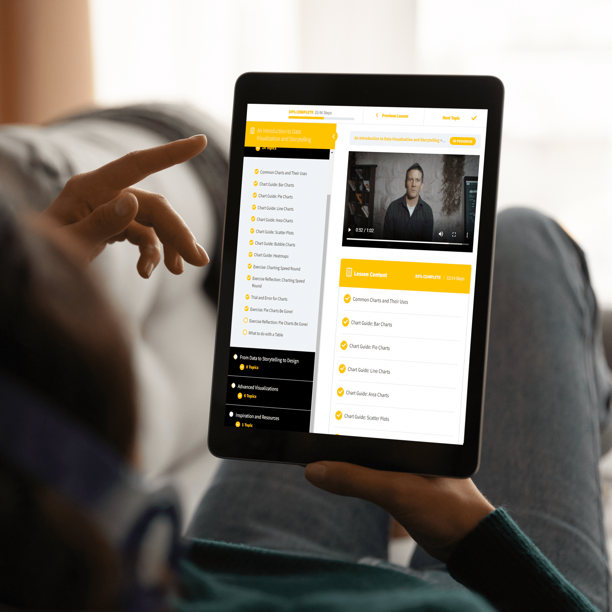
A Crash Course in Data Visualization
See the future of data design and learn the best practices for visualizing data and telling better stories.
Simplicity
Focusing on your audience to know what data you can leave out.
The Best Chart or Graph
The bread and butter of data visualization: How do you decide on the best chart or graph for your data?
Data Visualization Formats & Software
Understand the pros & cons of infographics, dashboards, & visual reports.
Icons & Diagrams
Learn to source & create icons and diagrams for your reporting and presentations.
Examples of Data Stories
Get proper training on what business stories look like and how they can be presented.
Graphic Design & Data
Learn what graphic design principles best impact your data.
Visualize Insights, Not Metrics
Know the difference between a metric and an insight, because your audience does.
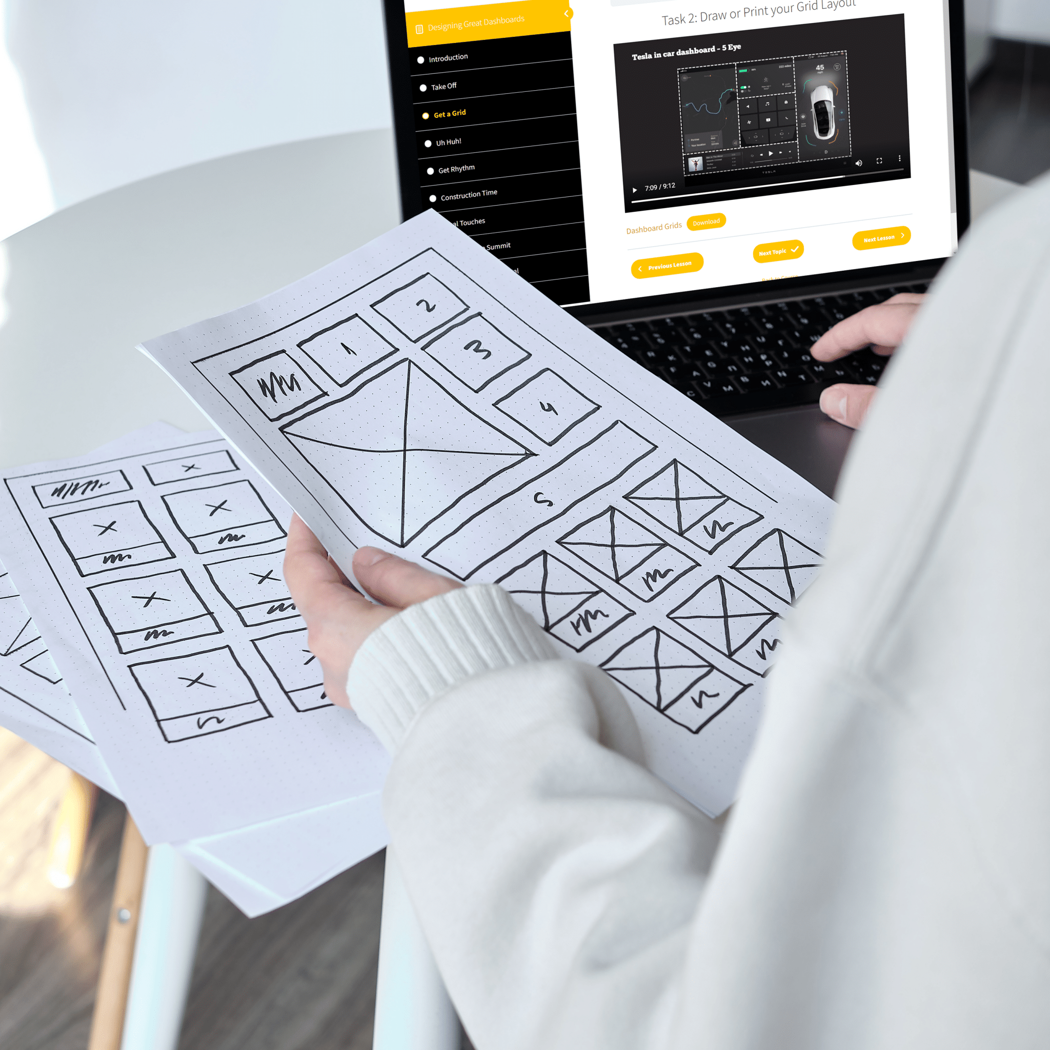
Sketching Your Grid & Visuals
Before you get on any data visualization tool, learn the importance of grids and a quick sketch.
There's no better time...
Learn how to visualize data like a professional.
Data visualization is a powerful tool for telling stories with data. It can help us see patterns and trends that we might not have noticed otherwise, or tell a story in a way that’s more compelling than just numbers on a page. But it’s also hard work! There are so many different chart types out there, and each one has its own strengths and weaknesses. How do you choose the right one for your data? And once you pick the best type of graph, how does it fit inside your wider story? This workshop will teach attendees everything they need to know about visualizing their data effectively.
New methods and new thinking
Stop your current way of reporting. Make the leap into better design.
The hope is that our workshop attendees will get a well-rounded set of techniques to get insights from data and communicate them better in more simplified ways. Datalabs instructors teach the workshop attendees what we, as a data visualization agency know, giving attendees new options and outlets for their data and their careers.
DIVE INTO THE TECHNIQUES OF DATA-DRIVEN COMMUNICATION
A DATA VISUALIZATION WORKSHOP DESIGNED FOR ZOOM OR TEAMS
What Will Attendees Learn in This Workshop?
How long is the Intro to Data Viz workshop?
In total, four hours — we offer it in two two-hour sessions or one half-day block.
What are the recommended number of attendees per workshop?
We find it works best to have between 5 and 20 attendees per workshop.
How does the Datalabs Agency teach the workshop?
Either via Microsoft Teams or Zoom. On-site workshops are possible, too. Inquire in the form below.
How much does a typical workshop cost?
It depends. We can price our data visualization workshops by the number of attendees or on a per workshop basis, whichever is cheaper for you. Contact us for an estimate.
Using both sides of the brain...
The art and science of turning raw information into lovely graphics
You will leave this workshop knowing how to simplify your data into something easy-to-understand; which chart types are useful for which kinds of datasets; how to highlight insights from your graphs; and finally, techniques for turning your visualizations into stories using graphic design software. We’ll also cover some great examples of effective storytelling through visualization – both good and bad – so you can avoid common pitfalls when creating charts yourself! By the end of this course, attendees will be able to create beautiful charts themselves with confidence!
Fun, informative, & impactful
A Data Visualization Workshop, An Enjoyable Experience
The Datalabs Agency has created this introductory course for people who are interested in becoming better at communicating insights through data visualization. By participating in this interactive workshop, we hope that participants will gain valuable skills that they can excitedly take back into their workplaces and apply immediately.


WHAT OUR CLIENTS SAY
The Datalabs Agency launched it's first interactive data visualisation in 2011. Since then, we've kept in touch with many of our clients from all over the world. Here what some of them have to say about us.
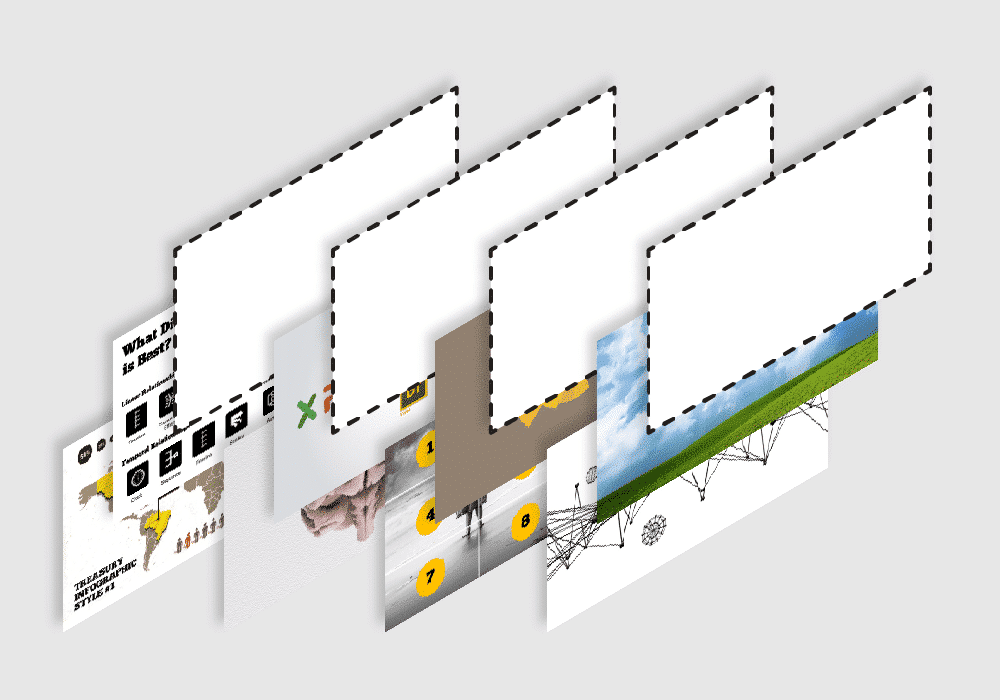
Add to Your Introduction to Data Visualization Workshop Experience
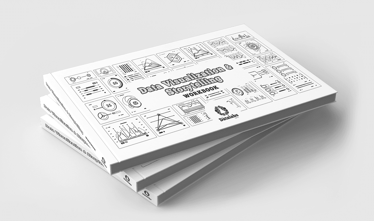
Data Visualization & Storytelling: A Workbook to Accompany the Workshop (digital or printed version)
Our workbook is a great resource for data visualization design workshop attendees, whether they’re sitting in the Boardroom or the analyst’s desk. The ideas and techniques featured in this workbook are vital for all modern executives dealing with reporting, statistical analysis, or visual communications. Designed by the Datalabs Agency, it contains insider tips and tricks from our professional data visualizer and BI designers, as well as exercises to follow that will help you perfect your skills! Available as either a digital or printed version for employees working from home or in the office.
The Introduction to Data Visualization: Tools & Techniques Workshop Can Be Customized
Let us know about your ideas for this type of data visualization training. We know that you and your team might have specific needs. We’ve trained everyone from beginners to skilled graphic designers. We know you might have early adopters in your teams and those who don’t want to change.
This introductory workshop can be tailored for any audience at any level. The collaborative exercises can be reimagined with your data, data your employees will be working with next. Reach out to us and mention you’re interested in customizing your data visualization workshop.
See What ‘Extras’ Come With Our Data Visualization Workshops…

Book our workshop or take the online course!


Get trained to visualize data and tell better stories.
$45


Who Facilitates Our Data Visualization Workshops?
Otto Ottinger
Managing Director

Otto is the Datalabs Agency’s Managing Director. Having learned his data visualization skills whilst working at National Geographic, Otto now serves as the Senior Instructor and Strategist for large client engagements, holding workshops with such companies as Marriott Hotels, Al Jazeera, eBay, and the Reserve Bank of Australia.