


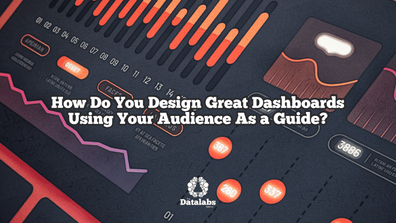
Description
What Will I Learn in This Course?
Learn a dashboard design process. Then take what works for you and apply it immediately in your next dashboard design.

Simple to See & Follow
We visualize the steps. You think about the simple choice you need to make. And we move the project along.

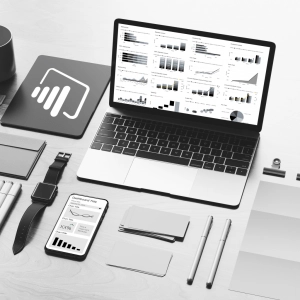
Design With BI Software in Mind
Regardless if you’re designing in Power BI, Excel, or Tableau, you’ll see a new way to aproach user interfaces for dashboards.
Ensure your audience are satisfied with your dashboard design and narrative by choosing the right business questions and insights to present to your audience.

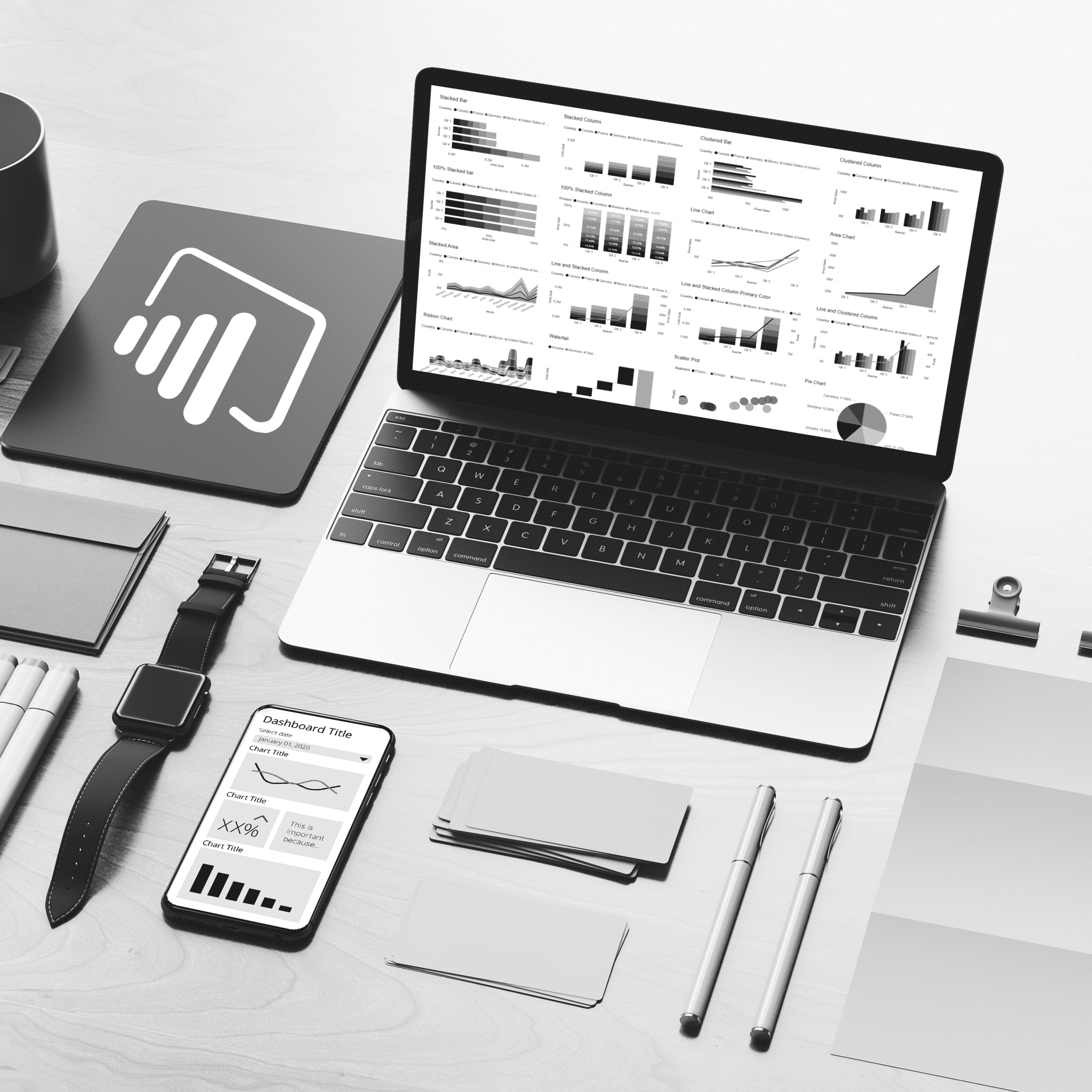
Dashboard interface design - Learn how to make your dashboard visually stunning through appropriate use of colors, icons, layouts and more.

Learn from designers - Once you've completed the dashboard design process, watch a designer complete a dashboard as they would for any fortune 500 company

Business Objectives - Perhaps the most important part of the process is to understand why you're designing it and what you want your audience to do with it.

When taking this course, you'll receive a free interactive workbook to assist you in forming your dashboard brief. A crucial part of any design and development project.

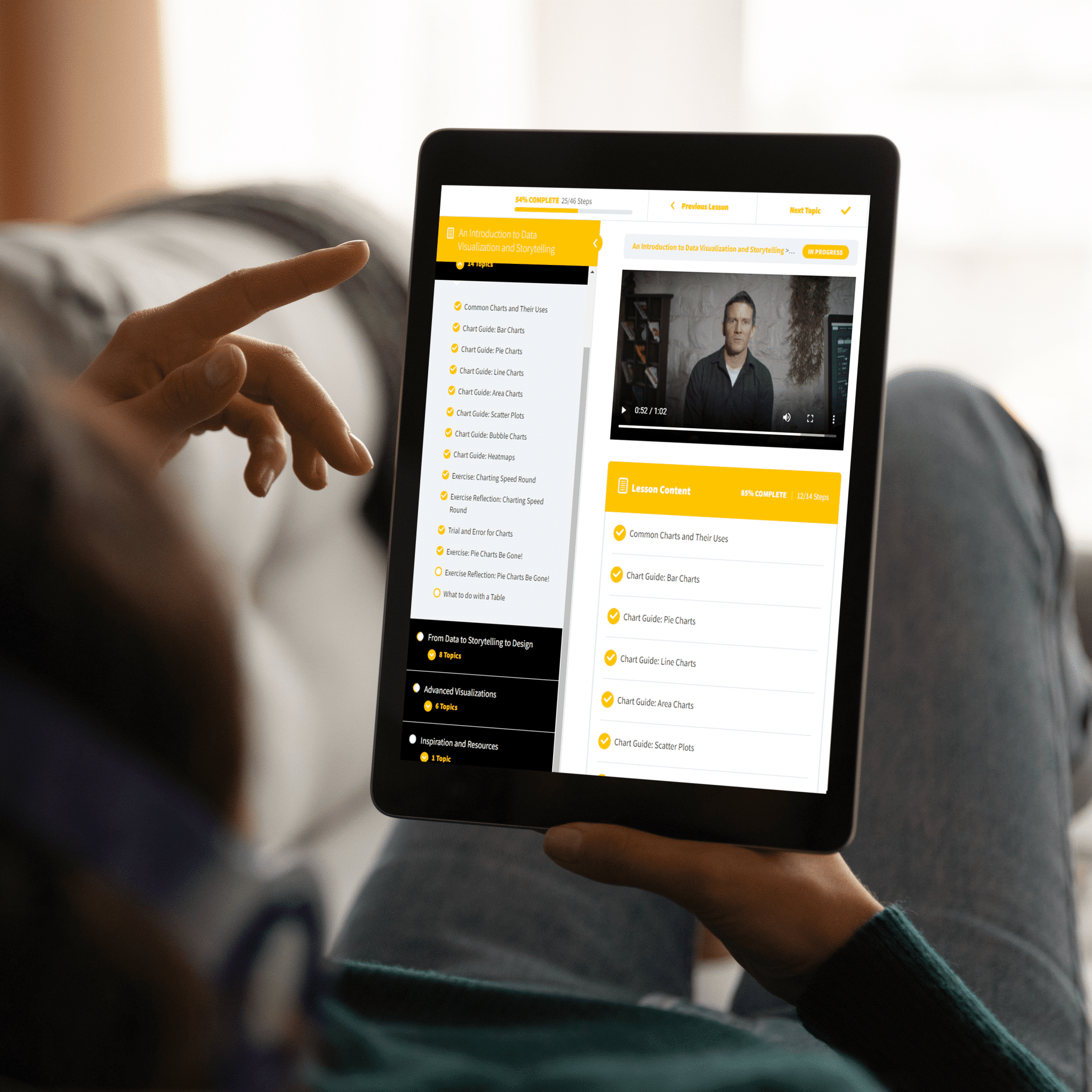
ABOVE: See inside the dashboard training course — learn more about dashboard design and what you will learn.
Be the Most Useful Human in Your Team

Storytelling With Dashboards
Think of dashboards as unique storytellers. Here’s some examples of business intelligence stories that you can tell.

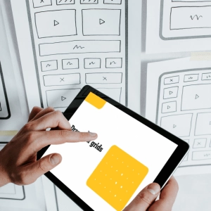
A Simple Practice for Design
You like to keep it simple. We like to keep it simple. With that in mind, here’s simple process for dashboard design.

Professional Video Tutorials
Do you learn better visually?. So do we. So that’s how designed this course.
Questions & Answers About This Dashboard Training Course
View The Datalabs Agency’s digital product and services terms and conditions and the Data Arts privacy policy.


