


Using animation to tell data stories bridges the communication gap between executives and key stakeholders like corporate shareholders, financial analysts, marketing managers, sales managers, even your customers. By providing additional insight to these key stakeholders in this user-friendly and engaging format, you will find your other data reports will be sought after.
Motion Graphics with a Point
Animated Data Videos
Animation Tells Great Stories With Data
Why Should You Look at Data Animation?
Engagement goes up because data journalists and data visualizers do the hard work of simplification and extracting the key insights from your data. Imagine your reports as an animated video with an AI voice-over, explaining next quarter’s financial outlook, or the key numbers that are impacting your business right now. Think of them as animated business dashboards, explaining the key points found in your sales, social, web, marketing analytics, or customer relationship management (CRM) data.
Uses for Animated Data Videos
Financial Reports
Advertising Metrics
Sales Dashboards
Content Analytics
Competition Dashboards
Marketing Analytics
Executive Presentations
Quarterly Briefings
Social Media Metrics
Mobile Statistics
Annual Reports
Web Analytics
Social Media Monitoring
Human Resource Stats
Tell Your Story With Animated Data & Motion Graphics
 Datalabs’ animated data videos are designed as motion graphics with the narrative driven by numbers, insights, and ideas. They are a content form that can explain your business’s data in a simple and visual story.
Animation combines both visual and auditory stimuli to cater to multiple learning styles and evoke stronger emotions than static imagery alone. By using an animation of your data, you can present the process to understanding complex data in a clear and captivating way with the aim to: explain, educate and inform. With Datalabs’ help, your insights will be told in story form and communicated in an innovative format rarely used by businesses today. You and your insights will stand out.
Make a motion graphic with your report data.
Or give an old report a new life as a video explainer.
Begin a new chapter for your corporate communications. Order data-driven motion graphics from the Datalabs Agency today.


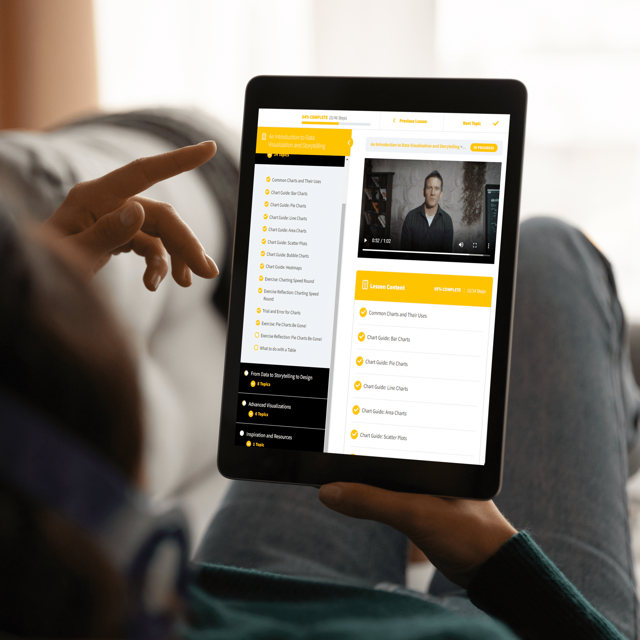
Have a look at what we teach below.
Are you interested in learning about data visualization?
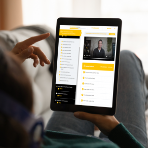


Get trained to visualize data and tell better stories.
Original price was: $129.$89Current price is: $89.

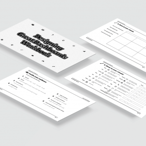

Finally, a course that shows you what you need to know.
Original price was: $129.$89Current price is: $89.

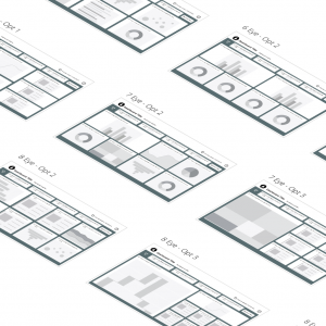
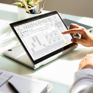


Get the best grids, layouts, navigation, and UI components for your dashboards.
Price range: $790 through $1,390
Questions & Answers