

John “Otto” Ottinger is a data visualizer, specializing in the visual design of complex data systems. The founder and Managing Director of the Datalabs Agency, a data visualization & consultancy firm, Otto works at the intersection of user experience (UX) design, visual analytics, and storytelling. He started his career as an editor and interactive designer at National Geographic, in Washington, DC.
Founder & Managing Director of the Datalabs Agency
Otto Ottinger
There he learned the same information design and storytelling techniques that he teaches in his workshops. Now in his role at Datalabs, Otto has gone on to design software, dashboards, infographics, and data tools for clients like Nestlé, Mercedes-Benz, Bupa, BlackRock, Adidas, eBay, Marriott, CommBank, and HCF, among others.

Some of the notable brands Otto has worked with...
Otto Ottinger’s Clients of Note


Australia, Europe, & the U.S.A.
KEYNOTES & SPEECHES
Always start off with a humblebrag...
A Keynote Speaker with Humor and Awesome Design
First off, let’s get this out of the way — I’m writing this. This page will now be in the first person. Otherwise, reading this would become unbearable.
As for my delivery of keynote addresses and company workshops, I think I do a few key things well.
• The design of the presentation is top-notch. I can’t help but love design;
• The story that forms the speech or workshop agenda is well-thought-out. Often it’s only after
my third or fourth draft is written that I declare, “Eureka! That’s the story!”
• The information is what the audience is craving. I listen to my clients, understanding what they need to know and most importantly what they don’t know they need to know comes from years of experience and an empathetic ear;
• The entertainment factor is high. I enjoy what I do when I’m presenting. My speeches and workshops are visual feasts, well-paced, and personable.
Examples of Past...
KEYNOTE SPEECHES
Visualising Economic Data
Sydney, Australia
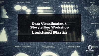
Data Viz & Storytelling
Hong Kong, SAR
Power Of Infographic Design
Canberra, Australia
Visualising Big Data
Sydney, Australia
Examples of Past...
Workshops at Company Retreats
Data Journalism

Doha, Qatar
Data Viz & Storytelling
Melbourne, Australia
Data Visualization in Finance
Hong Kong, SAR
Data Viz & Storytelling
Washington, DC
Call me whatever...
Public, Guest, or Keynote Speaker
As you can see from the topics and speech titles above, what I do is interesting to a wide range of industries. Everyone uses and communicates data. And I love to customize my work, blend my thinking with the expertise that sits on my client’s side. I get to be a jack-of-all-trades, working (however briefly) in very technical areas of expertise and learning new skills as I go.
I can then convert those new skills back into the training and presentations that I give at conferences, company off-sites, or corporate retreats. A typical brief that I often receive from a client for this line of work goes like this:

I want to reward my employees, have them learn something new. I want it to be incredibly useful to what they do on a day-to-basis. I want them to have fun learning it — after all, this is a reward for a long year or a successful quarter

CXO or Senior Manager
Perspective on the need for a guest speaker or workshop facilitator at a company off-site or annual retreat
Two things that I value when I’m hired to come to speak:
• Access. I love to understand the context of why I’m showing up in your company’s lobby or swanky retreat. Let me know what the challenges are and I’m keen to hear the aspirational reasons. So access to information is key for a curious person, like myself. And access to data is nice, as well. I want my time in front of your staff to be hyper-relevant to their current experiences. If we can work through a data problem collaboratively in a facilitated workshop or I can design custom data visualizations using your division’s KPIs — all the better!
• Out-of-the-box thinking. Solving big problems, visualizing fast-moving changes, or changing the way employees think and see data are what I like to tackle. My thinking is concentrated on design and visual communication. And I have extensive experience in visualizing and presenting business data. Out-of-the-box thinking is utilizing a skillset foreign to your team’s experience, like data visualization & storytelling, and trusting it can give you that quantum leap in the areas that you need it.


The Design of Visual Analytics & Complex Systems
DATA VISUALIZER
Establishing a Data Design Philosophy with the Datalabs Agency
Australian/American Data Visualizer
The best part about running a data agency is the breadth of clients and industry challenges to work with. By “breadth of clients” I mean it runs the gamut of Fortune 500, NASDAQ, and ASX 200 (Australia’s equivalent). Plus, this agency takes me to the Middle East, Africa, and Europe. This leads me to my second favorite part: “Industry challenges.” These same companies — no matter if they work in banking, energy, manufacturing, or education — have similar problems.
The data couldn’t be more different. However, what gets put to me is always a similar challenge.
This one challenge I classify and place into three “buckets”: lack of simplicity, lack of creativity, or inability to communicate visually.
So over my 16+ years as a data visualizer, I’ve developed what could be called a data design philosophy and methodology to tackle these three challenges. To me, data visualization paired with visual communication is a human-to-human art form. Along with my data visualization style, this is what gives a Datalabs Agency piece of work a distinct look and feel.
This same philosophy is also why clients around the globe come to me.

Examples of Past...
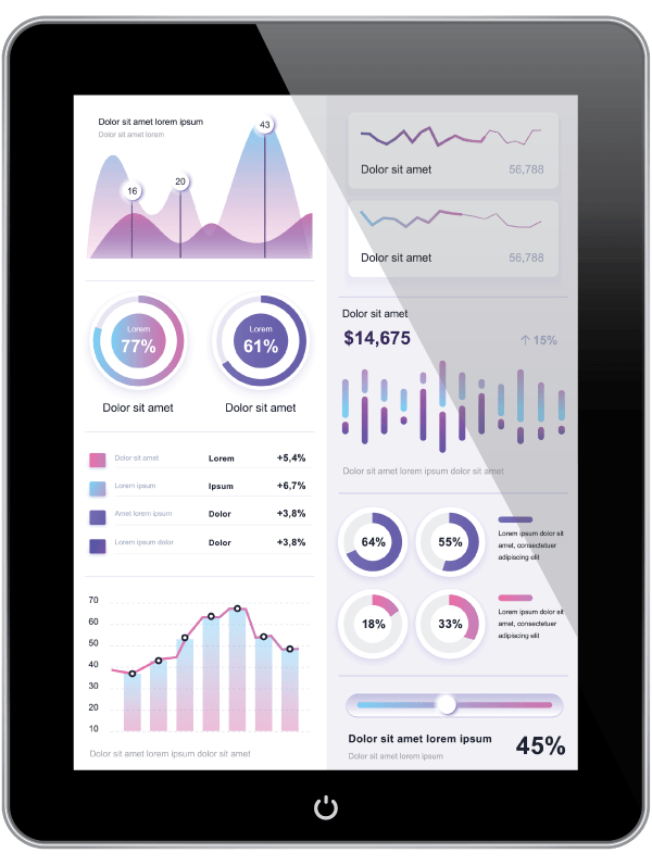
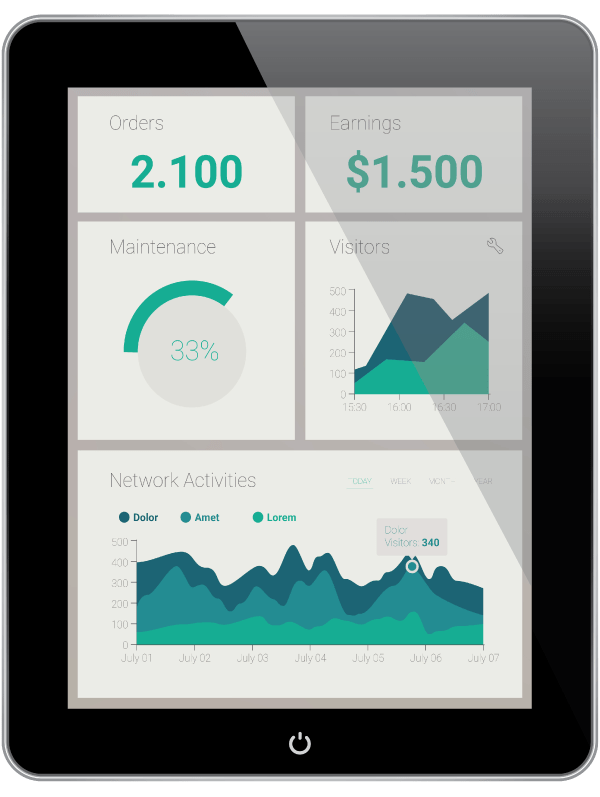
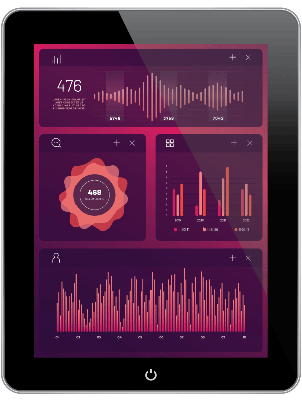
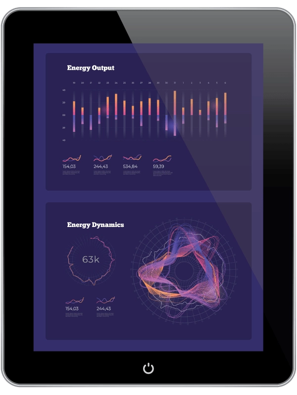
DATA VISUALIZATION DESIGN
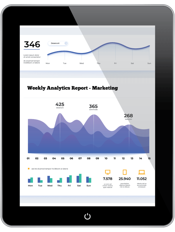
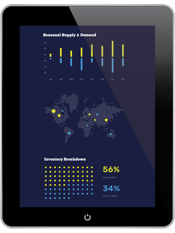
Global Sales Analytics

Stuttgart, Germany
Revenue Dashboards, APAC

Hong Kong, SAR
Silicon Chip Manufacturing

San Francisco, California
Visualizing Procurement Data

Herzogenrauch, Germany
From the Perspective of an Industry Veteran...
“Inventions” in Data Visualization Throughout the Years
I started visualizing data back at the National Geographic Society back in the late 1990s. A lot has changed since then. I took what I learned there — visual storytelling and infographic design — and applied it to my new world and new company Down Under.
I was one of the first to bring infographics to Australia. The problem was it was too early. No one at that time understood the power of that type of visual data and storytelling. Believe it or not, “What is an infographic?” was a typical question.
Fast forward to the present day, infographics are everywhere. And infographics are everywhere in terms of quality and sophistication. Bad ones outnumber the good.
Long ago, I moved up the “food chain” and stopped selling and designing infographics for clients. I like to learn and challenge myself for the ‘next thing.’
This came with the massive growth of business intelligence and dashboards.
I was at the first Tableau roadshow in Melbourne, Australia. The speaker from Tableau asked the audience of a thousand or so attendees, “Who here is currently using our product?” Roughly one in ten hands went up. I spent the rest of that presentation changing my generic dashboard design page, sprinkling the keyword “Tableau” liberally about it.
Since then, Microsoft Power BI has overtaken Tableau, both in client interest and in functionality. I now design in both.
In the early days of the BI revolution when I was consulting with Marriott Hotels in Hong Kong, I saw a need for data visualization style guides. Too many dashboards are created without a design philosophy, without a common design language, and without the proper attention to color theory, typography, grid systems, and user experience (UX) design. Since then, my data visualization style guides are in operation inside great companies such as Mercedes-Benz in Germany, Intel in San Francisco, BlackRock in New York, and Telstra in Australia. I do more every year, expanding the range and depth of what they cover.
What’s next in data visualization? I think you know where this is going: Artificial intelligence or A.I.
Where am I going with the Datalabs Agency? Yep. Same answer.

A good hockey player plays where the puck is. A great hockey player plays where the puck is going to be. I have determined that the puck has a 93% chance of being at coordinates -23.796, 1.038 in exactly 3 seconds.

ChatGPT & A.I. Wayne Gretzky
The future of attributable quotes on the Internet
Professional & Thought-provoking
Looking for a speaker for your event?
"*" indicates required fields