


Updated September 2026
So you need…
Marketing Dashboards
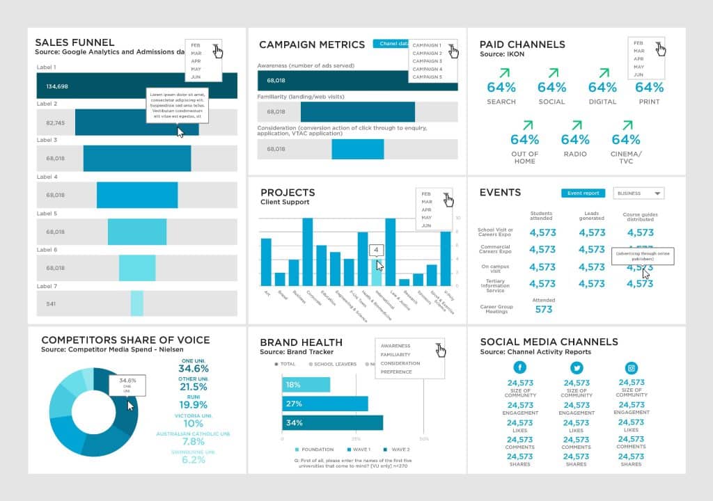
Marketing teams are asked to prove campaign ROI, but the numbers usually live in five separate logins. We design custom marketing dashboards that put campaign performance, traffic, and spend on one screen, built in Power BI or Tableau around the metrics your team actually reports on.
The straight answer
What is a marketing dashboard?
Campaign, traffic, and spend data usually live in separate logins — a marketing dashboard puts them on one screen your team actually opens every week. We design these for you, built around your existing data sources in Power BI or Tableau instead of a generic template.
The Datalabs Agency is a Melbourne-based data visualization consultancy founded in 2012 that delivers corporate training workshops (Power BI, Tableau, data storytelling), dashboard design, and BI style guides for clients including Mercedes-Benz, Adidas, and UPS.
Custom vs off-the-shelf
How is a custom dashboard different from a template?
A template ships with someone else’s chart choices and default metrics. A custom marketing dashboard starts from your campaigns, channels, and reporting cadence, so every chart on the page answers the question your team actually asks each week.
Templates are a reasonable starting point for a small team moving off spreadsheets — our Power BI templates exist for exactly that. A template cannot know that your team tracks cost per lead by channel, or that leadership only cares about three numbers out of a twelve-tab report. A custom-built dashboard is scoped around your actual KPIs and your actual data sources, built to the metrics your team already reports on. That difference matters most once a team outgrows the basics: more campaigns, more channels, and a report that used to take an afternoon to assemble by hand.
Built around your channels
What goes into a marketing dashboard?
Campaign performance, website traffic, spend against budget, and channel comparison usually sit side by side on a marketing dashboard. We choose the chart types and layout around the decisions your team makes each week, instead of a fixed set of default widgets.
This follows the same process behind our wider dashboard design service: sketch the layout before styling it, then build in whichever tool your data already lives in.
Marketing has its own KPIs
How is this different from a general BI dashboard?
Marketing gets its own dashboard because its metrics change weekly: campaign, traffic, and spend numbers your team actually reports on. A general BI dashboard usually mixes finance, operations, and sales metrics that only a few people ever open.
Scoping a dashboard to one function is a design decision. A dashboard trying to serve marketing, finance, and operations at once tends to serve none of them well — too many metrics compete for the same screen, and nobody can find the one number they actually track that week. Building a marketing-specific view means every chart on the page answers a question a marketer actually asks.
Compare your options
Template, workshop, or custom dashboard — which fits?
The right option depends on whether you want a dashboard delivered, or the skills to build one yourselves.
| Power BI template | Designing Great Dashboards workshop | Custom marketing dashboard | |
|---|---|---|---|
| Pricing model | AU$1,119–$1,969 one-off | From AU$4,600 per session | Quoted per project |
| Built from your own campaign data | — | — | ✓ |
| Who does the building | Your team, from a template | Your team, after training | We build it and hand it over |
| Best for | A fast start on standard KPIs | Teams who want the skill in-house | Marketing teams who want it done for them |
Workshop price shown is the remote half-day rate for up to 12 attendees; on-site and full-day rates are on our workshop pricing page.
Questions & Answers
Marketing dashboards
Start with the questions, not the charts
How we design a marketing dashboard
I start every marketing dashboard project with a short conversation, not a data pull. What does your team actually decide with this data each week? Which campaigns get paused, which channels get more budget, which numbers go in the Monday report? Those answers decide the layout long before I open Power BI or Tableau.
Most marketing teams already track plenty of numbers — impressions, clicks, spend, conversions, cost per lead — spread across five or six platforms. The dashboard’s job is not to show every metric available.
It puts the handful your team actually acts on in one place, arranged so the story is obvious at a glance instead of buried in a table. The metrics that do not survive that cut are the ones nobody has opened since the platform started reporting them.
I sketch the layout before touching colour or chart type. A campaign-comparison view, a spend-versus-budget tracker and a channel breakdown need three different chart shapes, not one template stretched across all three. Getting the layout right first is what stops the finished dashboard becoming another report nobody opens.
Once the layout is agreed, the build happens in whichever tool your data already lives in. If your team reports out of Power BI, that is where the dashboard lives — see our Power BI dashboard design work. Tableau builds follow the same process.
Dashboards still in use long after a project ends answer a real question every time someone opens them. The target: a tool your team opens on a Monday morning, never a showcase piece.

Founded in 2012, still hands-on
Who’s behind these dashboard designs
I founded The Datalabs Agency in 2012, in Melbourne, after learning visual storytelling at National Geographic. That background shapes how I still think about a marketing dashboard: it is a piece of visual communication first, and a data connection second.
Since then I have built dashboards and BI style guides for clients including Mercedes-Benz, Adidas, and UPS, alongside corporate training workshops in Power BI, Tableau — see our Tableau dashboard design work — and data storytelling. Marketing dashboards are one of the more common requests: every marketing team eventually needs proof of what a campaign actually did.
I still get involved directly in design decisions on every project. Dashboard work, especially the marketing kind, rewards someone who has sat through enough campaign reviews to know which number actually changes a decision and which one just fills a slide.
What’s next in data visualization? I think you know where this is going: artificial intelligence. Where am I going with the Datalabs Agency? Same answer.
The Data Design Firm for AI & Visualization
The Datalabs Agency
Templates, guides, grids, icons…
Creative Design Assets »
Learn visualization and storytelling skills…
« Beautiful Courses in Data Design
Some of the notable brands Otto has worked with…
Otto Ottinger’s Clients of Note








Send us what you are tracking now…
Still stitching your marketing report together by hand?
"*" indicates required fields