


Every chart your reports need…
EXECUTIVE DATA VISUALISATION
CHARTS, MAPS AND DATA STORIES, EVERY MONTH, IN YOUR BRAND
Forty charts a month, one visual language...
THE CHART DEPARTMENT YOU DO NOT HAVE TO HIRE
Your analysts can build a chart. Building forty of them a month in one visual language, each labelled with what it shows and sized for the report, the deck and the release, is a different job.
Send the numbers and the point you want made. The charts come back ready to publish, drawn in your brand, on a schedule you can plan a publishing calendar around.
Good analysis, slow to publish, and never twice the same
THE CHARTS ARE THE BOTTLENECK
A quarterly report ties up an analyst for a fortnight, and most of that fortnight goes on formatting. Colours drift between teams. Two charts of the same measure disagree on scale.
The finding everyone worked for arrives as a default Excel bar, and the reader has to dig for it. Send the data and the point instead, and the analyst goes back to analysis.
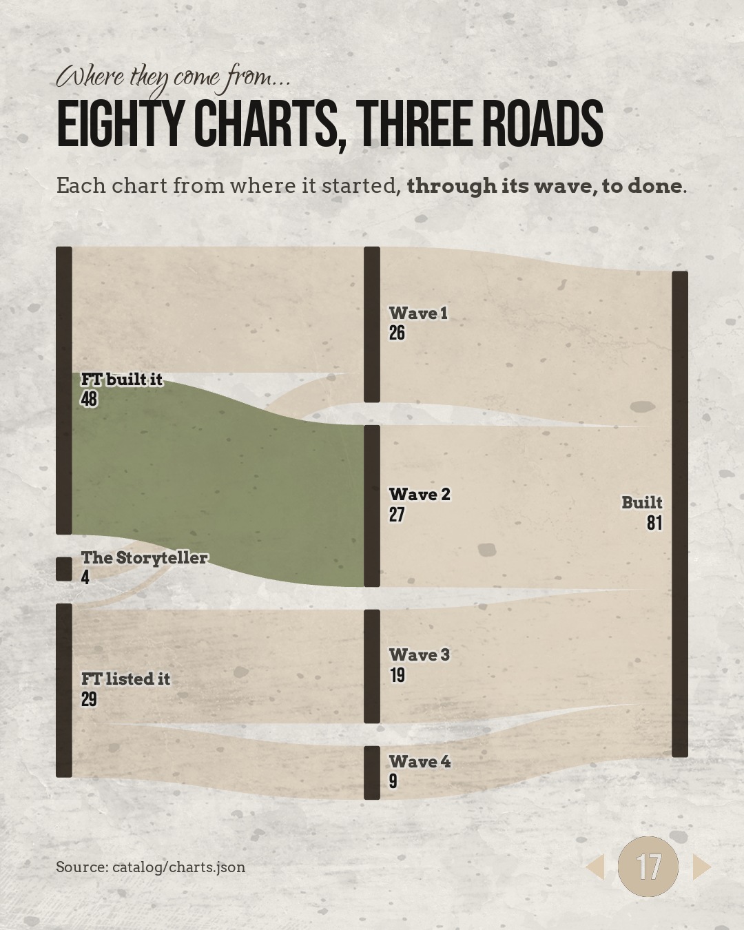
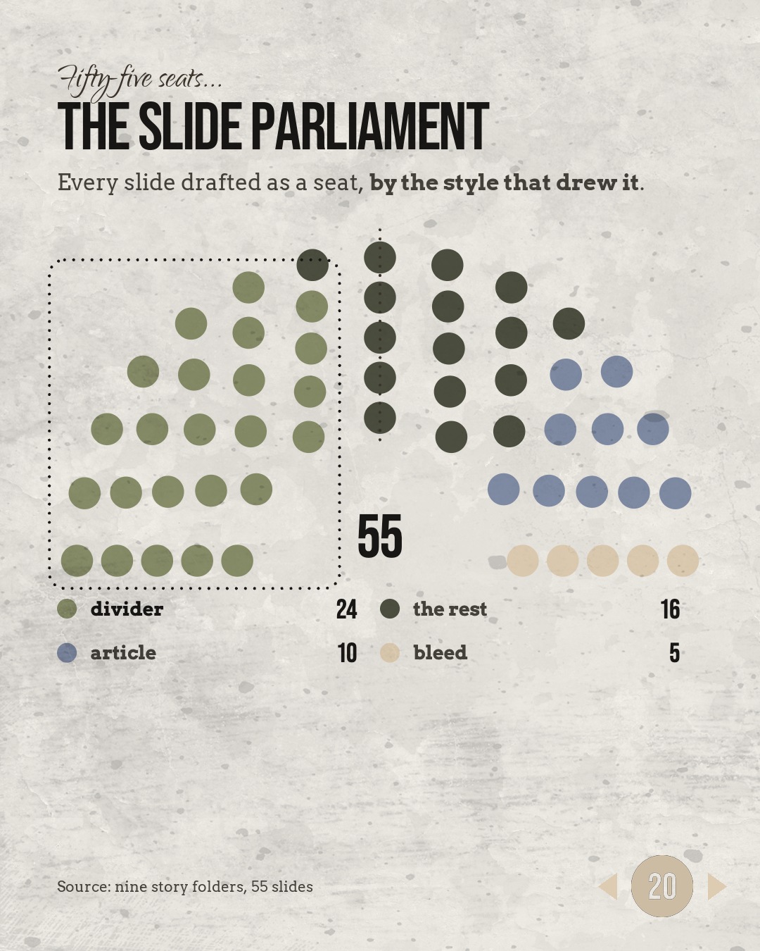
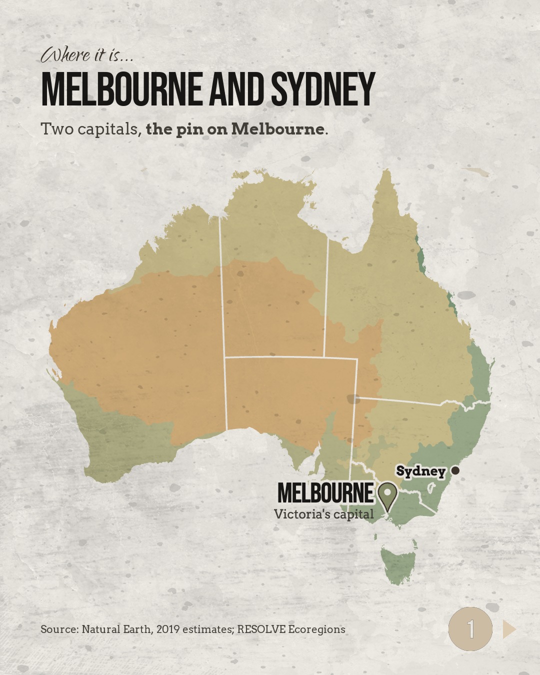
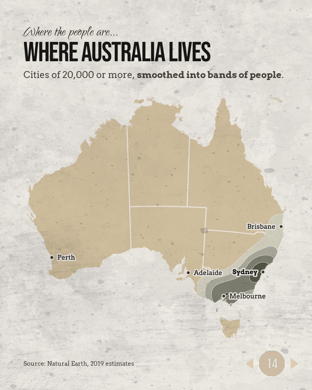
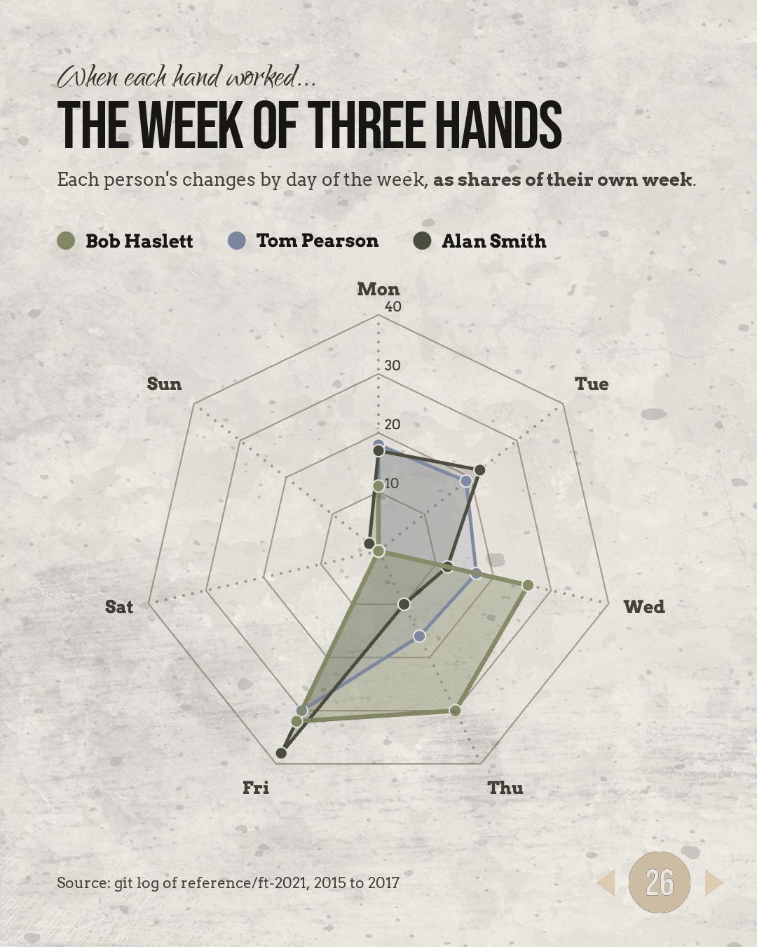
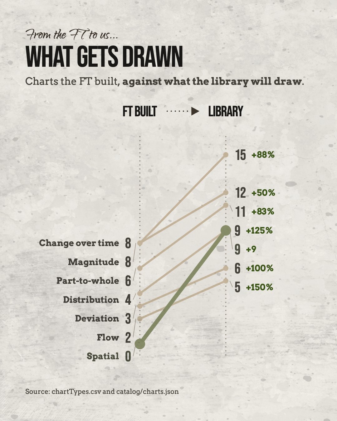
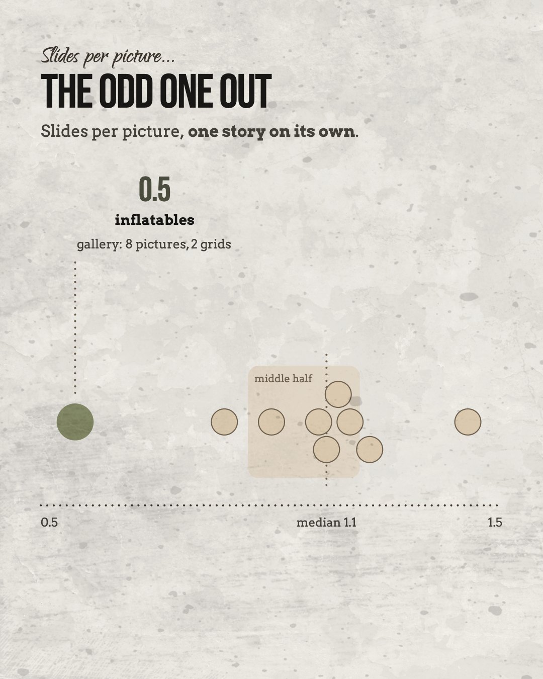
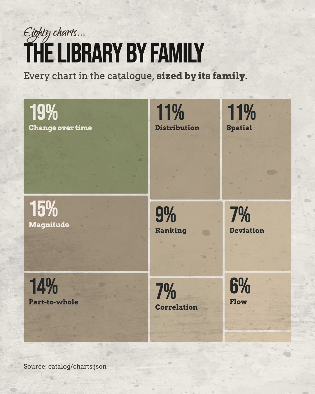
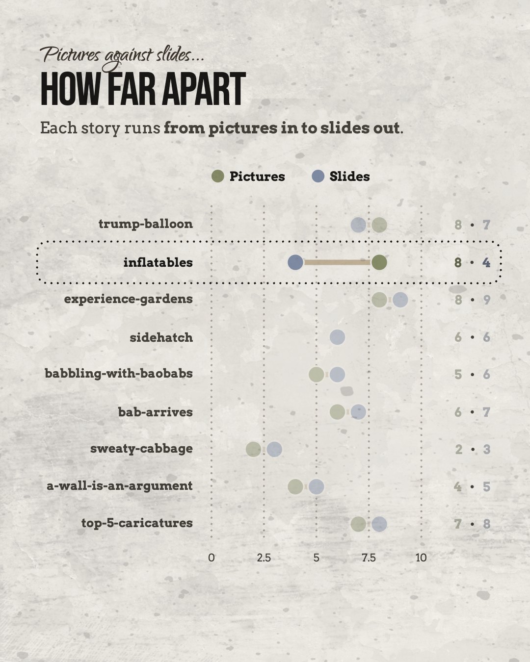
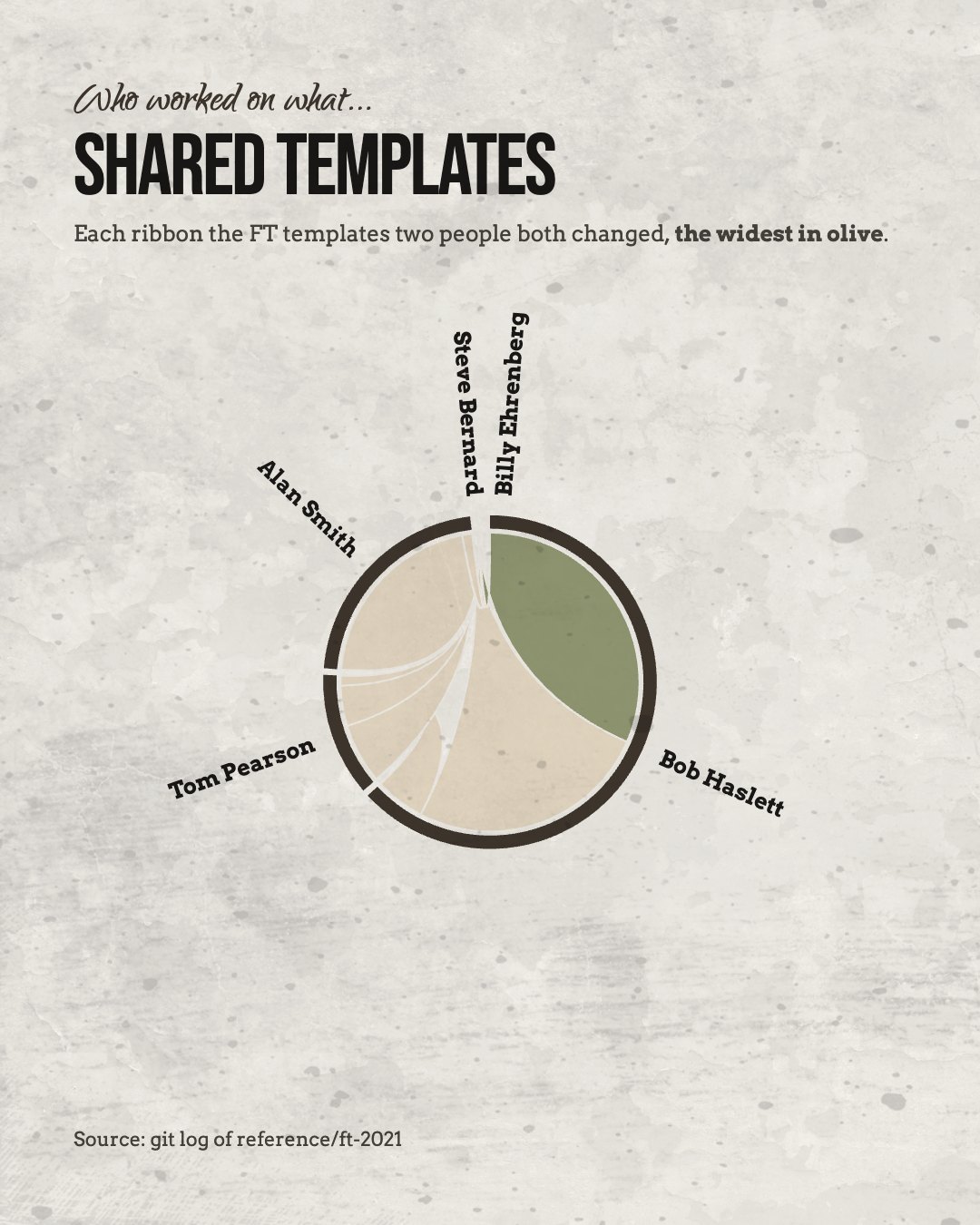
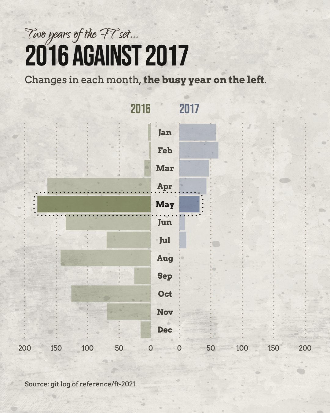
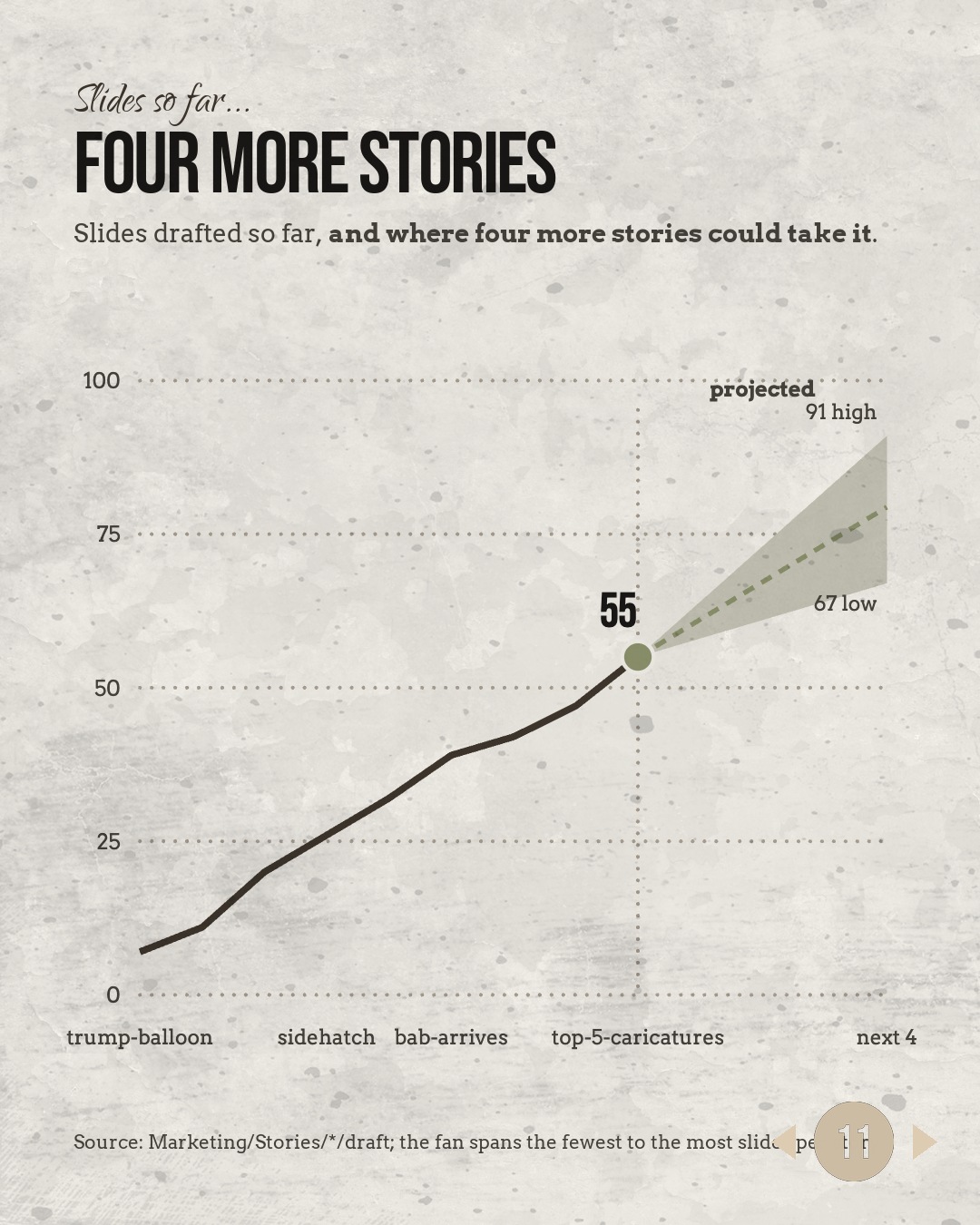
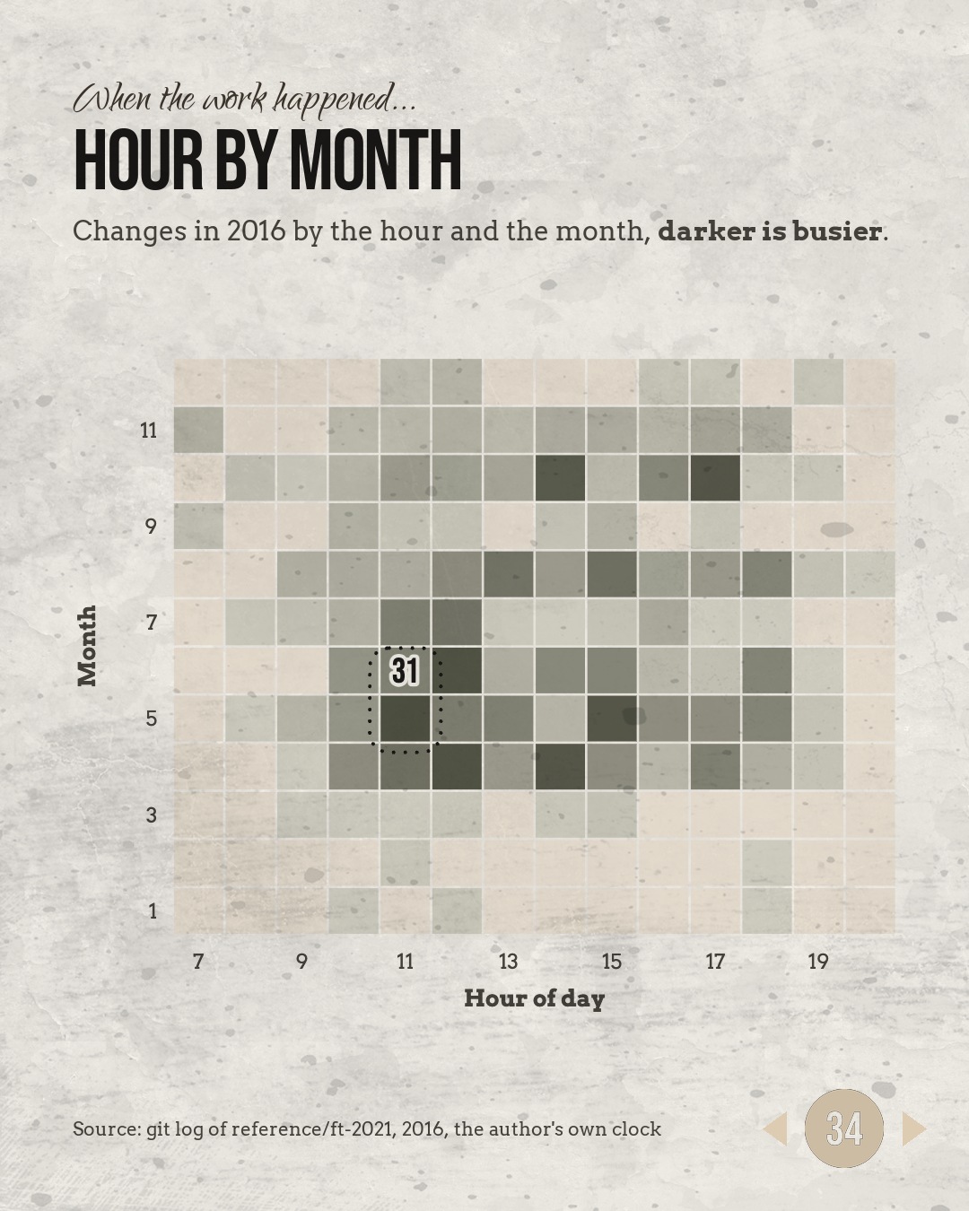
Introductory rate, first four clients...
FOUR DATA STORIES A MONTH
A data story is one chart-led sequence on a single question: up to 10 charts or maps, each carrying the one line that says what it shows, built from your numbers and drawn in your brand. Four every month, five working days each.
From $1,900 a month, with a one-off set-up quoted once: your palette, type and chart rules built into the system so every chart after that comes out right. Month to month, no lock-in. An introductory rate for the first four subscriptions, held for twelve months.
Three ways the same chart arrives...
STATIC, ANIMATED, INTERACTIVE
STATIC
A chart drawn once, at print or screen size, for reports, board papers, decks and the press release. PNG, PDF and the layered file. Every data story arrives this way.
ANIMATED
The same chart built up in motion, for video, for social, and for the screen behind a speaker. A rendered video and the project file. On request, inside the month.
INTERACTIVE
A web version the reader moves through, when the numbers are worth exploring. Built in D3 and hosted wherever you like. Quoted per build.
An agentic chart system, 81 chart types, your brand
What you get every month
One visual language
Every chart comes out of one system, so a bar in January matches a bar in June, across teams and across reports.
81 chart types
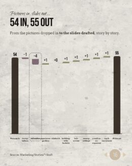
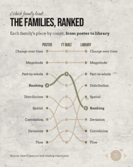
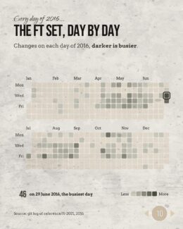
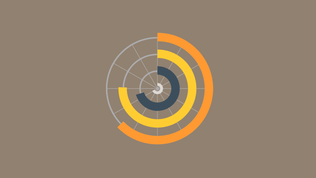
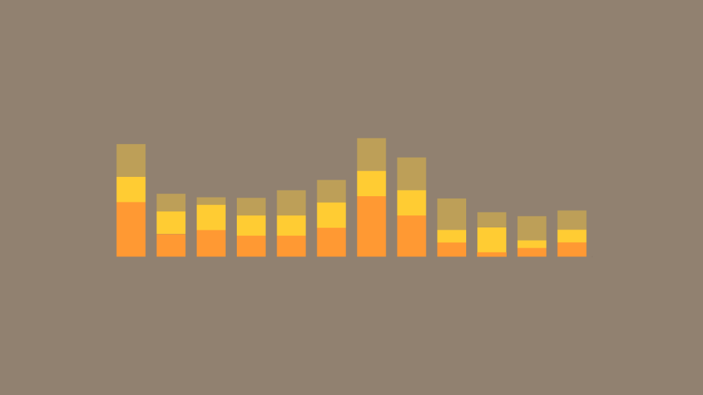
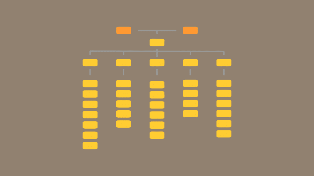
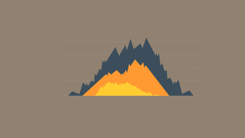
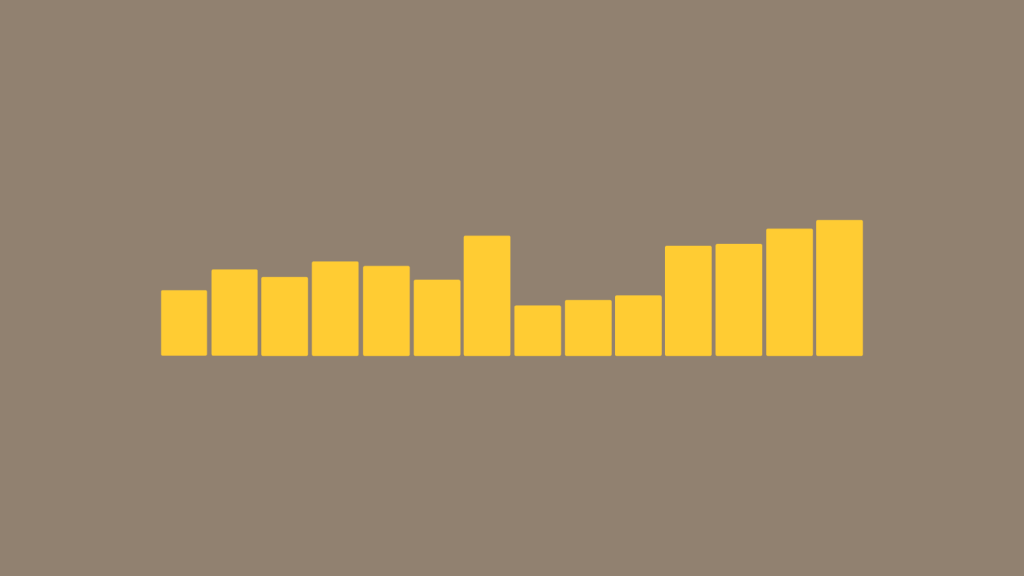
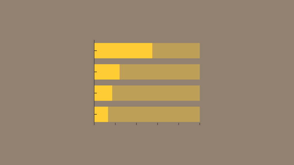
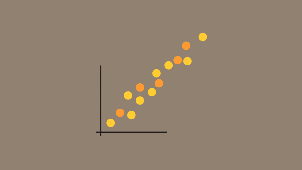
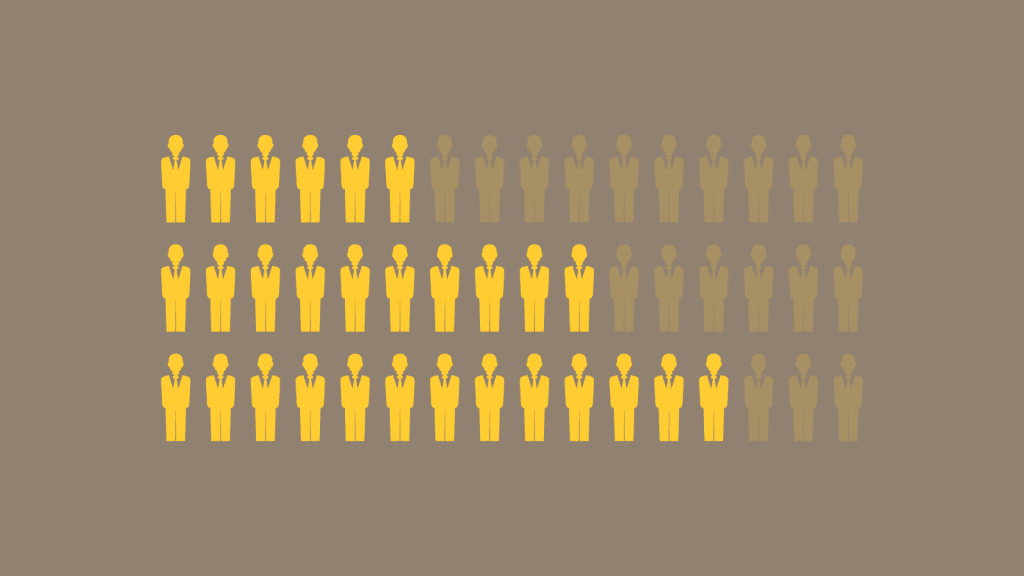
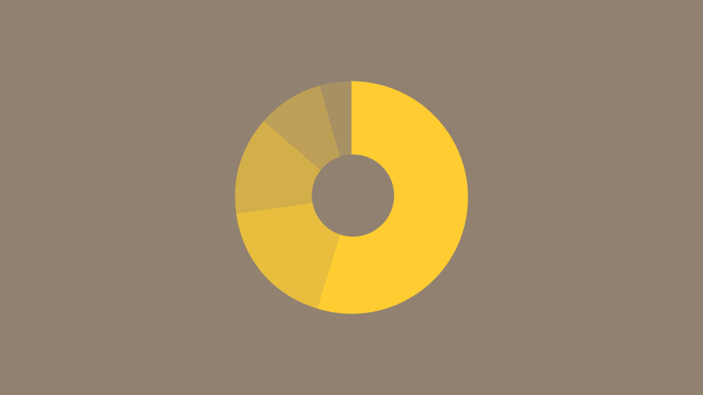
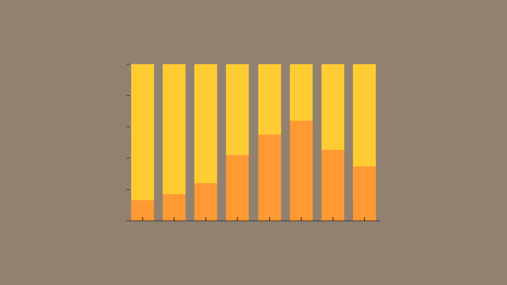
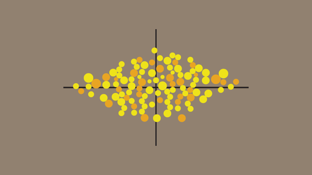
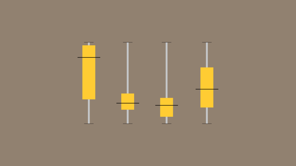
Past bars and lines: sankeys, bump charts, waterfalls, cartograms, beeswarms. The chart that fits the point, not the one the tool defaults to.
Maps that hold up
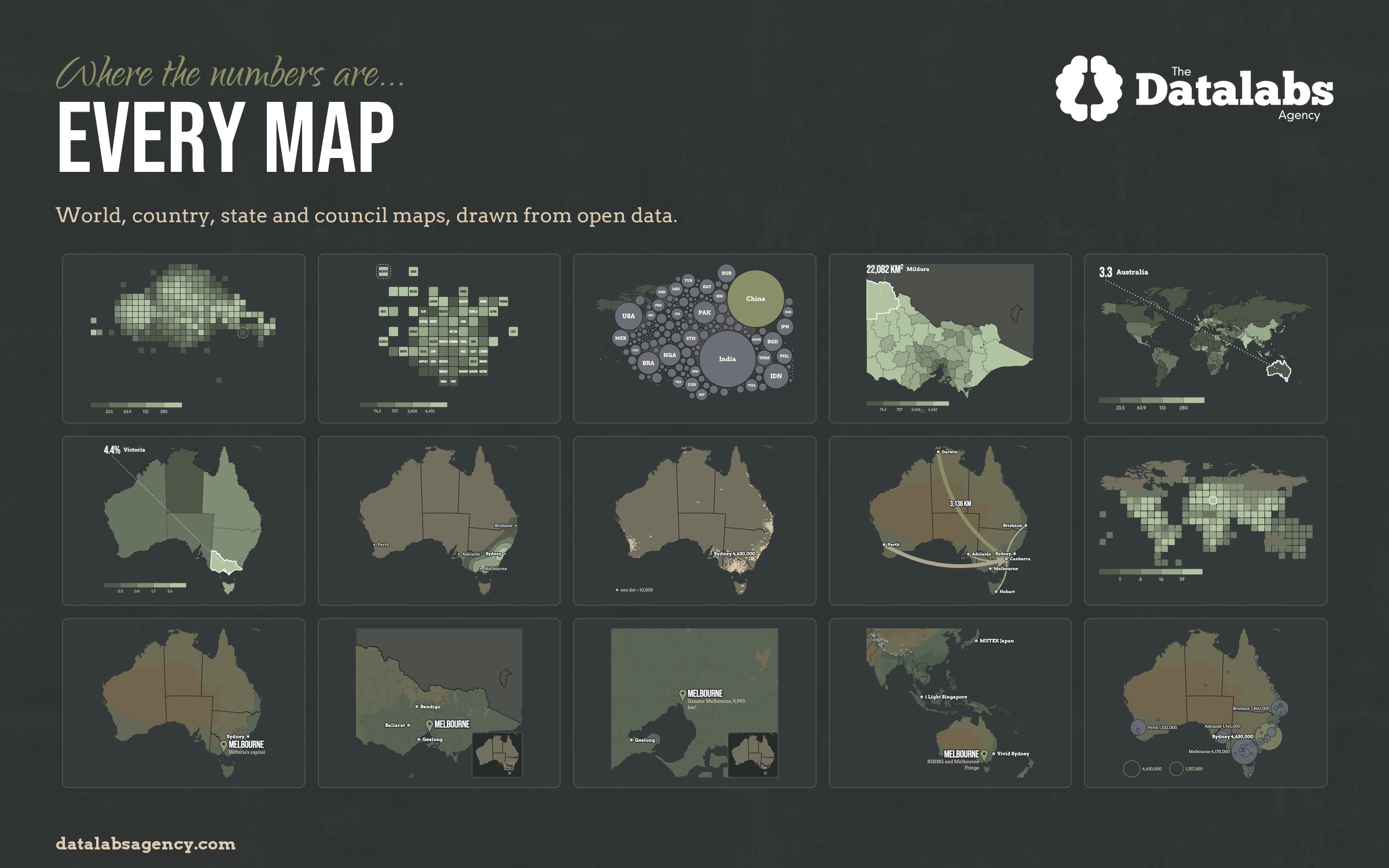
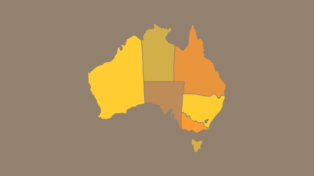
World, country, state and council maps drawn from open boundary data, with the terrain, the labels and the projection done properly.
Locked to your brand
Your palette, type and chart rules are set once, then every chart is drawn from them. Nothing arrives off-brand.
Moving versions
Any chart as an animated version for video, for social, or for the screen behind a speaker, built from the same file.
Interactive when it earns it
A web version when the reader genuinely needs to explore the numbers, built in D3 and hosted wherever you like.
Five working days
Each data story is drawn, checked and back with you inside a working week of the numbers arriving.
Your data stays yours
Work happens under your NDA, and nothing you send is ever used to train a model.
One library behind every chart on this page...
ONE CHART SYSTEM
81
chart types, bar to sankey
15
map views, world to council
4
data stories every month
Interactive and static pieces built for organisations around the world
EXAMPLES OF THE WORK
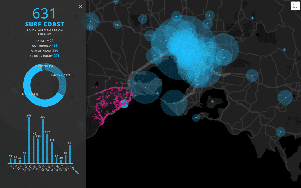
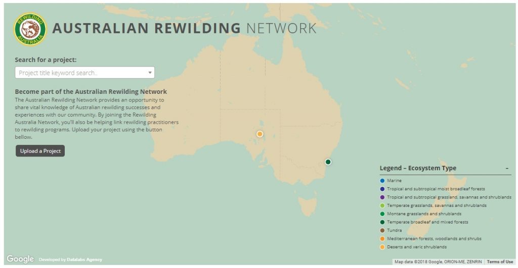
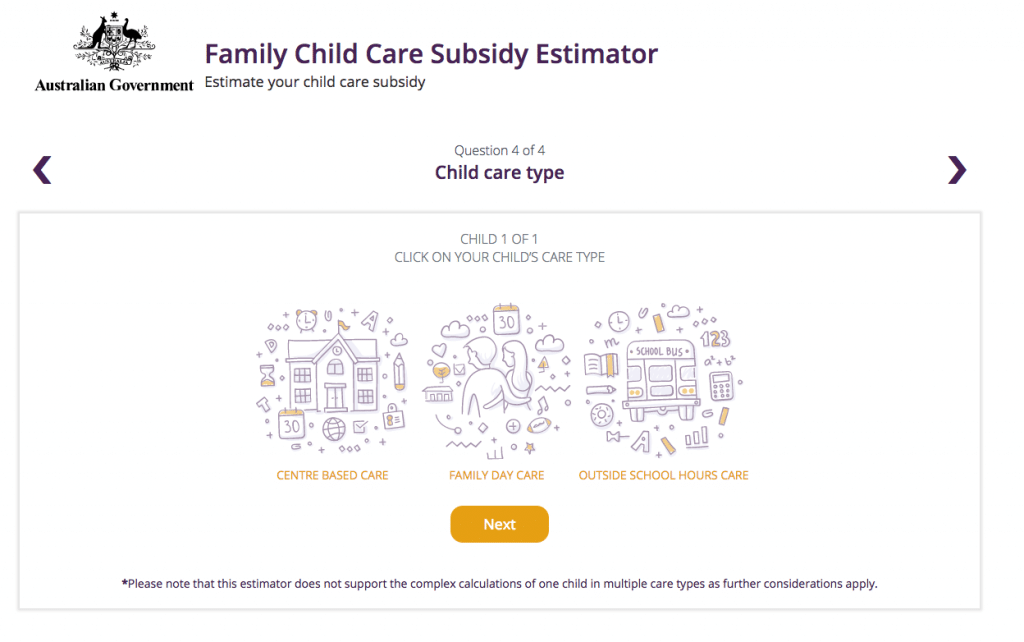
Three interactive pieces built for clients — click any of them. The subscription produces the same standard as static charts for reports and decks, animated versions for video, and interactive builds when the numbers are worth exploring.
Every interactive piece, before the subscription existed...
TWENTY-SEVEN, STILL LIVE













Your numbers, published monthly.on brand.on time.
Questions about
the subscription?






Working with organisations around the world since 2011.
WHAT CLIENTS SAY
Otto has been designing data visualisation for 80+ organisations since 2011, from government agencies to Fortune 500 companies, alongside 300+ training workshops. Here is what some of them say.