


Updated September 2026
A visual case study…
ZIM: One Method, Four Time Zones
In early 2026, ZIM Integrated Shipping Services — the Israeli global container line — wanted its analysts telling better data stories. Datalabs delivered a lecture-and-workshop program across Israel, Hong Kong, and the Americas: two open lectures to light the fuse, three hands-on workshops to do the training, all live from Melbourne.
The program in one paragraph
What did the Datalabs Agency deliver for ZIM?
Across February and March 2026, the Datalabs Agency ran a data storytelling program for ZIM’s analysts: two one-hour open lectures on data accessibility and storytelling — one for the Hong Kong and Israel offices, one for the Americas — and three four-hour workshops (data visualisation and storytelling, creative data presentations with PowerPoint, and infographics and report design), each capped at 20 analysts and run as two two-hour sessions per cohort.
The Datalabs Agency is a Melbourne-based data visualization consultancy founded in 2012 that delivers corporate training workshops (Power BI, Tableau, data storytelling), dashboard design, and BI style guides for clients including Mercedes-Benz, Adidas, and UPS.
Watch the funnel work
Two lectures in, three workshops out
The program’s shape: open lectures for audiences of up to 140 analysts on the left, and the hands-on workshops of 20 they feed on the right.
The problem behind the brief
Why does a shipping line train analysts in storytelling?
The animation above is the program’s shape. The ambition behind it: ZIM wanted its analysts’ insights to land harder with the business — data accessibility and understandability, with what the analysis means front and centre.
A global analyst community makes that a design problem twice over. The training had to land in Jerusalem, Hong Kong, and Americas working hours without diluting into a webinar, and it had to give analysts in different regions one shared method, so analysts in different regions end up speaking one language. The funnel design answered both: broad lectures open to every analyst, then small hands-on workshops for the people who build the reports.
Five deliveries, one method
The program, piece by piece
The program at a glance.
| Delivery | Cohort | Format |
|---|---|---|
| Open lecture | Hong Kong & Israel | One hour, all analysts invited |
| Open lecture | The Americas | One hour, all analysts invited |
| Data Viz & Storytelling workshop | Regional cohorts | Four hours as two 2-hour sessions, up to 20 |
| Creative Data Presentations workshop | Regional cohorts | Four hours as two 2-hour sessions, up to 20 |
| Infographics & Report Design workshop | Regional cohorts | Four hours as two 2-hour sessions, up to 20 |
All sessions ran live on Microsoft Teams from Melbourne across February and March 2026, placed in Jerusalem, Hong Kong, and Americas working hours — cohorts spanned Israel, Hong Kong, the United States, and Brazil.
The teaching assets, full size
Inside the workshop materials
Click any asset to view it full-screen — chapters and process frames from the program decks.
Finding the small stories in big data
Micro-Stories
Zooming back out to the big picture
Macro-Stories
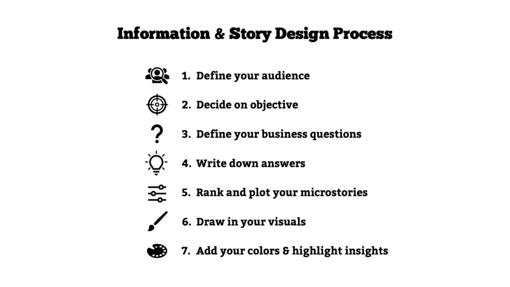
Seven steps, audience first
The Story Design Process
Where the program began
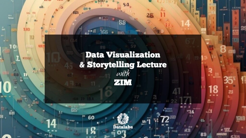
The Open Lecture
Click the markers
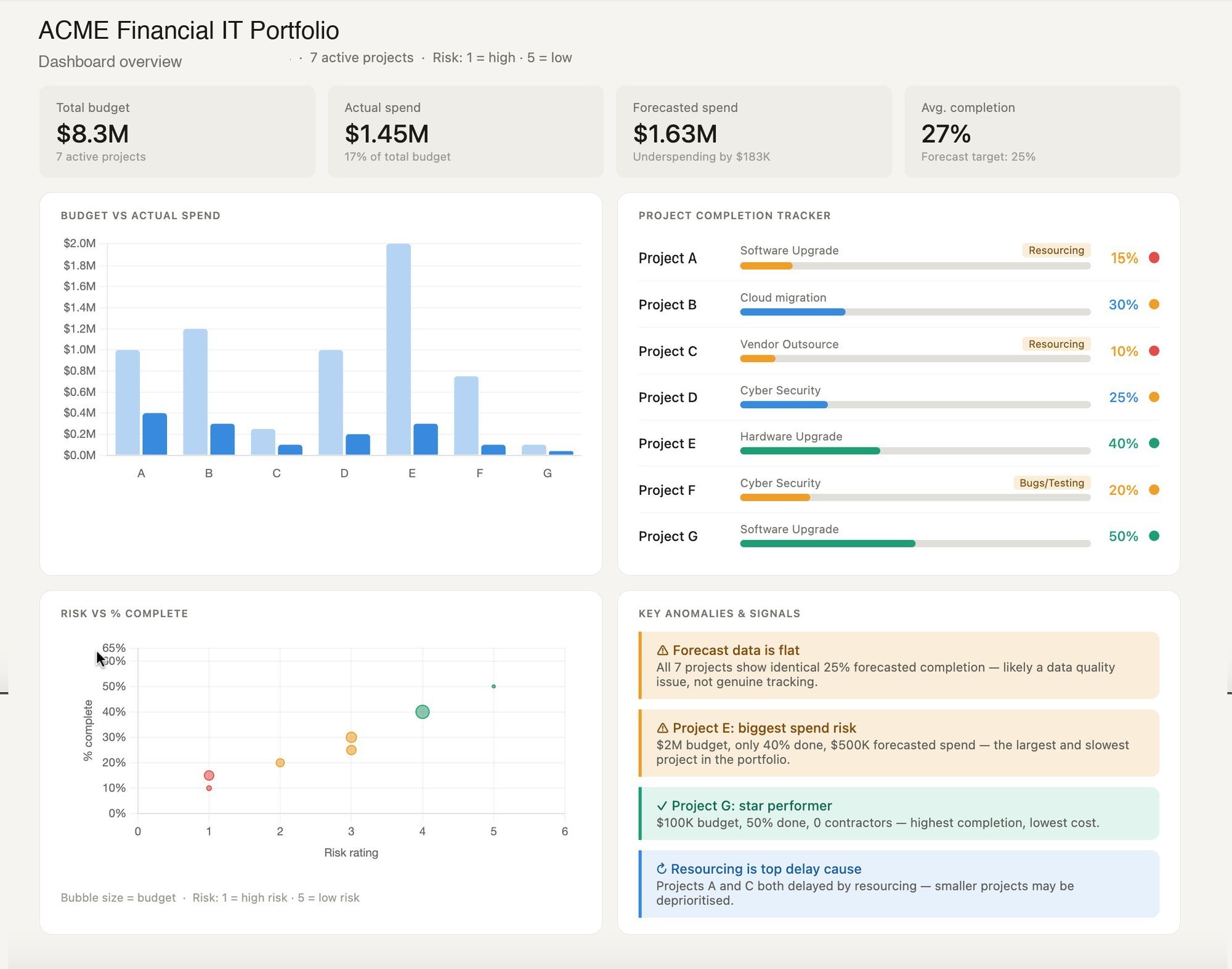
Read the teaching dashboard
Workshop cohorts practised on this teaching dashboard, built on fictional portfolio data. Five markers explain how it reads.
The method that stuck
Six ideas the analysts took home
Six devices from the curriculum — the ones attendees quote back.
Delivered, documented, taught
What did ZIM receive at the end?
ZIM received the five live deliveries, decks designed to ZIM’s own brand guidelines, a custom workbook with exercises and a dummy dataset, and a full aftercare layer: curated slide packs, per-cohort summary packs, and session recordings for attendees to revisit.
The outcome that matters most showed up in the weeks after delivery: the method’s vocabulary — the three-act structure, the six-question filter, micro-stories — began appearing in how the analyst community talks about its own reports. When a client can teach the material back, the shared language has landed — and a shared language is what separates training from consulting.
Don’t just show the data — show what it means. The analyst’s job is the route and the destination, never just the map.

Otto Ottinger
The principle behind the ZIM curriculum
Questions & Answers
The ZIM program
Small stories, big picture
Micro-stories and macro-stories
The centre of the ZIM curriculum is a pairing. A micro-story is the small, sharp narrative hiding inside a big dataset — a segment behaving oddly, an outlier worth naming, the most profitable or least reliable of anything, a gap where numbers should be. Analysts learn to hunt these deliberately: cohorts, superlatives, overlaps.
The macro-story is the discipline that stops micro-stories becoming trivia. Once the small narratives are on the table, the analyst zooms back out: what do these add up to, and what should the business do about it? The workshops drilled the three-act structure for exactly this — context, insight, call to action — so a report ends with a recommendation, never a shrug.
Between the two sits craft. The six-question filter forces scope, context, insight, plot, motivation, and ask to be settled before any software opens; thinking in arrays means sketching several visual options on paper before committing; and the five pillars — charts, icons, diagrams, typography, photography — keep the toolbox wider than a default bar chart.
The same devices run through our Introduction to Data Visualization workshop — on your data instead of a dummy set. The chapter cards above are from the ZIM decks themselves.


Wide doors, small rooms…
Designing a program for a global analyst community
The ZIM brief had a scale mismatch built in: the message mattered to every analyst in the company, and hands-on training only works in small rooms. Most programs pick one and lose the other. A funnel keeps both — open one-hour lectures for the many, four-hour workshops for the twenty.
The lecture is not a teaser; it does real work. An hour on data accessibility and storytelling gives the whole analyst community shared vocabulary and tells the business change is coming. The workshops then take the people who build the reports through the method properly — exercises, critique, and a workbook they keep.
Geography shaped everything else. Sessions were placed inside Jerusalem, Hong Kong, and Americas working hours from Melbourne, and the Americas cohort grew to include Brazil along the way — a reminder that global programs should be designed to stretch. Splitting each workshop into two two-hour sessions kept virtual attention honest and gave attendees a week to apply the first half before the second.
Aftercare closed the loop: curated slide packs, summary packs per cohort, and session recordings — the materials a busy analyst returns to at report-writing time. The format is repeatable, and the economics live on our workshop pricing page; the program shape is yours for the asking via our training workshops.
The Data Design Firm for AI & Visualization
The Datalabs Agency
Templates, guides, grids, icons…
Creative Design Assets »
Learn visualization and storytelling skills…
« Beautiful Courses in Data Design
Some of the notable brands Otto has worked with…
Otto Ottinger’s Clients of Note








Professional & Thought-provoking
Looking for a speaker for your event?
"*" indicates required fields