


Updated August 2026
A visual case study…
Transurban: The Road Usage Calculator
In mid-2017, Transurban’s Strategy team was researching a hard policy question: what happens to road funding as fuel excise fades? Over roughly three months, I project-managed and design-led a public interactive calculator that let anyone model current charges against a distance-based road usage charge — for a single car or an entire fleet.
The project in one paragraph
What did the Datalabs Agency build for Transurban?
The Road Usage Cost Calculator was a client-side web application — HTML, CSS, and JavaScript — launched publicly at roadusagecalculator.com. It modelled current road funding charges against a proposed Road Usage Charge across every Australian state and territory, with three ways in: a quick mode, a vehicle-by-vehicle detailed mode, and CSV import for whole fleets. Our role: project management and design lead, with a development team building the application.
The Datalabs Agency is a Melbourne-based data visualization consultancy founded in 2012 that delivers corporate training workshops (Power BI, Tableau, data storytelling), dashboard design, and BI style guides for clients including Mercedes-Benz, Adidas, and UPS.
Watch the slider drive it
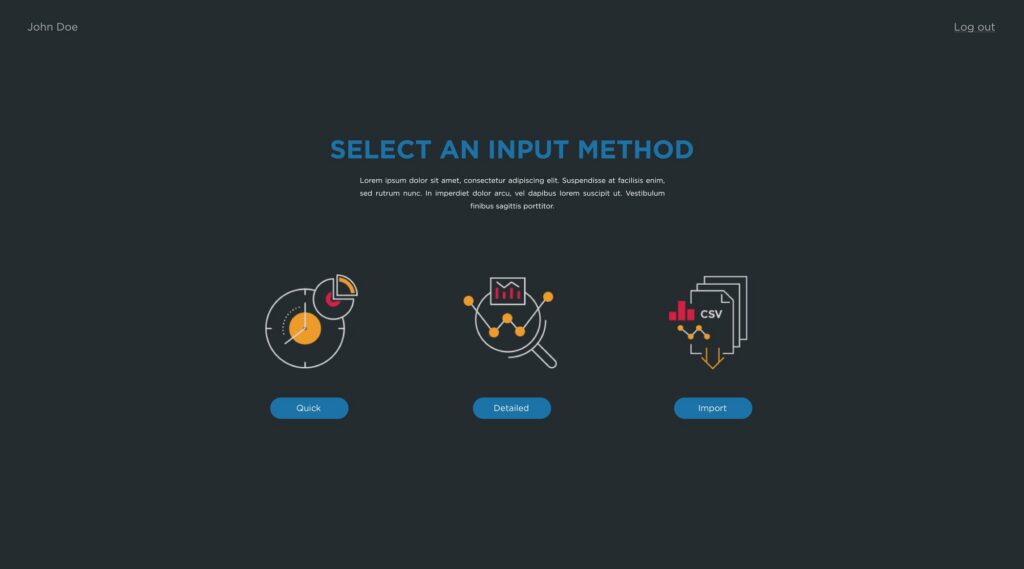
Three ways in, three cost lenses out
Any input mode, one adjustable per-kilometre rate, and every scenario lands as fleet, vehicle, and per-km numbers side by side.
The problem behind the brief
Why did a road policy debate need an interactive tool?
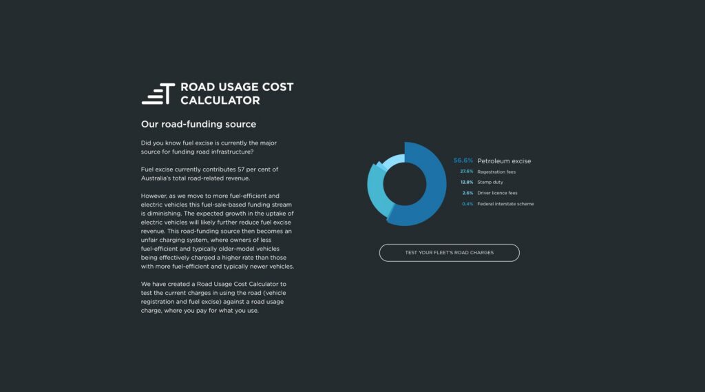
The animation above is the tool’s logic. The policy problem behind it: Australia funds roads largely through fuel excise, and as the fleet shifts to fuel-efficient and electric vehicles, that revenue declines. A Road Usage Charge — paying for distance travelled instead of fuel burned — affects every vehicle type, state, and registration category differently. Abstract argument was never going to settle it.
Transurban’s Strategy team wanted stakeholders to model the scenarios themselves: their own fleet, their own state, their own annual kilometres, against an adjustable per-kilometre rate. An interactive tool turns a policy abstraction into a number on your own household or fleet — and a debate about a number you can see is a better debate. The calculator shipped with an educational landing page explaining the funding structure, so the context travelled with the tool.
Meet users where their data is
The three input modes
Each mode served a different user with a different amount of data on hand.
| Mode | Built for | What you enter |
|---|---|---|
| Quick | Anyone exploring the policy | Fleet size, vehicle and fuel type mix, registration costs, average annual kilometres |
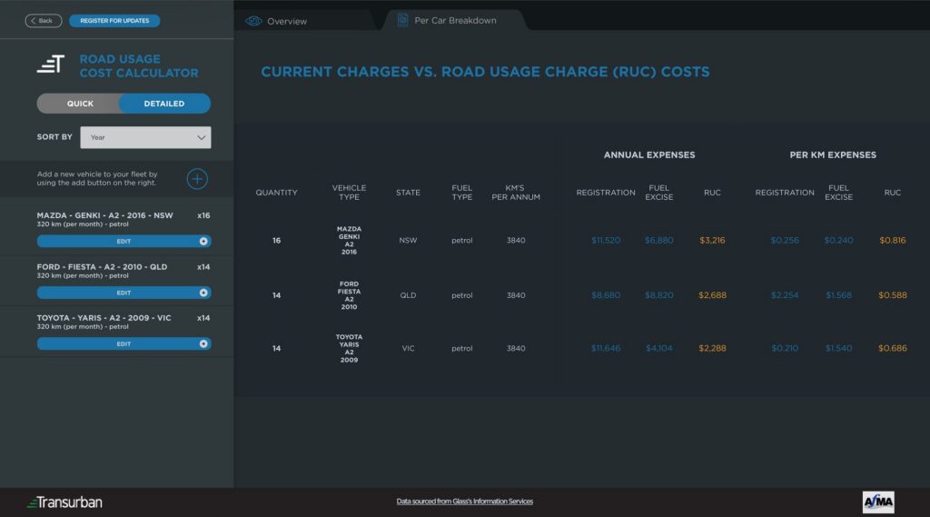
| Detailed | Analysts and fleet owners | Each vehicle’s make, model, year, state, fuel type, and annual distance |
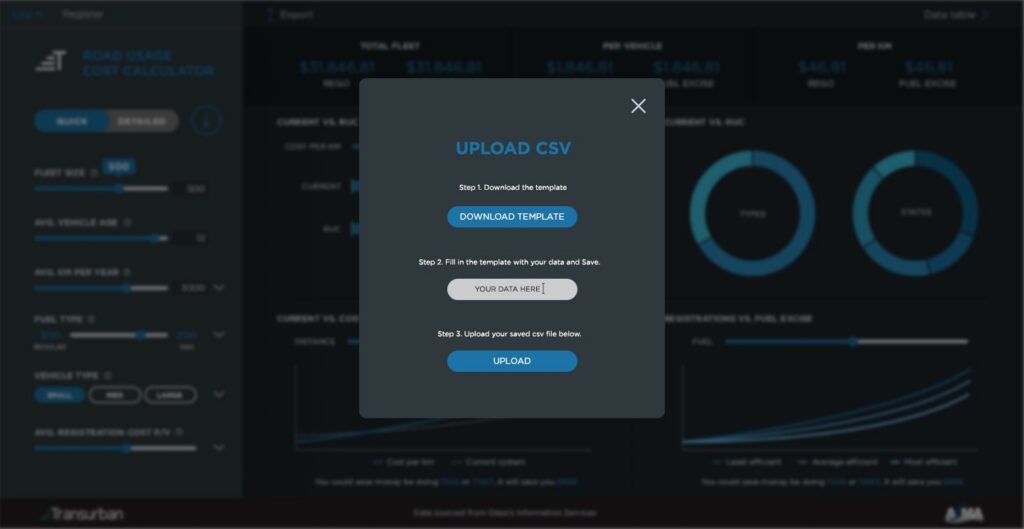
| CSV import | Large fleet operators | A bulk upload against a downloadable template |
All modes fed the same comparison engine: current charges (fuel excise plus registration) against the modelled Road Usage Charge.
Design screens from the build
Inside the calculator
Click any screen to view it full-size — design frames from the build, with indicative modelling data throughout.
The three input methods
Choose Your Way In
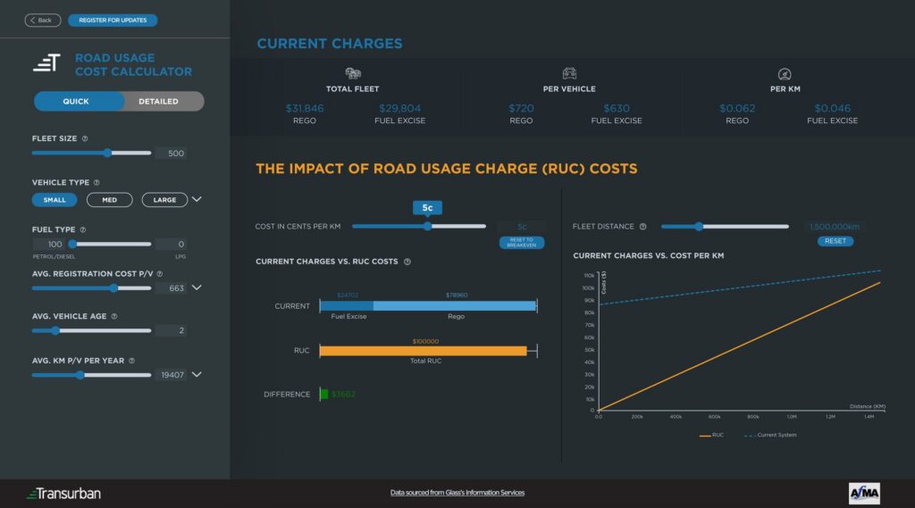
Sliders for rapid scenarios
Quick Mode
Every vehicle, both systems
Per-Car Breakdown
Whole fleets in one upload
CSV Import
Click the markers
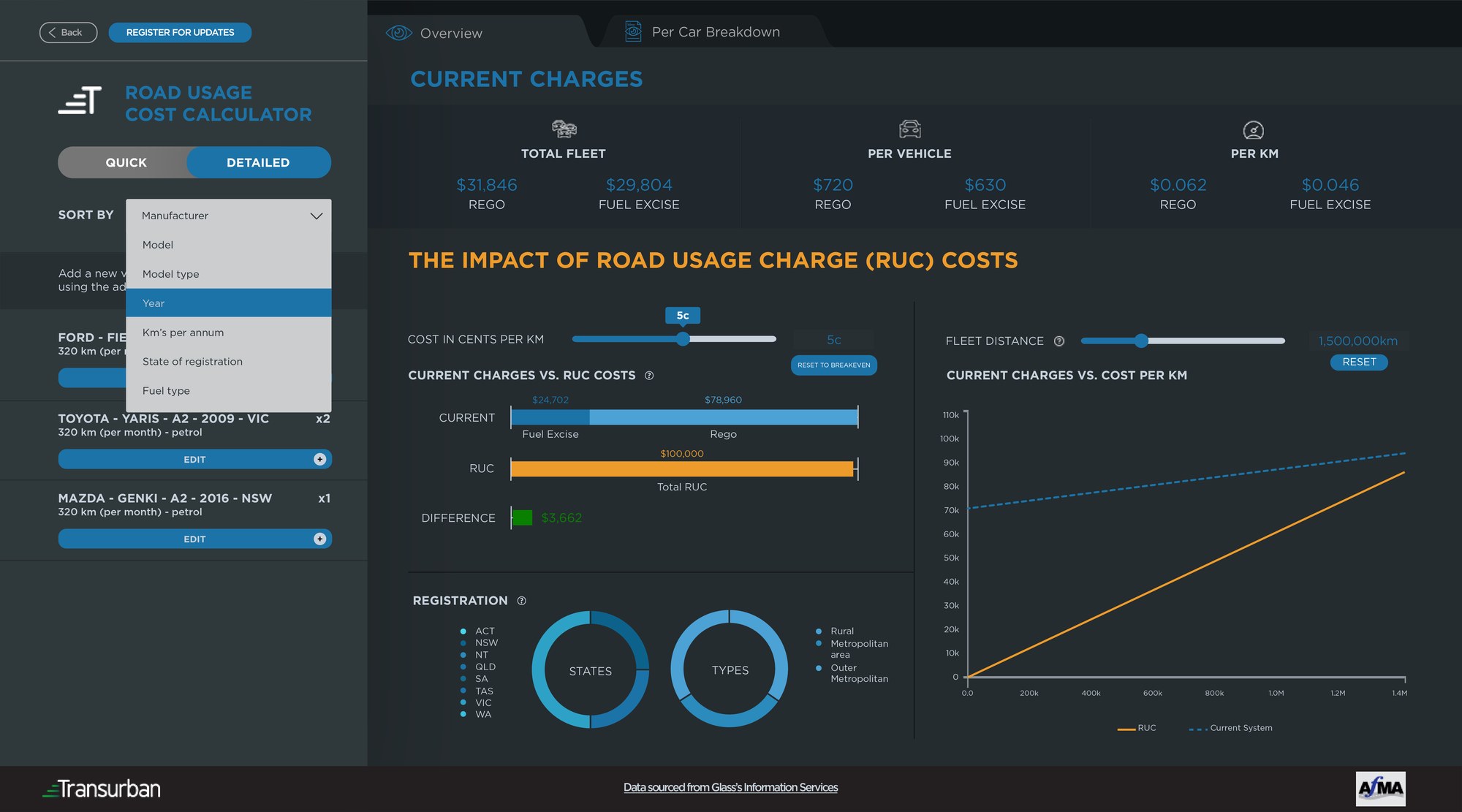
Read the results screen
The main results view, annotated — five markers explain how a scenario reads. Figures are indicative.
The rules under the tool
The design principles behind the calculator
Six decisions that made a policy instrument feel like a consumer product.
Delivered and shipped public
What did Transurban receive at the end?
A fully functional public calculator at roadusagecalculator.com: real-time comparison of current charges against a Road Usage Charge, an adjustable per-kilometre rate, three cost perspectives, comparative and trajectory charts, per-vehicle tables, and an educational landing page — covering all eight Australian states and territories.
The tool has since been retired from service, which this page states plainly — policy instruments have seasons. What it demonstrated stands: multi-variable cost comparison made accessible to non-technical stakeholders, and a funding debate given a shared, checkable model. The hard work was invisible: registration rules across eight jurisdictions and four categories, fuel classifications, and excise rates — correct in every combination.
A policy debate improves the moment the public can poke at the numbers themselves.

Otto Ottinger
The principle behind the calculator
Questions & Answers
The Transurban project
Invite first, prove later
Designing a calculator the public can argue with
A policy tool has two audiences that want opposite things. A curious member of the public wants an answer in ninety seconds; a fleet analyst wants to model four hundred vehicles precisely. Serve only the first and the tool is a toy; only the second and nobody opens it.
The calculator’s answer was three doors into one engine. Quick mode asked for a handful of sliders — fleet size, vehicle mix, average kilometres — and produced a defensible first answer fast. Detailed mode let a user specify every vehicle down to make, model, year, and state. CSV import took an entire fleet in one upload, against a template the tool itself provided.
The output design made the comparison legible. Current charges and the modelled Road Usage Charge sat side by side, with differences colour-coded and savings in green; a trajectory chart projected both across rising annual distance so the crossover point was visible; and three cost lenses — fleet, vehicle, kilometre — meant every stakeholder found the number they think in.
Interactivity is our craft in every format — see the interactive data visualizations we design — but a public policy tool is its sharpest use: the audience explores the model for themselves.


Eight jurisdictions, no shortcuts…
The data governance under a simple slider
The calculator looked simple — that was the point — but the simplicity sat on a hard data problem. Registration costs differ across all eight Australian states and territories, and within them by category: rural, metropolitan, outer metropolitan, older vehicles. Fuel excise varies by fuel classification. Vehicle efficiency varies by make, model, and year.
Getting one combination right is easy; the tool had to be right in every combination, because a public calculator that misprices one state’s rural utes loses the whole argument. The project’s centre of gravity sat behind the interface: the extended data design sessions structuring the multi-dimensional cost rules, and the cleansing passes that made the reference data trustworthy.
My role was project management and design lead: translating the Strategy team’s policy research into functional requirements, running the data design, shaping user flows, and coordinating the development team that built the application across a roughly three-month timeline. Design leadership on a build you do not code yourself is its own discipline — the spec and the data model are your product.
The tool served its season and has been retired, but the shape is durable: policy question, governed data model, public interface. If your organisation has a debate that needs a shared model, our dashboard design services page shows how the engagement starts.
The Data Design Firm for AI & Visualization
The Datalabs Agency
Templates, guides, grids, icons…
Creative Design Assets »

Learn visualization and storytelling skills…
« Beautiful Courses in Data Design
Some of the notable brands Otto has worked with…
Otto Ottinger’s Clients of Note








Professional & Thought-provoking
Looking for a speaker for your event?
"*" indicates required fields