


Updated September 2026
A visual case study…
Monash: 1.4 Million Views, 3 Markets
Monash University wanted to reach the parents of prospective international students. Otto Ottinger and team built a rankings motion graphic, subtitled it in Bahasa, and ran it across Indonesia, Malaysia and Singapore — 1.4 million views, engagement above 90%, and the university’s YouTube channel up 102.7% in a month.
The engagement in one paragraph
What was built for Monash University?
A single rankings dataset became three things: a printed infographic, an animated data video, and a 30-second cut subtitled in Bahasa for the Indonesian market. The video ran as a YouTube TrueView campaign from December 2012 to January 2013 and became Monash’s outstanding video result for the year.
The Datalabs Agency is a Melbourne-based data visualization consultancy founded in 2012 that delivers corporate training workshops (Power BI, Tableau, data storytelling), dashboard design, and BI style guides for clients including Mercedes-Benz, Adidas, and UPS.
Follow the dataset
One dataset, three formats, three markets
The same rankings data was rendered three ways, then pointed at the three markets where Monash was recruiting.
The problem behind the brief
Why subtitle a university video in Bahasa?
Because the buyer was not the student. Monash needed to reach parents of prospective international students — the people who actually weigh up whether a degree abroad is worth it — and those parents were searching in their own language.
Keyword research settled the creative direction before a frame was drawn. “University rankings” was by a distance the most-used search term in university searches, so the motion graphic was themed and tagged to that term. The Bahasa cut followed the same logic one step further: if the primary audience searches in Bahasa, the video has to be findable in Bahasa. Neither decision was a stylistic preference. Both came out of the data.
What the campaign returned
The numbers, market by market
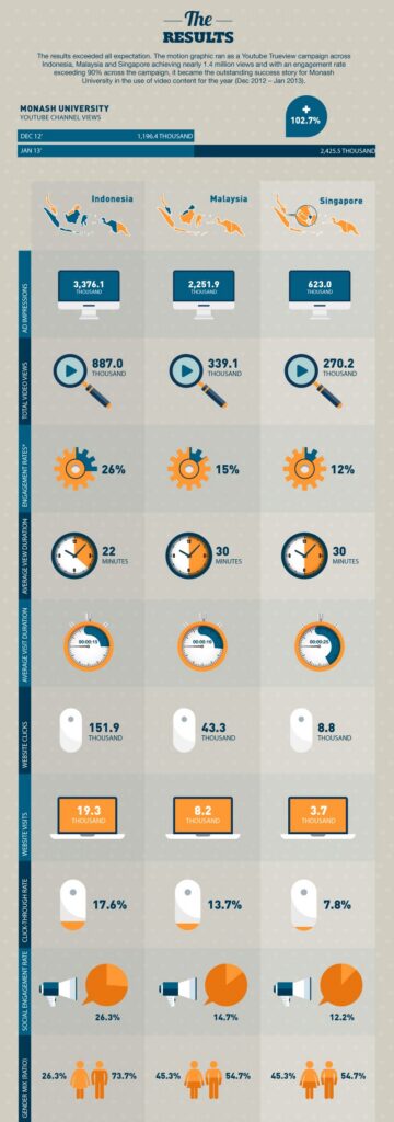
Campaign performance as recorded at the time, sourced to Google Analytics and YouTube Analytics.
| Metric | Indonesia | Malaysia | Singapore |
|---|---|---|---|
| Ad impressions | 3,376.1k | 2,251.9k | 623.0k |
| Total video views | 887.0k | 339.1k | 270.2k |
| Engagement rate | 26% | 15% | 12% |
| Website clicks | 151.9k | 43.3k | 8.8k |
| Website visits | 19.3k | 8.2k | 3.7k |
| Click-through rate | 17.6% | 13.7% | 7.8% |
| Social engagement rate | 26.3% | 14.7% | 12.2% |
Across the whole campaign, Monash’s YouTube channel views rose from 1,196.4k in December 2012 to 2,425.5k in January 2013 — an increase of 102.7%.
How it was reported at the time
The results, as they were recorded
This is the campaign report produced when the work closed, sourced to Google Analytics and YouTube Analytics. It carries the 102.7% jump in channel views across a single month and the full per-market breakdown — ad impressions, view duration, click-through and social engagement for Indonesia, Malaysia and Singapore side by side.
The work, full size
What was designed
Click either card to open it full-screen.
The source artefact
The Rankings Infographic
Built for Monash Marketing
The Reporting Template
The decisions that carried it
Six choices behind the result
None of these were creative preferences. Each one came from something the data said.
Designed, animated, localised, measured
What did Monash Marketing receive?
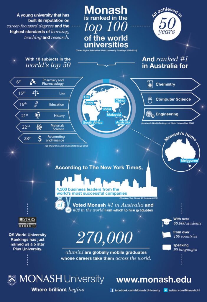
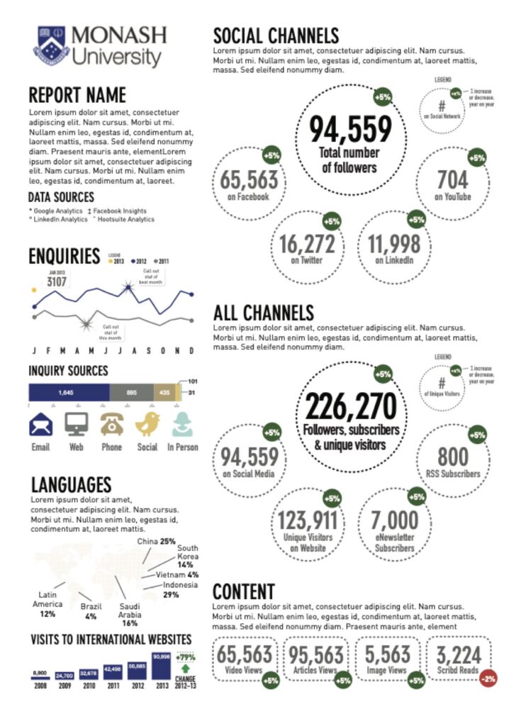
A Monash-branded rankings infographic drawing on Times Higher Education, QS and New York Times data; an animated version of the same story; a 30-second cut with Bahasa subtitles for the Indonesian market; and an analytics reporting template covering social channels, enquiry volumes, languages and international web traffic.
The reporting template is the piece that kept working after the campaign closed. It was built as a layout Monash Marketing could fill each reporting cycle, pulling from Google Analytics, Facebook Insights, LinkedIn Analytics and Hootsuite — so the team could see the next campaign’s audience the same way this one had been aimed.
We did not translate the video because translation is nice. We subtitled it because the people deciding were searching in Bahasa, and an English video is invisible to them.

Otto Ottinger
The decision that made the Monash campaign work
Questions & Answers
The Monash rankings campaign
Design after research…
How keyword research chose the creative
Most university video starts from a brand brief. This one started from a search log. Before anyone drew a frame, the research question was simple: what are people actually typing when they look up universities? The answer came back clearly enough to settle the creative direction — “university rankings” dominated, by a wide margin.
So the motion graphic was built around rankings and tagged to match. That is a narrower brief than “promote the university”, and the narrowness is the point: it meant the video answered a question people were already asking instead of one Monash wanted to raise.
The same dataset then carried an A3 infographic and a 30-second cut. Three formats, one set of facts, each aimed at a different moment — a page someone reads, a video someone watches, a short someone is served.
That sequence is still how we teach format choice in our data visualisation training workshops: work out what the audience is looking for, then decide what to build.


Reaching the actual decision-maker…
The audience was never the student
The brief said something most university marketing skips over. The primary audience was not prospective students — it was their parents. Students may pick the country; parents weigh the cost, the safety and the standing of the institution, and a ranking is exactly the kind of evidence that settles a family argument.
Once the audience is named that precisely, the language question answers itself. Parents in Indonesia search in Bahasa. An English-only video is not simply less convenient for them, it is effectively invisible — it does not surface for the searches they run. Subtitling was a findability decision.
The results bore it out. Indonesia returned 887,000 views and a 26% engagement rate, well clear of Malaysia at 15% and Singapore at 12%, and it produced 151,900 website clicks against Singapore’s 8,800.
Thirteen years on, the lesson has not aged. Identify who actually decides, find out how they search, and build for that. If you want your team working this way, the Introduction to Data Visualization workshop is where the method is taught, and the format and costs sit on our workshop pricing page.
The Data Design Firm for AI & Visualization
The Datalabs Agency
Templates, guides, grids, icons…
Creative Design Assets »

Learn visualization and storytelling skills…
« Beautiful Courses in Data Design
Some of the notable brands Otto has worked with…
Otto Ottinger’s Clients of Note








Professional & Thought-provoking
Looking for a speaker for your event?
"*" indicates required fields