الوصف
Founder & Managing Director of the Datalabs Agency
Otto Ottinger
John “Otto” Ottinger is a data visualizer, specializing in the visual design of complex data systems. The founder and Managing Director of the Datalabs Agency, a data visualization & consultancy firm, Otto works at the intersection of user experience (UX) design, visual analytics, and storytelling. He started his career as an editor and interactive designer at National Geographic, in Washington, DC.
There he learned the same information design and storytelling techniques that he teaches in his workshops. Now in his role at Datalabs, Otto has gone on to design software, dashboards, infographics, and data tools for clients like Nestlé, Mercedes-Benz, Bupa, BlackRock, Adidas, eBay, Marriott, CommBank, and HCF, among others.
Some of the notable brands Otto has worked with...
Otto Ottinger’s Clients of Note


Australia, Europe, & the U.S.A.
KEYNOTES & SPEECHES
Examples of Past...
KEYNOTE SPEECHES
Examples of Past...
Workshops at Company Retreats
The Design of Visual Analytics & Complex Systems
DATA VISUALIZER
Establishing a Data Design Philosophy with the Datalabs Agency
Australian/American Data Visualizer
The best part about running a data agency is the breadth of clients and industry challenges to work with. By “breadth of clients” I mean it runs the gamut of Fortune 500, NASDAQ, and ASX 200 (Australia’s equivalent). Plus, this agency takes me to the Middle East, Africa, and Europe. This leads me to my second favorite part: “Industry challenges.” These same companies — no matter if they work in banking, energy, manufacturing, or education — have similar problems.
The data couldn’t be more different. However, what gets put to me is always a similar challenge.
This one challenge I classify and place into three “buckets”: lack of simplicity, lack of creativity, or inability to communicate visually.
So over my 16+ years as a data visualizer, I’ve developed what could be called a data design philosophy and methodology to tackle these three challenges. To me, data visualization paired with visual communication is a human-to-human art form. Along with my data visualization style, this is what gives a Datalabs Agency piece of work a distinct look and feel.
This same philosophy is also why clients around the globe come to me.
Examples of Past...
DATA VISUALIZATION DESIGN
What Do You Want From a Data Visualization Consultant?
Our data visualization consultants have seen a lot of bad dashboards, reports, and infographics. We know how to solve common design problems and quickly arrive at better choices in charts, insights, layouts, data strategies — you name it. Most importantly, if you seek our advice, we can get your project moving again in the right direction.
What is a Data Visualization Consultant?
A data visualization consultant is a professional data visualizer, hired give advice or a second opinion on the user experience (UX) and the user interface (UI) of a business intelligence dashboard, infographic report, or interactive application.
The Datalabs Agency brings over twelve years of analytics and data visualization design experience. We’ll bring relevant advice, workarounds, and solutions from our portfolio of past client projects. We can suggest options and solve big problems in the usability, structure, and visualizations found in your existing project. We can also discuss the challenges found in your teams’ workflow and abilities when comes to visualizing data. And finally, we have a vast knowledge of the tools and the software that you may be using, be it Power BI, PowerPoint, or Tableau.
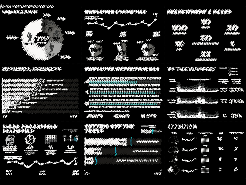
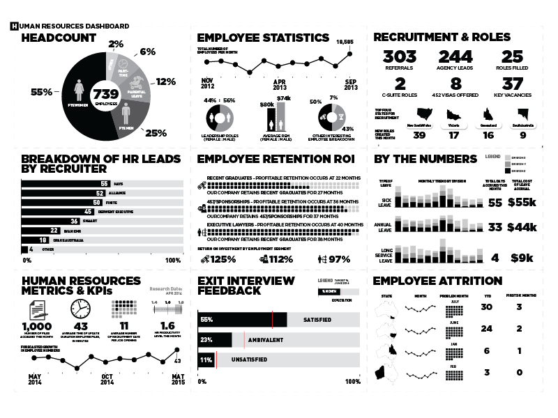
ABOVE: Drag the yellow icon found at the center of the image. This is a before-and-after example of a dashboard design one of our data visualization consultants helped with.
Visualize a Great Hire
Looking for a data visualization consultant?
"*" تحدد الحقول المطلوبة
View The Datalabs Agency’s digital product and services terms and conditions and the Data Arts privacy policy.
