


Updated November 2026
قبل أن تعرضه على مجلس الإدارة…
مستشار في مجال تصوير البيانات
A fixed-price dashboard review and audit. You send the Power BI, Tableau or Excel dashboard, report or deck you are about to share. We read it the way your audience will, and send back an annotated PDF showing what to change, what to cut and why.
النسخة المختصرة
What is a data visualization consultant?
A data visualization consultant is a designer you hire to review work that shows data: a BI dashboard, a report, an infographic or a board deck. A review takes an hour or a half day, is quoted before you commit, and ends in a written critique your team can use without you in the room.
The Datalabs Agency is a Melbourne-based data visualization consultancy founded in 2012 that delivers corporate training workshops (Power BI, Tableau, data storytelling), dashboard design, and BI style guides for clients including Mercedes-Benz, Adidas, and UPS. Reviews are delivered remotely, worldwide. We only travel for workshops.
ملف PDF واحد، مع تمييز كل تغيير
What do you actually get back?
A visually annotated PDF. Your screens, marked up: chart changes, layout and grid fixes, colour and typography calls, icon ideas, and the interactions that are getting in the way. Each note says what to do and why it matters to the person reading the screen.
The review comes as a document, not a meeting. A marked-up PDF goes into the ticket, the sprint and the handover note. Your developer can work from it, your analyst can question it, and someone new can read it in six months and see why the dashboard looks the way it does.
Most reviews need one hour for a single dashboard or report, and a half day for a suite of screens or a full reporting pack. If you have something bigger, such as a BI rollout, a reporting programme or a department moving off spreadsheets, tell us and we will quote the whole job.
اطلع على السعر قبل إتمام الصفقة…
ستة أمور يمكنك الاستعانة بنا من أجلها
مرر مؤشر الفأرة فوق إحدى الدوائر أو انقر عليها. يتم عرض سعر كل منها قبل إتمام عملية الشراء.
ألا يناسبك أي منها؟ صف لنا ما تنوي إرساله وسنخبرك أيها يناسبك.
الجزء الممل الذي يبعث على الطمأنينة
Who you are hiring, in six numbers
The year we started doing this
Workshops delivered
Companies worked with
Workshop topics on the shelf
Countries taught in person
Designer on your job
انقر على العلامات
This is how we read a dashboard
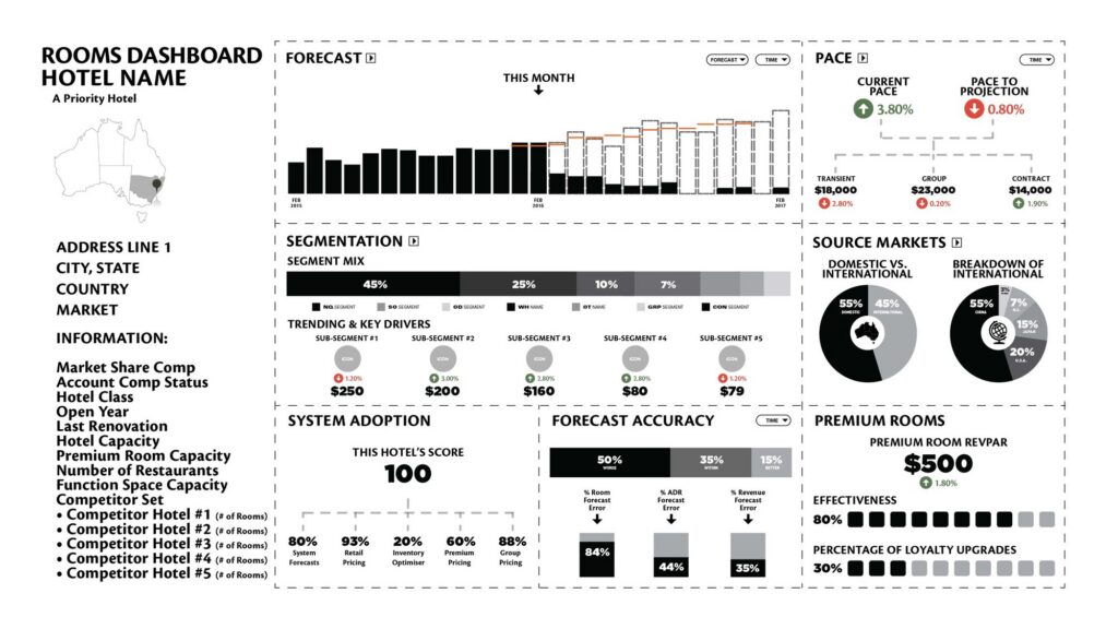
Five markers on a real screen we designed for Marriott. A review comes back at this level of detail, on your own screens. Figures shown are illustrative design values.
من ملفك إلى قائمة المهام المطلوب إصلاحها
What a review actually changes
Three inputs, one document, four kinds of change. Every note comes with a reason.
من البداية إلى النهاية، دون أي مفاجآت
How a review runs
Six steps. The whole thing takes under a fortnight from the day you send the file.
1
أرسلها أنت
رابط، أو ملف، أو تسجيل لمشاركة الشاشة. لا نحتاج إلى الوصول إلى مستودع البيانات الخاص بك، ولا نريد بيانات اعتمادك.
2
نطرح سؤالين
من الذي يفتح هذه الرسالة، وماذا يقرر بعد قراءتها؟ إذا لم يتمكن أحد من جانبكم من الإجابة على السؤال الثاني، فهذا يخبرنا بالكثير.
3
القراءة
شاهد المسلسل دفعة واحدة، بالطريقة التي سيشاهده بها جمهورك.
4
الجلسة
ساعة واحدة أو نصف يوم، ويتم تحديد السعر قبل البدء. موظفوك موجودون في الغرفة ويمكنهم التفاوض على السعر.
5
ملف PDF المُشَرَّح
في غضون يومين عمل. كل التغييرات محددة على شاشاتكم، مرتبة حسب أهميتها، حتى يتمكن فريقكم من البدء بالتغييرات الأكثر أهمية.
6
الرجوع إلى الخلف
أرسل النسخة المنقحة فور الانتهاء من إعدادها. ويشمل ذلك مراجعتها مرة أخرى.
ثلاث مشكلات مختلفة
A review, a rebuild, or a workshop?
Most people need a review and ask for a rebuild. Here is how they compare.
| A review | A rebuild | A workshop | |
|---|---|---|---|
| What you send | The thing you already built | The problem, not the file | A team and a date |
| What comes back | An annotated PDF of changes | New dashboards, built | People who can do it next time |
| Typical time | Under a fortnight | Four to eight weeks | Half a day or a day |
| Who it suits | A tech lead or PM about to ship | A reporting stack nobody trusts | An HR or L&D lead with a team |
| Where it starts | Quoted before you start | Quoted on scope | From about $300 per person for a team of 12 |
If the review finds a rebuild is needed, the PDF says so, and the review fee comes off the rebuild quote.
العمل، بالحجم الكامل
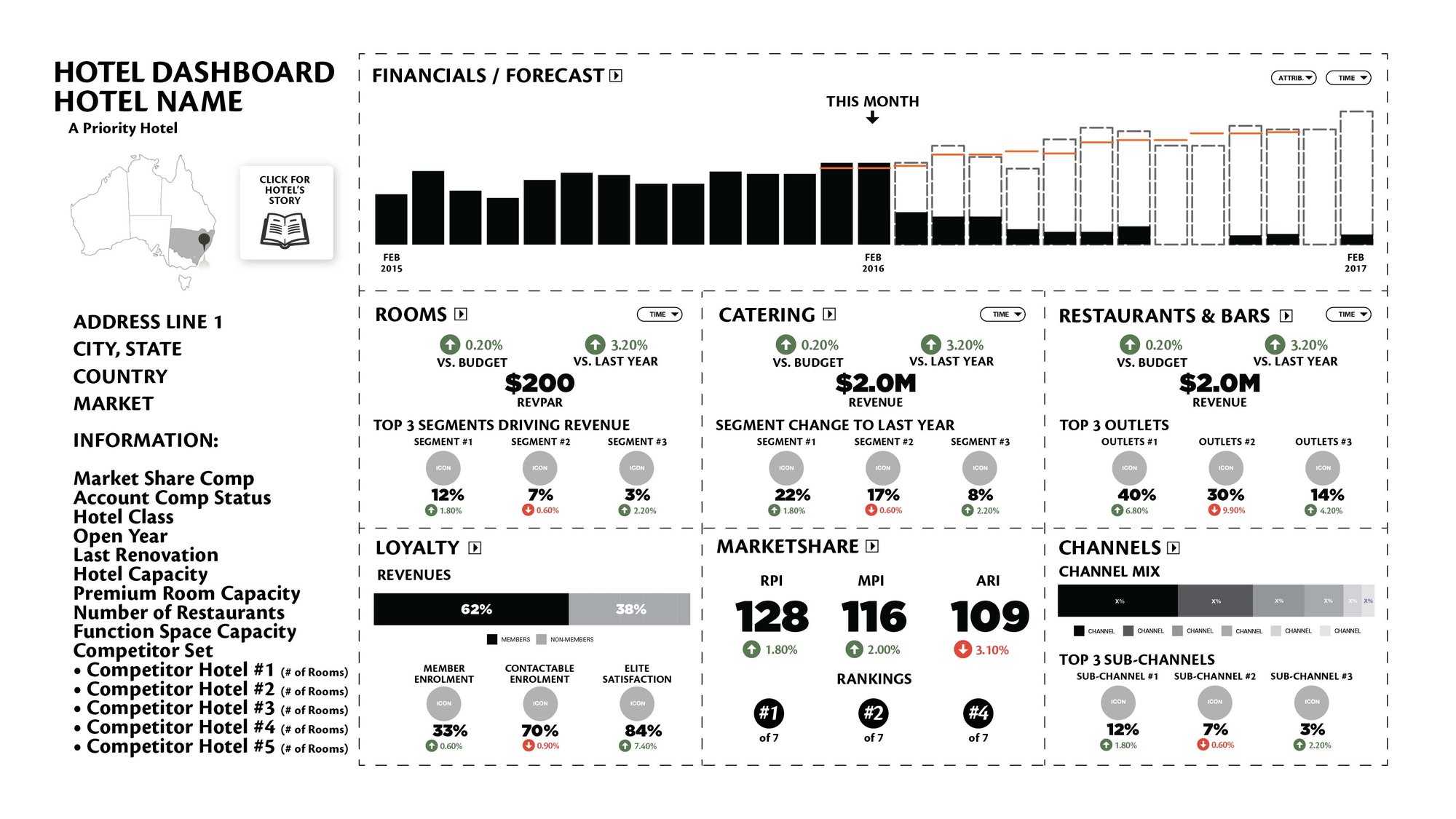
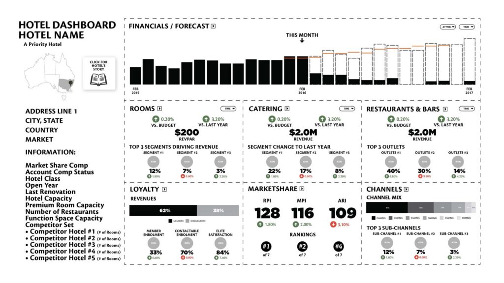
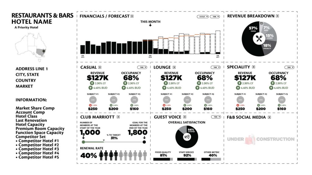
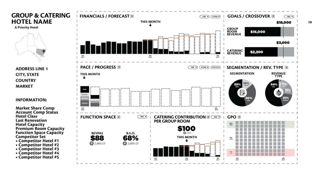
Four screens, four different readers
One engagement, four audiences. Click any design to open it full-screen — these are the design files, with indicative figures.
للمديرين العامين
Hotel
لمديري الإيرادات
Rooms
لمديري قطاع الأطعمة والمشروبات
Restaurants & Bars
لفرق المبيعات
Group & Catering
الجزء الذي لا تستطيع الشركات الكبرى ذكره
You get the person whose name is on the work
Search for a data visualization consultant and you will mostly find staffing firms, offshore development shops and freelance marketplaces. They sell you a resource. They rarely tell you which person will open your file.
Here it is Otto Ottinger. He founded the firm in 2012 and still does the work. He learned visual storytelling at National Geographic, has delivered 300 workshops to 90+ companies on three continents, and keynotes on data design. He is the person in your meeting. There is no account manager and no bench, and no junior does the review for him.
One designer can only read so much. If you need twenty dashboards audited next week, we are the wrong firm, and we will tell you on the first call.
بعض الأعمال، التي تم تدوينها
عملاء بارزون








الناس هم الوحيدون الذين يتخذون الإجراءات — لذا يجب أن يكون الناس، وليس البيانات، هم الأولوية في تصميم لوحات المعلومات.

أوتو أوتينجر
المبدأ الذي تُقيَّم كل مراجعة وفقًا له
الـ10 ثوانٍ الأولى…
What a data visualization consultant looks for first
I open your dashboard the way the person you built it for does: cold, on a Monday, with something else on my mind. My first question is whether I can tell what this screen wants me to do. If I cannot answer that in about ten seconds, your audience will not get any further either.
Three faults account for most of what I find. The first is a dashboard built from the data outward: every field the warehouse offered, arranged tidily. It is complete and accurate, and nobody uses it.
The second is a number with nothing to compare it to. Revenue of $4.2m tells you little. Revenue of $4.2m against a $4.6m budget, in a quarter that ran 9% ahead of last year, tells you something.
The third is a filter doing a design decision’s job. When a screen serves four audiences badly and adds a dropdown, the hard choice has been handed to the reader.
None of these are technical faults, so they pass technical review. Your developer built what was specified and your analyst checked the numbers. Nobody checked whether the screen argues for anything, and a QA pass cannot catch that because nothing is broken.
The review is a design critique with your team, written down afterwards so it outlasts the meeting. I will tell you which charts to change and to what. I will tell you what to cut, which is often the least popular and most valuable part. Where something is taste rather than evidence, I will say so.
النتيجة المقلقة
When the dashboard is not actually the problem
A fair share of reviews end with me telling a client their dashboard is fine. The reason nobody opens it is somewhere else, and it is usually one of three things a redesign would not fix.
Sometimes nobody decided who it was for. A committee commissioned it, so it serves the committee: a bit for finance, a bit for operations, a bit for whoever asked loudest. The fix is to pick one reader and give the others their own screen. We did this on the Marriott project: four screens with four jobs, instead of one screen and a dropdown.
Sometimes nobody has the authority to act on the decision it supports. A well-built operational dashboard handed to people who cannot act on it is a newsletter. That is an organisational finding, not a design one. I will still write it down, because otherwise you are paying to decorate the problem.
And sometimes the team has no shared rules. Nine dashboards by six people, each sensible alone and unreadable together, because a colour means something different on each one. That calls for a style guide and a workshop: write the rules down once and teach them once, so you stop having the same argument every quarter.
A review that can only ever conclude “redesign it” is not worth buying. Three of the six reasons people come to us end somewhere other than a redesign, and saying so in writing is most of what the fee buys.
Questions & Answers
Hiring a data visualization consultant
Related reading…
AI consulting · Six AI projects to start with · Data visualization workshops · Marriott dashboard case study


شركة تصميم البيانات المتخصصة في الذكاء الاصطناعي والتصور المرئي
وكالة داتا لابز
القوالب، والأدلة، والشبكات، والأيقونات…
عناصر التصميم الإبداعية »

تعلَّم مهارات التصور وسرد القصص…
« دورات رائعة في تصميم البيانات
المهنية والمثيرة للتفكير
هل تبحث عن متحدث لهذا الحدث الخاص بك؟
"*" تحدد الحقول المطلوبة